Every home tells a story through the details its owner chooses, and some of those details quietly undermine even the most well-intentioned spaces. Certain decorating habits have become so common that many people overlook them entirely, yet they consistently create an impression of low effort or low investment. Understanding which choices tend to cheapen a space is the first step toward making smarter, longer-lasting decisions for your home.
All-White Plastic Light Switch Covers
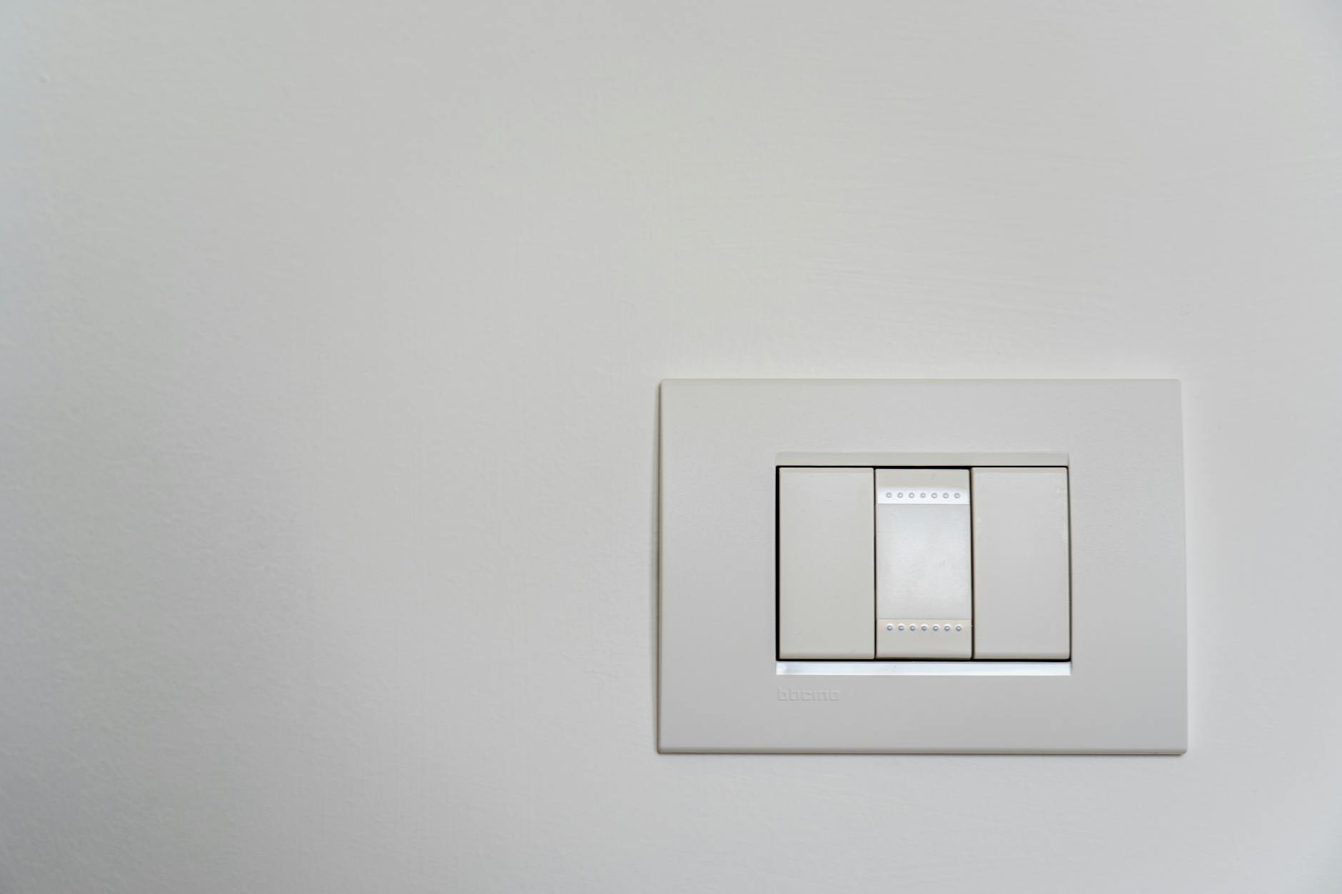
Builder-grade plastic switch plates are one of the most overlooked details in a home, yet they register immediately to anyone with a design-conscious eye. They come standard in nearly every new construction and rental property, which is precisely why they read as unfinished or uninvested. Swapping them out for metal, brass, or ceramic alternatives takes minimal effort and costs very little. The difference in perceived quality is disproportionately large for such a small change.
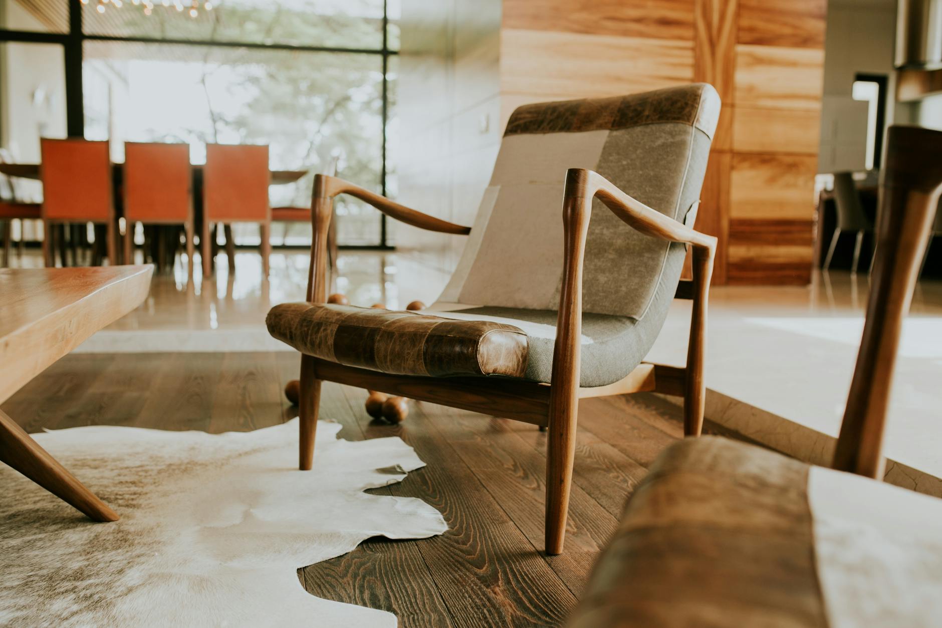
Matching Furniture Sets
Purchasing an entire room’s worth of furniture from the same collection signals a lack of layering and personal curation. Well-designed interiors tend to mix periods, textures, and sources to create depth and visual interest. A perfectly matched set can make a space feel more like a showroom floor than a lived-in home. Introducing one or two contrasting pieces immediately elevates the overall composition.
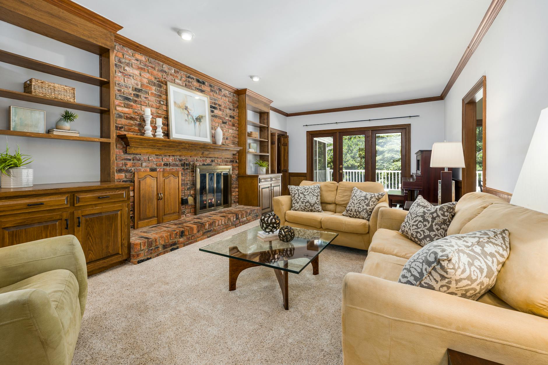
Hollow-Core Interior Doors
Hollow-core doors are a standard cost-cutting measure in many homes, but they dramatically reduce the sense of quality throughout a space. They produce a thin, tinny sound when closed and flex visibly under pressure, which signals low-grade construction. Solid-core doors add acoustic privacy and a satisfying weight that changes how a room feels entirely. Replacing even the most frequently used doors in a home makes an immediate and lasting impression.
Popcorn Ceilings
Popcorn or cottage cheese ceiling texture was widely used in mid-century construction as an acoustic and cost-saving measure. Today it reads as dated and difficult to maintain, and it tends to collect dust and discolor over time. Many homeowners avoid addressing it because the removal process can seem daunting, yet professional remediation is widely available. A smooth painted ceiling immediately modernizes a room without changing a single piece of furniture.
Thin Curtains Hung Too Low
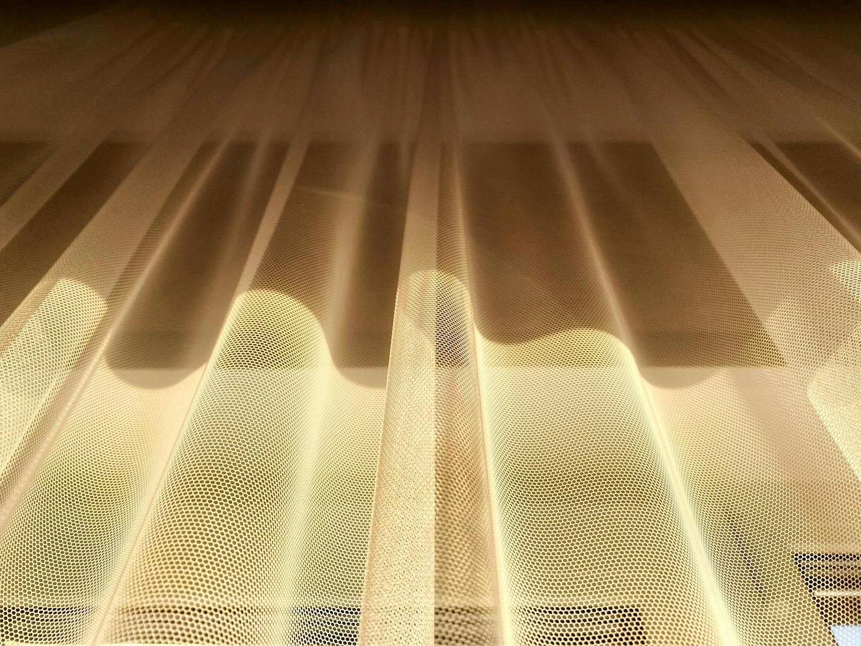
Curtains that barely skim the window frame or hang at the exact height of the window casing make ceilings feel lower and rooms feel smaller. Fabric weight also plays a major role, as sheer or unlined panels tend to look inexpensive regardless of their actual cost. Hanging rods close to the ceiling and allowing fabric to pool slightly on the floor creates an architectural illusion of height and grandeur. The rod placement and fabric choice matter far more than the brand or price point.
Plastic Venetian Blinds
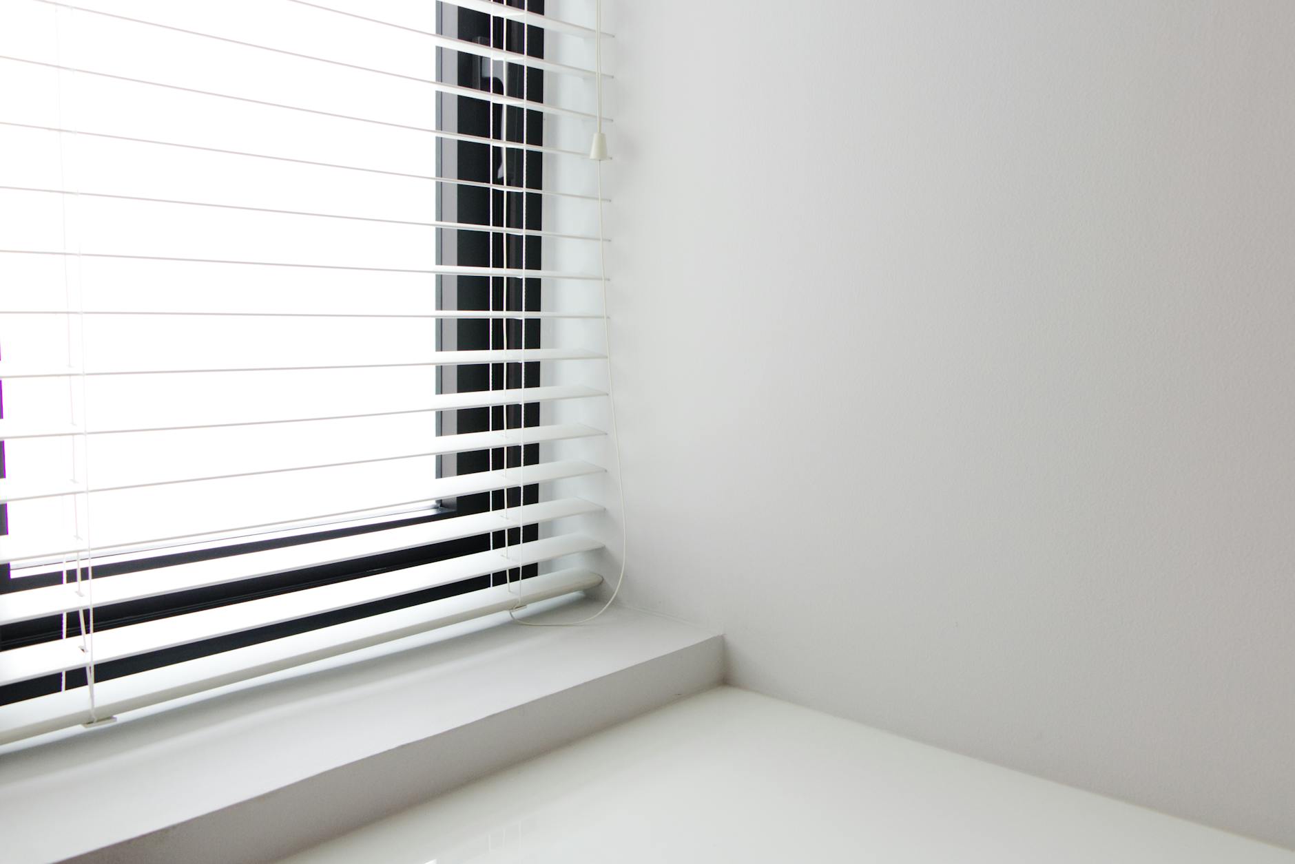
Plastic slatted blinds are among the most common window treatments found in rentals and builder-grade homes, and they are also among the most effective at reducing a room’s perceived quality. They yellow with sun exposure, bend easily, and rarely hang perfectly straight after minimal use. Replacing them with woven wood shades, Roman shades, or even simple linen panels transforms the entire mood of a window. Natural materials bring warmth and texture that synthetic blinds are fundamentally unable to replicate.
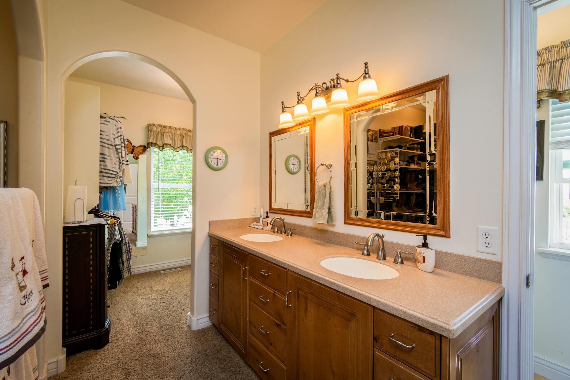
Builder-Grade Bathroom Vanities
The standard vanities installed in most new homes feature low-grade MDF construction, basic chrome hardware, and generic styling that suits no particular aesthetic. They tend to dominate a bathroom’s visual impression because of their scale, making their quality especially apparent. Replacing the hardware alone can make a meaningful difference without touching the cabinet itself. A new mirror and updated light fixture compound that effect significantly.
Matted or Yellowed Grout
Grout that has darkened, discolored, or cracked draws the eye immediately and overwhelms the quality of surrounding tile. It is one of those details that homeowners often stop noticing over time but that guests register instantly. Grout cleaning products and regrout pens are widely available and require no professional involvement. Addressing grout lines refreshes an entire bathroom or kitchen without replacing a single tile.
Brass Fixtures in the Wrong Context
Unlacquered or poorly finished brass fixtures that are mismatched across a space create visual noise that reads as accidental rather than intentional. This is distinct from the intentional use of warm metals, which has become a major design trend. The issue arises when aged chrome sits beside polished nickel and flat brushed gold without any cohesive intention. Choosing one metal finish and applying it consistently across a room creates immediate visual coherence.
Sofa Covers and Furniture Throws Used to Hide Damage
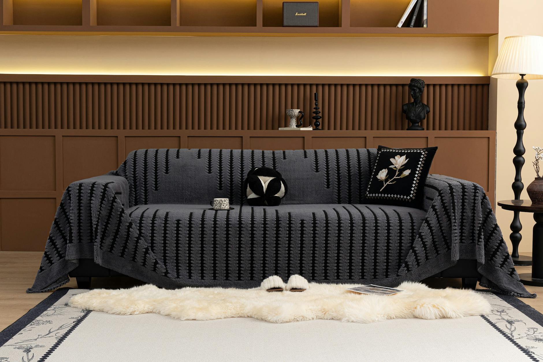
Using throws or slipcovers to conceal worn or damaged furniture is a solution that tends to draw more attention to the problem than it solves. Fabric slips, bunches, and shifts throughout the day, requiring constant readjustment and signaling that something is being concealed. If a piece of furniture has reached the end of its useful life, strategic replacement or professional reupholstery are more effective solutions. A single well-chosen sofa in good condition anchors a room far more effectively than several covered alternatives.
Framed Inspirational Quotes

Mass-produced typography prints featuring motivational phrases have become so ubiquitous in home decor that they now read as filler rather than thoughtful curation. They tend to appear in kitchens and living rooms in place of original artwork or personal photography. The issue is not the sentiment but the execution, as identical prints appear in millions of homes without variation. Swapping them for original art, handmade objects, or personal photographs adds character that is genuinely irreplaceable.
Fake Flowers and Artificial Plants

Artificial botanicals have improved significantly in recent years, but the majority of widely available options still read as obviously synthetic under natural light. Dust accumulation accelerates the aging process and makes them look neglected within months. Real plants introduce humidity, oxygen, and organic variation that no artificial product can replicate. Even low-maintenance options like pothos, snake plants, or dried botanicals outperform most faux alternatives in terms of perceived quality.
Laminate Countertops in Poor Condition
Laminate countertops are not inherently cheap-looking when they are well maintained and thoughtfully chosen, but chipped, bubbling, or peeling edges immediately change that equation. The seams and edges are particularly vulnerable and tend to show wear before the surface itself deteriorates. Regular maintenance and edge repair extend the life of laminate surfaces considerably. When replacement becomes necessary, butcher block and tile are cost-effective alternatives that read as intentional material choices.
Carpet in the Bathroom
Wall-to-wall carpet in bathrooms was a popular choice in mid-century and postwar construction but has long since fallen out of favor for practical and aesthetic reasons. It harbors moisture, mold, and bacteria in ways that hard flooring does not, and it visually shrinks the space by removing the contrast between walls and floor. Tile, vinyl plank, and even painted concrete provide far more hygienic and visually appealing alternatives. The removal of bathroom carpet alone can meaningfully update an older home’s feel.
Overhead Lighting as the Only Light Source
Relying exclusively on a single overhead fixture to light an entire room creates flat, unflattering illumination that strips a space of atmosphere. Overhead lighting exposes every imperfection on surfaces and faces while eliminating the shadows that give a room visual depth. Layering table lamps, floor lamps, and task lighting creates warmth and dimension that cannot be achieved from a single ceiling source. Even low-cost lamps with well-chosen bulbs transform the mood of a room dramatically.
Exposed Cords and Cable Management Issues
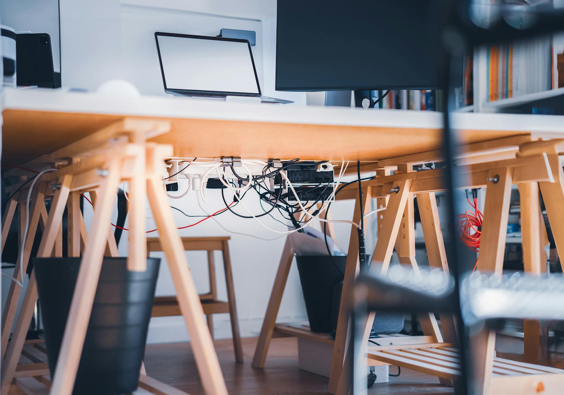
Visible power cords trailing across floors and baseboards or tangled behind entertainment units are one of the most effective ways to make a thoughtfully decorated room look unfinished. Cable management solutions range from simple cord covers to in-wall routing kits, and most require no professional installation. The absence of visible wiring allows furniture and art to hold the eye rather than the infrastructure behind them. It is a small intervention with a disproportionately large visual impact.
Cluttered Refrigerator Surfaces
Refrigerator doors covered in expired coupons, mismatched magnets, and layered paper create visual chaos in what is usually the most prominent surface in a kitchen. They anchor the eye to disorder in a space where cleanliness and calm are particularly desirable. Curating the refrigerator surface to hold only a few intentional items or clearing it entirely changes the feeling of the whole kitchen. The refrigerator is one of the largest objects in the home and deserves the same curatorial attention as any other surface.
Mismatched Bedding in Visible Guest Spaces
Guest rooms and visible sleeping areas furnished with mismatched pillow cases, worn comforters, and uncoordinated patterns communicate a low level of care toward the space and its intended occupant. A cohesive bedding set in a neutral or intentional palette requires no significant investment. Thread count matters far less than overall coordination and the appearance of being freshly laundered. Hotel-style layering with a flat sheet, duvet, and consistent shams creates a polished effect at any price point.
Open Storage Overloaded with Miscellaneous Items
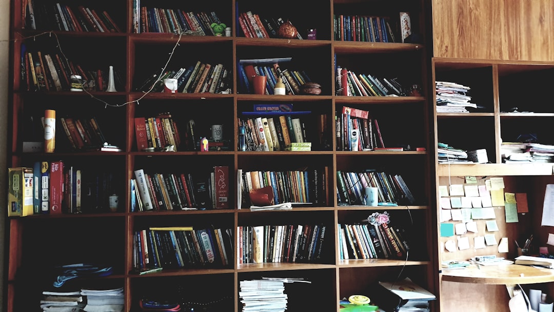
Open shelving and floating shelves have become a defining feature of contemporary interiors, but overcrowded or poorly organized shelving negates their visual appeal entirely. Items in mismatched sizes, colors, and categories create noise rather than composition. Effective open storage typically follows a rhythm of objects grouped by color, size, or material with deliberate negative space between them. Editing the contents of a shelf can be more impactful than replacing the shelf itself.
Thin Area Rugs on Large Floors
A small or thin area rug placed in the center of a large room without reaching under any furniture creates the impression of an afterthought rather than an intentional design choice. Rug size is one of the most common and most consequential mistakes in residential decorating. The standard guideline of having at least the front legs of all major seating on the rug applies across nearly every room configuration. A generously sized rug anchors a space and creates a sense of intentional zoning.
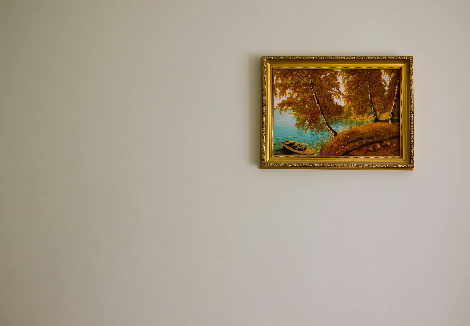
Unframed or Improperly Hung Art
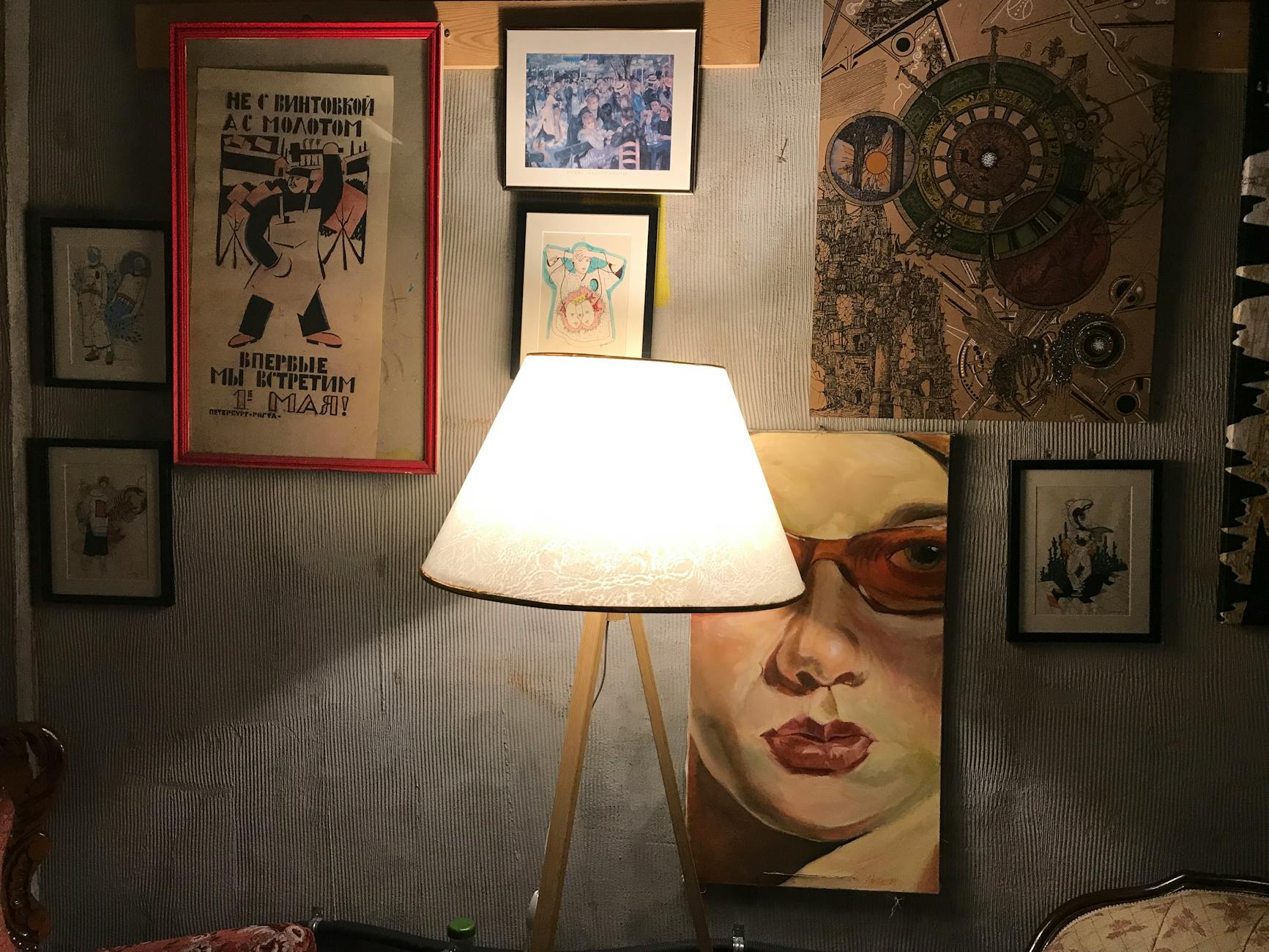
Artwork leaned against walls rather than hung, or hung with visible gaps between frames and walls, communicates an unfinished quality regardless of the art’s content or value. Frame selection also plays a role, as generic black or gold box frames in the wrong scale undermine even high-quality prints. Gallery walls function best when frames share at least one common element such as finish, mat color, or frame depth. The arrangement and hanging method are as important as the art itself.
Faux-Wood Contact Paper on Furniture
Contact paper applied to furniture surfaces as a temporary makeover solution tends to bubble, peel at the edges, and misalign at seams within a relatively short period. It is a widely recommended DIY technique that rarely achieves the clean result shown in tutorial photography. Paint, wallpaper panels, or new hardware are more durable and visually convincing alternatives for updating furniture surfaces. The seams of contact paper are particularly difficult to conceal on flat surfaces under direct light.
Plastic Storage Bins in Common Areas

Clear or brightly colored plastic storage containers placed in living rooms, bedrooms, or visible hallways introduce a visual language associated with utility spaces rather than curated interiors. Woven baskets, linen bins, and wooden crates perform the same organizational function while contributing texture and warmth to a space. The material of a storage vessel is a design decision as much as a practical one. Consistent basket or bin materials across a room create cohesion at very low cost.
Candles Burned to the Last Inch

Candles with severely tunneled wax or blackened jar walls left on display communicate neglect as effectively as any other single object in a room. They are often left in place simply because the scent has not yet been fully consumed, but their visual state works against the room’s overall impression. Fresh candles or candle vessels that have been cleaned and repurposed signal ongoing attention to the space. Candle presentation is a small but telling detail in any interior.
Generic Clock Designs
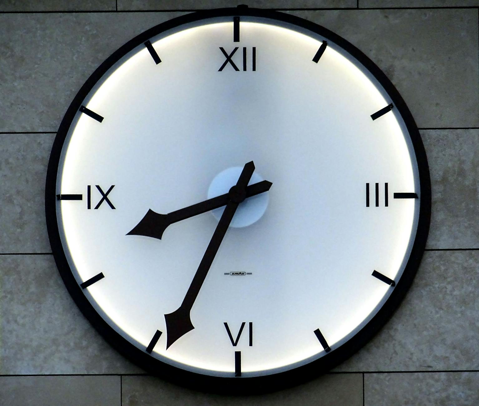
Round clocks with thin frames and basic numerals are sold in enormous quantities and appear in a correspondingly enormous number of homes without differentiation. A clock is a large wall object and therefore a significant design element regardless of whether it is treated as one. Architectural or oversized clock designs, vintage specimens, or clocks in unexpected materials contribute personality that generic versions do not. The time-telling function is secondary to the visual weight a clock carries in a room.
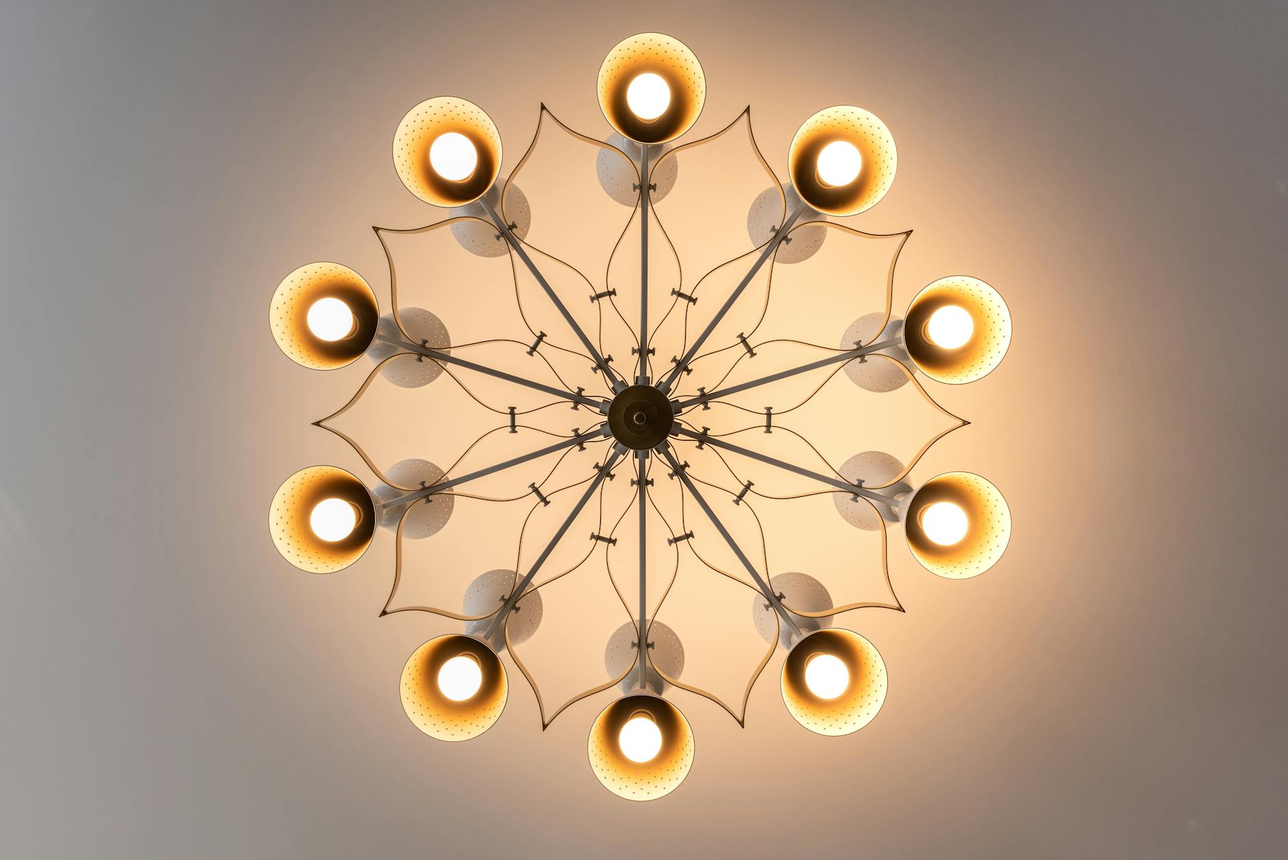
Single Pendant Bulbs Without Shades

Exposed Edison or filament bulbs hung from a single cord without any shade or fitting have moved from industrial-chic to overexposed in the span of a decade. They now appear in enormous numbers in kitchens, dining areas, and bedrooms where a more considered fixture would serve the space better. The light they produce is also unflattering in most residential contexts, creating glare without useful task illumination. Replacing them with a considered pendant or ceiling fixture immediately differentiates a space from the default aesthetic.
Painted Walls With Visible Roller Marks
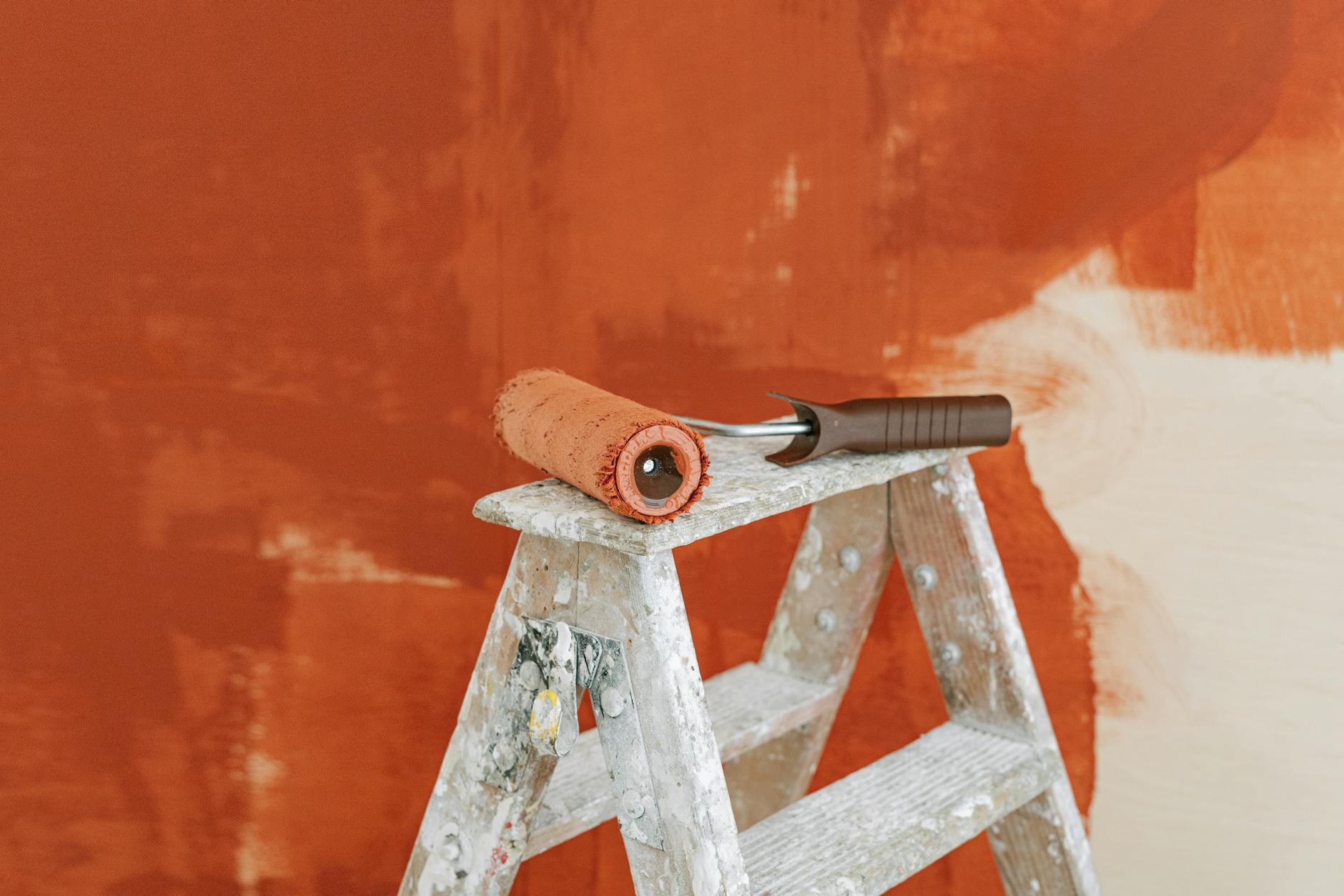
Walls painted with visible lap marks, roller texture, or inconsistent sheens suggest a rushed or low-skill application regardless of the paint’s quality or color choice. The finish on the wall is the single largest color surface in any room and therefore has an outsized effect on its overall impression. Proper wall preparation including filling, sanding, and priming before painting is what separates a professional result from a DIY outcome that reads as amateur. A single carefully applied coat of quality paint in an appropriate finish outperforms multiple coats of low-quality application.
Cabinet Hardware Left as Builder-Grade
Builder-grade cabinet hardware in kitchens and bathrooms is typically thin, small in scale, and finished in basic chrome or brushed nickel that shows wear quickly. Hardware is one of the most cost-effective ways to update cabinetry because the change is dramatic relative to the investment. Oversized bar pulls in matte black, unlacquered brass, or satin bronze read as intentional material choices. The scale of the hardware relative to the cabinet door is as important as the finish itself.
Mismatched Window Treatments Across One Room

Installing different styles of window treatments on adjacent or facing windows in the same room creates visual inconsistency that disrupts the room’s sense of order. This occurs most commonly when treatments are replaced one at a time as budgets allow rather than as a coordinated decision. Even modest curtain panels in a consistent style and fabric create a far more polished result than expensive treatments that do not match one another. Visual rhythm between windows is one of the foundations of a well-composed room.
Novelty or Themed Bathroom Accessories
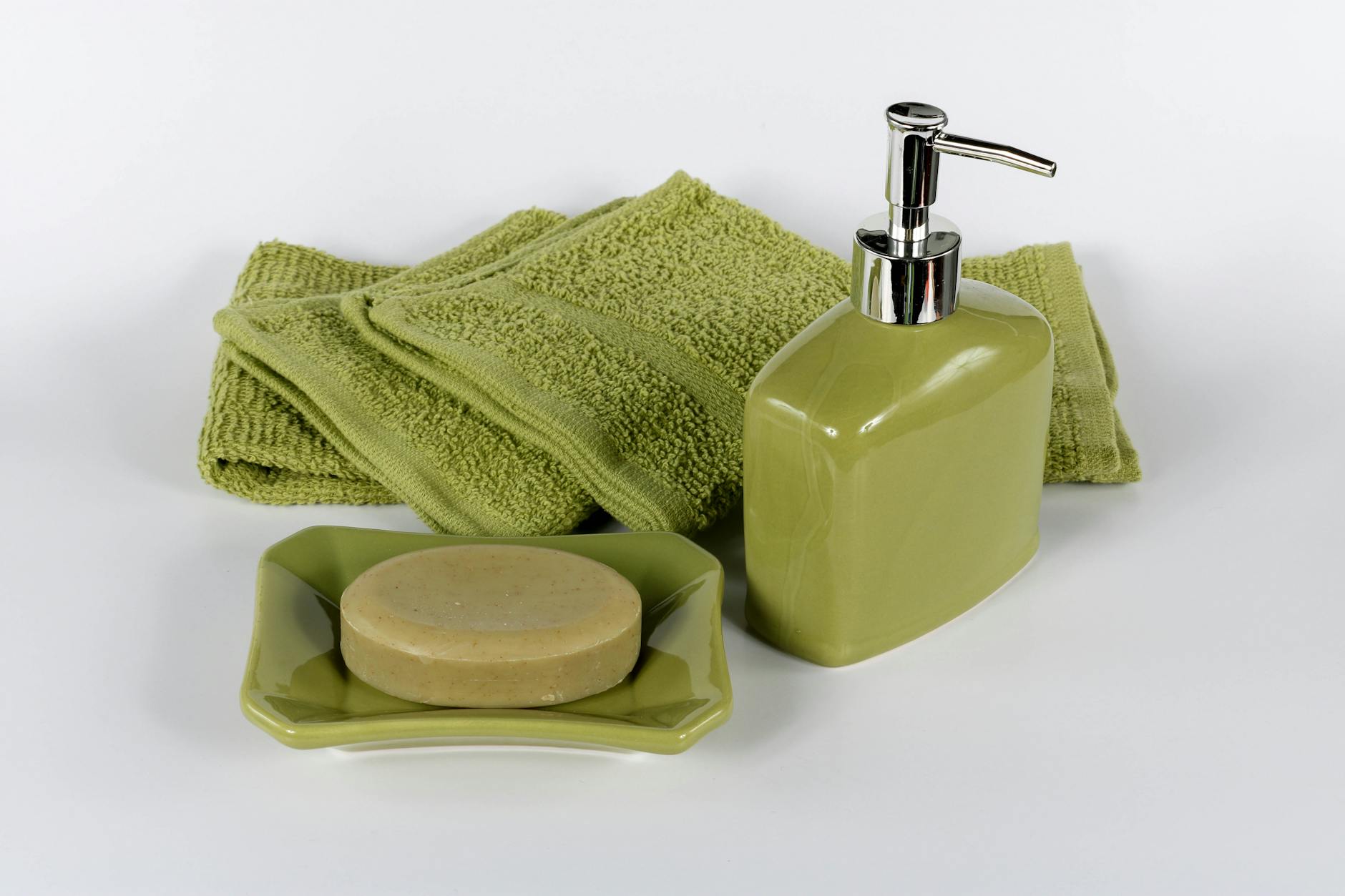
Bathroom accessory sets featuring novelty shapes, seasonal themes, or character-based designs read as temporary or juvenile in a way that undermines the room’s atmosphere. Soap dispensers, toothbrush holders, and tissue box covers in consistent materials such as ceramic, marble, or brushed metal create cohesion without requiring a major investment. The bathroom is a small space where every object on a surface is visible, making material consistency particularly impactful. A monochromatic or material-matched accessory set costs very little more than a novelty equivalent.
Low-Quality Door Hardware Throughout
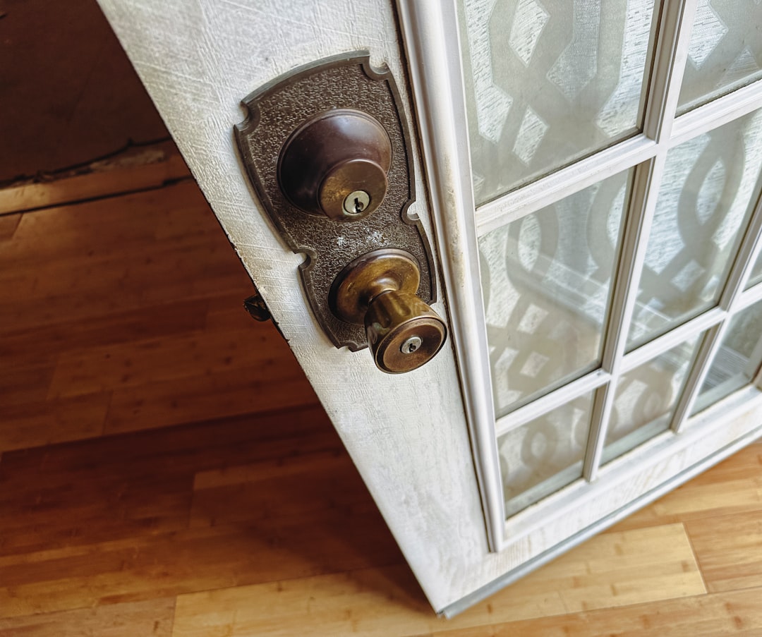
Door knobs and lever handles in hollow or lightweight metal are tactile and auditory signals of quality that visitors register every time they move through a space. They rattle, stick, and tarnish unevenly in ways that solid alternatives do not. Replacing door hardware is a straightforward DIY project that meaningfully changes the experience of moving through a home. Consistency of finish across all door hardware in a shared floor or zone is as important as the hardware style itself.
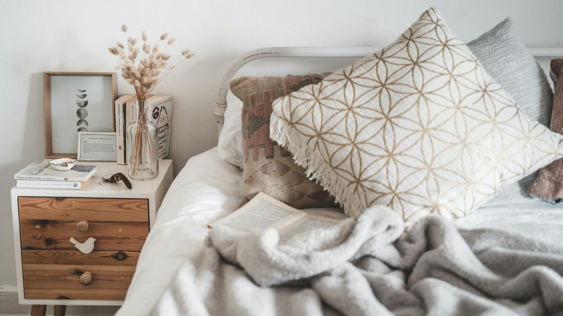
Uncoordinated Throw Pillow Collections
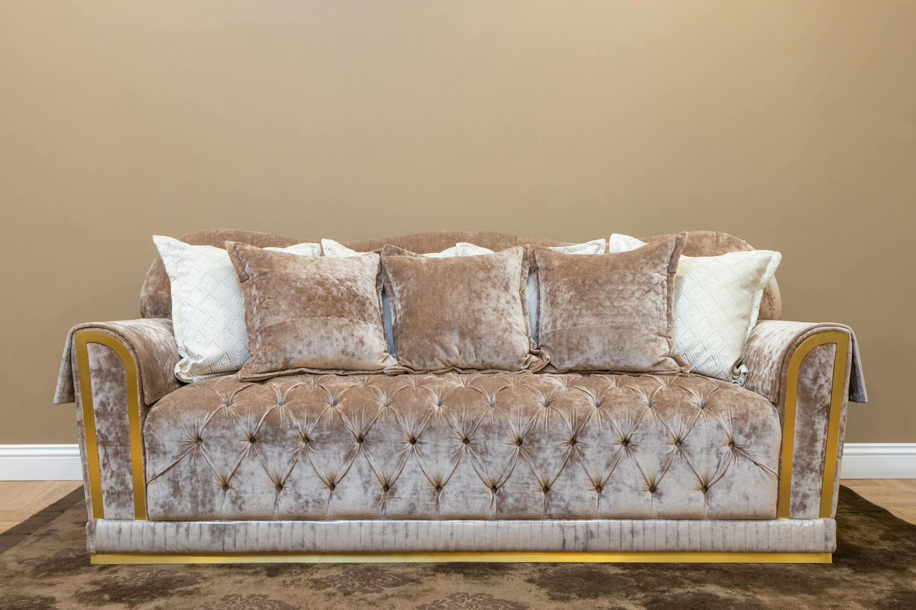
Throw pillows in clashing patterns, inconsistent scales, and unrelated color families create visual chaos on seating that would otherwise anchor a room effectively. The general principle of varying texture while maintaining a limited color palette applies across nearly every decorating style. An odd number of coordinated pillows in two or three complementary fabrics reads as intentional rather than accumulated. Editing the pillow selection on a sofa or bed is one of the fastest and most reversible ways to improve a room’s appearance.
Tarnished or Mismatched Picture Frames
Collections of frames in varying metals, plastics, and woods displayed together on a single surface create a visual cacophony that diminishes the content inside them. Frame galleries function most effectively when at least one element is held constant across the group. Spray painting mismatched frames in a single color is a widely used and highly effective technique for creating instant cohesion. The frames themselves communicate as much about the space as the images they contain.
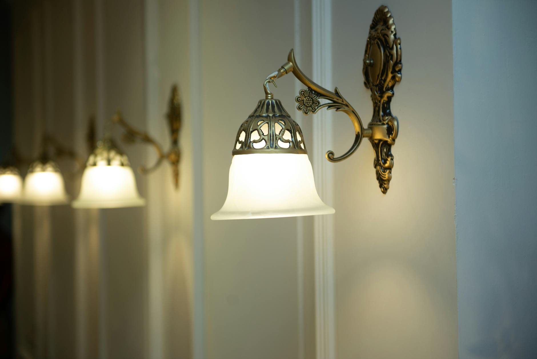
Outdated Light Fixtures in Key Rooms
Light fixtures that were installed when a home was built often reflect the aesthetic of their era rather than the current intent of the space. Kitchen and dining room fixtures in particular have an outsized effect on how modern or dated a home feels. Replacing a single central fixture in these rooms is one of the highest-impact updates available to a homeowner within a limited budget. New fixtures do not require rewiring in most cases and can be installed without professional help.
Wall-to-Wall Carpeting in Main Living Areas
Wall-to-wall carpet in living rooms and dining areas creates challenges with maintenance, allergen accumulation, and visual heaviness that hard flooring does not. It also limits furniture arrangement by creating a uniform texture that reduces the spatial definition that rugs and hard floors provide together. Where replacement is not immediately feasible, large area rugs layered over carpet can help zone and lift the space visually. The trend toward hard floors in main living areas reflects both aesthetic and practical preferences that have become deeply embedded in contemporary design.
If any of these choices have made their way into your home, share your thoughts and experiences in the comments.