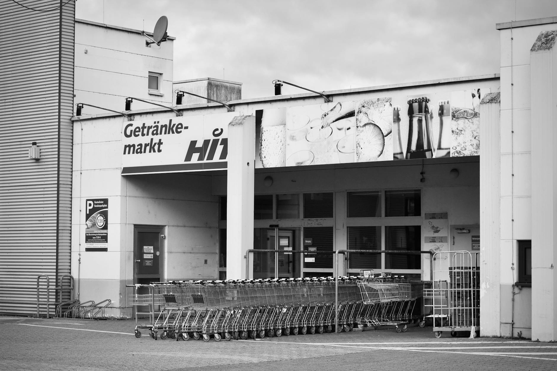
Supermarkets are masterfully designed environments where every shelf position, scent, and lighting choice serves a single purpose: to separate you from your money. Retail psychology has been refined over decades into a near-invisible science that most shoppers never consciously detect. Understanding these tactics does not require a marketing degree but simply a willingness to look past the carefully constructed illusions. The average household overspends significantly on groceries each year due to store design alone. Knowing what to look for transforms every shopping trip from a passive experience into an informed one.
Entrance Flowers
Fresh flowers and vibrant produce are almost always placed at the store entrance to trigger positive emotions the moment a shopper walks in. This psychological technique puts customers in an elevated mood which research consistently links to increased willingness to spend. The sensory experience of color and fragrance creates an immediate sense of abundance and freshness that colors perception of the entire store. Shoppers who feel good in the first thirty seconds of entry tend to fill their carts more generously. This carefully manufactured first impression has nothing to do with convenience and everything to do with emotional manipulation.
Bakery Aromas
Many supermarkets pipe the smell of freshly baked bread through ventilation systems even when nothing is actively baking on site. The scent of warm bread is one of the most powerful appetite triggers known to consumer researchers. Hungry shoppers have consistently been shown to purchase more impulsively and in larger quantities than those who shop satisfied. Artificial fragrance systems are sometimes used to maintain this effect throughout the day regardless of actual baking schedules. What feels like a comforting sensory experience is in fact a precisely engineered purchasing stimulus.
Cart Design
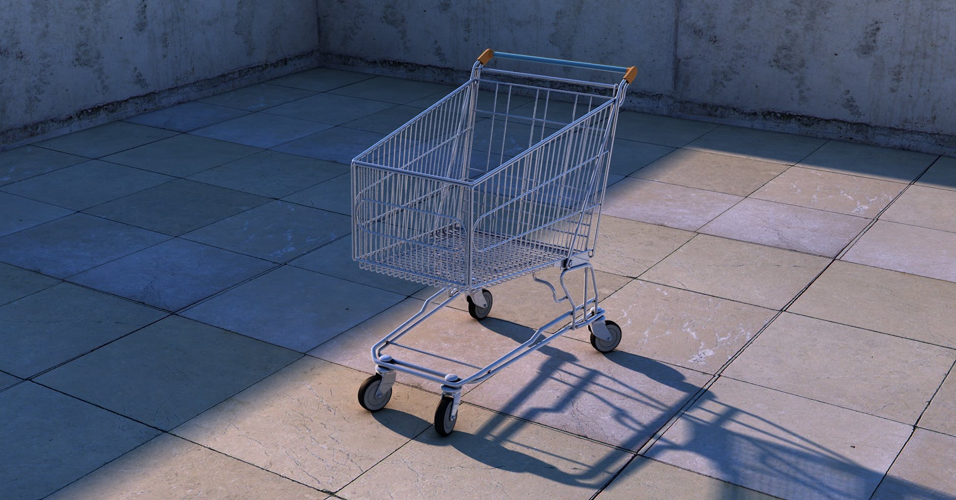
Shopping carts have been made progressively larger over the past several decades as a deliberate strategy to make purchases look smaller by comparison. A half-full large cart creates a subconscious urge to add more items simply to feel like a complete shop has been done. Studies have demonstrated that doubling cart size can increase the average purchase volume by a substantial margin. The wheels are also engineered to glide smoothly to reduce any physical friction that might slow a shopper down or prompt reflection. The humble cart is one of the most quietly effective spending tools in the entire retail environment.
Floor Tiles

Narrow tile spacing in certain aisles causes cart wheels to click more frequently which creates an auditory illusion of faster movement. Shoppers perceive themselves as moving too quickly and instinctively slow down to browse more carefully. This technique was formally studied by consumer behavior researchers who found it measurably increased sales in the aisles where it was applied. Wider tile spacing is typically found in high-margin sections where stores want customers to move briskly without dwelling too long. The floor beneath your feet is as strategically considered as anything displayed on the shelves above.
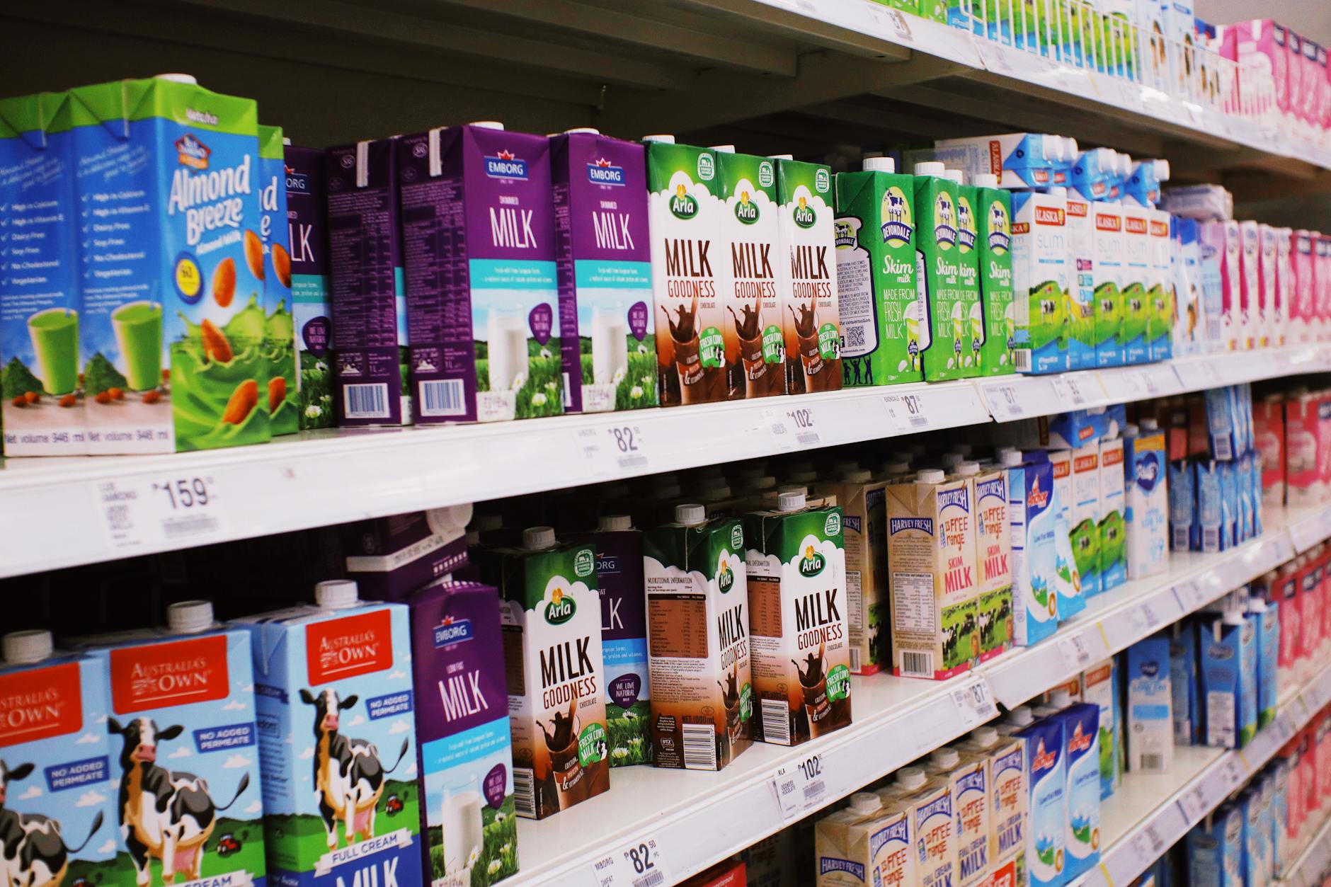
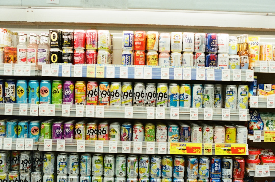
Eye Level Shelving
Products placed at direct eye level are not there because they are the best value or the most popular choices. They are there because brands pay significant slotting fees to supermarkets for that premium shelf real estate. Store-brand and better-value alternatives are consistently stocked on lower or higher shelves where they are less likely to be noticed. Children’s products are frequently placed at a child’s eye level to encourage in-aisle requests that parents find difficult to refuse. Looking up and down rather than straight ahead is one of the simplest ways to avoid this manipulation entirely.
Lighting Strategy

Warm golden lighting is used over meat and bakery sections to make products appear fresher, more appetizing and visually rich. Cool blue lighting is deployed over seafood to reinforce associations with clean ocean water and freshness. Produce sections are often illuminated with enhanced green and red spectrum lighting that makes fruits and vegetables appear more vibrant than they would under natural light. This specialized lighting is calibrated to maximize the visual appeal of perishable items where profit margins tend to be higher. The colors shoppers see in a supermarket are rarely an accurate representation of what the product looks like in natural light.
Muzak Tempo
Background music in supermarkets is selected and tempo-controlled with direct reference to purchasing behavior research. Slower music has been shown to reduce the pace at which shoppers move through the store increasing total time spent and therefore total spend. Faster tempo music is sometimes used near checkout areas to accelerate movement and reduce queue frustration. Volume levels are kept just low enough to remain subconscious so shoppers do not realize their pace is being influenced. The soundtrack of a supermarket is a behavioral tool dressed up as ambient atmosphere.
Maze Layout
Supermarket floor plans are deliberately designed without intuitive navigation so that shoppers must travel through multiple aisles to reach everyday staples. Essential items like milk, eggs and bread are placed as far from each other as possible and usually at the back or periphery of the store. This forces shoppers to pass thousands of products they had no intention of buying on their way to what they actually need. Dead ends and curved pathways are sometimes used to disorient and slow movement in high-margin zones. What appears to be a simple grocery run becomes an extended exposure session to impulse purchase opportunities.
Loss Leaders
Certain deeply discounted products advertised prominently in weekly flyers exist primarily to draw shoppers through the door rather than to generate profit on their own. These are known in retail as loss leaders and the store often makes little or no margin on them. The calculation is that a shopper who enters for a discounted rotisserie chicken will inevitably fill their cart with full-price items along the way. The advertised deals are typically placed at the back of the store to maximize the distance and number of aisles a shopper must navigate. The bargain that brought you in almost always costs you more than you saved by the time you reach the register.
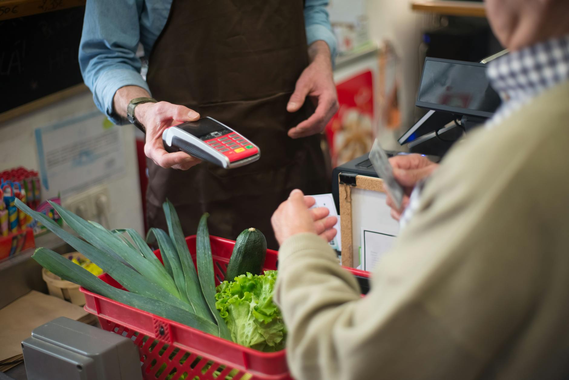
Checkout Placement
The checkout zone is one of the most carefully merchandised areas in the entire store and is stocked with small high-margin impulse items at deliberate heights. Candy, magazines, batteries and travel-size products are positioned to capture attention during the idle waiting period in a queue. Children’s snacks are placed at lower heights in the checkout lane as a direct strategy to generate requests from young shoppers. The wait itself is engineered to create a window of unplanned purchasing in a moment when the shopper’s guard is lowered. Almost nothing in the checkout zone is there by accident or out of logistical convenience.
Free Samples
Free food samples create a powerful psychological phenomenon known as the reciprocity effect where recipients feel a subconscious obligation to make a purchase in return. Sample stations are almost always positioned mid-aisle rather than at the entrance to ensure shoppers are already committed to the zone before encountering them. The items being sampled are typically higher-priced specialty products where a single conversion justifies the cost of many samples given away. Research consistently shows that sampling dramatically increases purchase rates for the featured product on the same shopping visit. What feels like a generous gesture from the store is a highly calibrated sales technique with a measurable return on investment.
Loyalty Cards
Supermarket loyalty programs are primarily data collection tools that allow retailers to build detailed behavioral profiles of individual shoppers. Purchase history is analyzed to determine price sensitivity and to identify which promotions are most likely to increase spending for each customer segment. Personalized discounts are sometimes offered on products a shopper already buys reliably which gives the illusion of saving while rarely changing overall basket size. The points systems are structured to require significant spend before any meaningful reward is unlocked to keep shoppers committed over a long period. The data gathered is also frequently sold to or shared with third-party manufacturers and marketing partners.
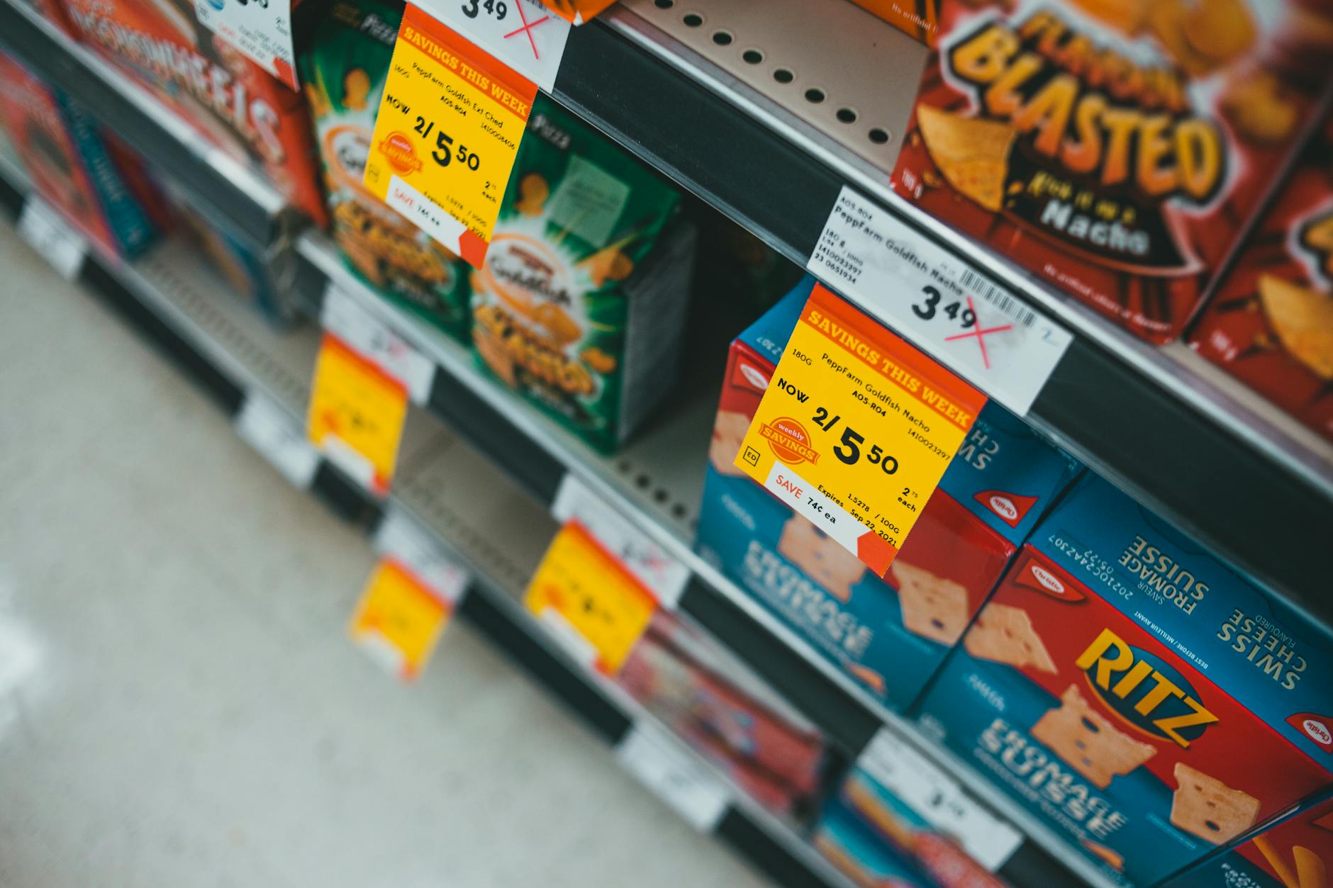
Discount Psychology

Prices ending in .99 or .97 are used universally because research confirms that consumers process these figures as significantly lower than the nearest round number. A product priced at 3.99 is psychologically catalogued by most shoppers as “three” rather than “four” despite the negligible difference. The “was” and “now” pricing format suggesting a discount is often based on an inflated original price that was never consistently charged. Multipack deals such as “3 for 5” frequently offer no actual saving over buying the items individually and rely on shoppers not doing the mental arithmetic. Price architecture in supermarkets is designed from the ground up to make spending feel like saving.
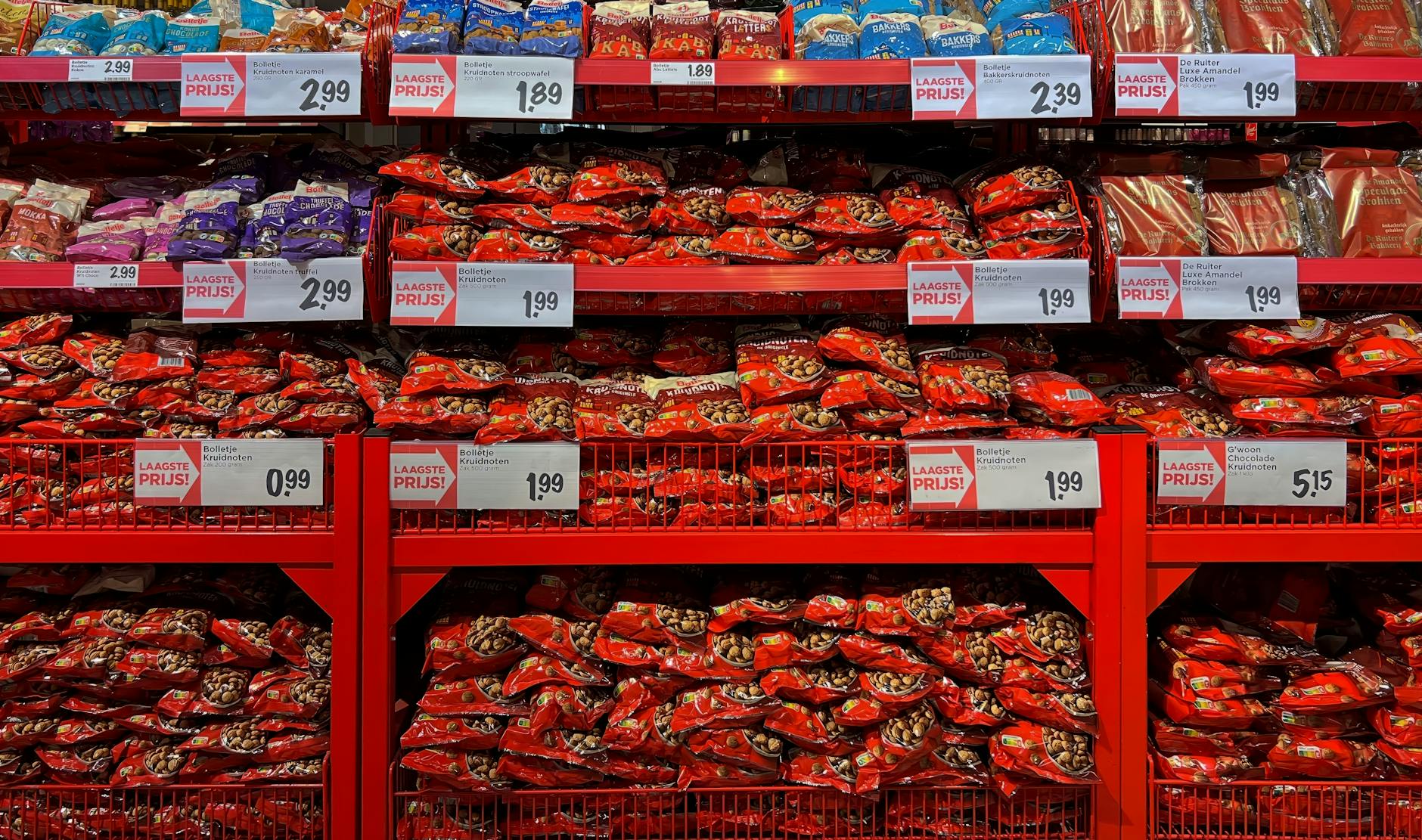
Seasonal Displays
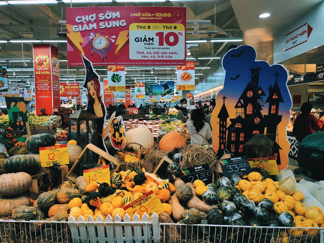
End-of-aisle and seasonal displays are among the most expensive spaces in a supermarket and are rented by brands at a premium. The positioning implies to shoppers that these products are on special offer or are particularly noteworthy when often they are simply full-price items with prominent placement. Seasonal themes create a sense of urgency suggesting that certain products are only relevant or available for a limited time. Holiday displays appear progressively earlier each year as a strategy to extend the spending season and normalize early purchasing. The festive or seasonal context bypasses rational price evaluation by framing the purchase as an emotional or celebratory decision.
Unit Pricing
Unit pricing information is displayed inconsistently across supermarket categories making direct value comparisons between products deliberately difficult. Different size variants of the same product are sometimes listed using different units of measurement to prevent easy like-for-like comparison. Smaller package sizes are regularly priced at a higher per-unit cost than larger ones but placed alongside them in ways that obscure this difference. The visual noise of promotional stickers and bold typography around pricing draws attention away from the quiet unit price figure that would reveal the true value. Consistent unit price comparisons across a whole shop would redirect significant spending toward better-value options.
Anchor Pricing

Supermarkets frequently place a premium product directly next to a mid-range product to make the mid-range option feel like a bargain by comparison. This technique is known as anchoring and it shifts the reference point from a shopper’s actual budget to the higher-priced option as the new baseline. A moderately priced wine placed next to an expensive bottle becomes the “sensible choice” even if it was never a purchase the shopper had planned. Three-tier product displays featuring good, better and best options consistently drive purchases toward the middle tier which is often where the highest margin sits. The architecture of choice in supermarkets is never neutral.
Scarcity Signals
“Limited stock” labels, low shelf inventory, and “only a few left” signage are retail tools used to trigger urgency in shoppers who might otherwise deliberate or decline a purchase. Artificial scarcity has been extensively documented as a tactic that compresses decision-making time and reduces price sensitivity. Products with these labels are not necessarily in short supply and the signage is often a permanent fixture rather than a live inventory update. The fear of missing out is a deeply wired human response and supermarkets have long known how to activate it with minimal effort. A shopper who believes an item may be gone tomorrow makes a very different calculation than one shopping without any time pressure.
Store Brand Positioning
Private label or store-brand products are often manufactured in the same facilities as the premium branded equivalents they sit beside on the shelf. Packaging for store-brand items has been redesigned in recent years to closely mimic the aesthetic of premium brands to benefit from association without paying brand licensing costs. The margin on store-brand products is typically significantly higher than on branded alternatives which is why they are actively promoted by retailers. Shoppers who perceive store brands as inferior are in many categories making a decision based on marketing rather than on any meaningful difference in product quality. Blind taste tests across multiple product categories regularly reveal no distinguishable preference for branded over own-label alternatives.
Expiry Placement
Products closest to their expiry date are routinely placed at the front of shelves while fresher stock is rotated behind them in a standard practice known as forward rotation. This ensures that older stock is sold first which benefits the retailer’s shrinkage calculations but leaves shoppers with shorter-dated products unless they reach to the back. Staff are trained to restock from the rear and present frontmost items first in service interactions. Shoppers who do not check dates and reach to the back of a chilled shelf often find items with meaningfully longer remaining shelf life. The practice is standard across the industry and serves the store’s inventory management interests ahead of the shopper’s.
Bulk Bin Psychology
Bulk buying sections create a strong psychological association between large quantity and good value even when the per-unit price is not actually lower than packaged alternatives. The act of scooping and filling a bag engages shoppers physically in a way that increases product involvement and attachment before any purchase is made. Portion control becomes more difficult with bulk purchases leading to over-purchasing that is rationalized as economical planning. Bulk sections also externalize packaging costs onto the consumer while presenting this as an environmentally conscious choice. The perceived savings from bulk buying are frequently offset by spoilage and over-consumption that would not occur with standard portioned packaging.
Pharmacy Placement

In-store pharmacies are consistently positioned at the far end or back corner of supermarkets to ensure that health-related errands draw shoppers through the maximum amount of retail floor space. The route to the pharmacy passes high-margin snack, beverage and seasonal sections that benefit from the footfall generated by necessity-driven visits. Over-the-counter health products displayed near the pharmacy benefit from proximity association creating an implied clinical endorsement that no such placement actually confers. Shoppers visiting specifically for a prescription or healthcare product have a lower engagement threshold with surrounding merchandise and are more susceptible to proximity-based impulse purchasing. The pharmacy is one of the most powerful footfall anchors in the entire supermarket format.
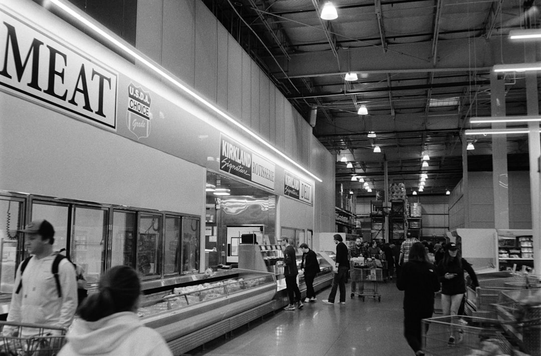
Prepared Food Sections
Hot food and prepared meal sections have expanded dramatically in supermarkets over the past two decades as a direct response to the high margins available on value-added convenience products. A whole roast chicken sold as a prepared meal generates multiples of the margin of the equivalent raw product in the meat aisle. These sections are designed to appeal to end-of-day fatigue by presenting immediately consumable options to shoppers who arrive tired and short on time. Placement near the entrance or adjacent to checkout areas targets the hunger and time pressure that peak in late afternoon shopping hours. The growth of in-store dining and grab-and-go sections represents one of the most successful margin expansion strategies in modern food retail.
Trolley Return Design
Supermarkets that require a coin deposit for trolley use are not primarily motivated by trolley theft prevention but by the behavioral benefit of requiring shoppers to enter the store before accessing a cart. Shoppers who carry a basket rather than push a cart consistently spend less with studies showing basket shoppers reach a physical discomfort threshold that limits purchasing in a way cart shoppers do not experience. The physical design of baskets including their weight when loaded is a natural spending limiter that supermarkets are aware of and factor into store layout decisions. Self-service basket areas are often positioned further inside the store than trolley bays to increase floor exposure before the shopping vessel is selected. The choice between basket and cart is never as incidental as it appears.
Demographic Targeting
Supermarket product ranges and store layouts differ between locations based on detailed demographic profiling of the surrounding catchment area. Premium product ranges and organic sections are expanded in stores located in higher-income postcodes while value ranges are more prominently featured elsewhere. This zoning ensures that the most profitable product mix for each demographic is presented as the default range rather than as a premium upsell. Ethnic food sections vary dramatically in prominence between stores based on local population data in ways that rarely reflect stated brand commitments to diversity. The store a shopper visits is itself a curated retail environment shaped by who the retailer believes them to be.
Children’s Aisle Design

Aisles containing children’s products are saturated with bright colors, character licensing and interactive packaging elements that are calibrated to engage children and generate in-store requests to parents. Height positioning of children’s cereals, snacks and beverages is calculated to the approximate eye level of a child being pushed in a trolley seat. Products targeted at children consistently carry some of the highest margins in the store relative to their ingredient cost. The use of familiar cartoon and film characters on packaging leverages emotional associations built outside the store environment in a way that bypasses parental product evaluation. Supermarkets have long understood that a child’s engagement in a purchasing decision is one of the most effective conversion tools available to a retailer.
Receipt Psychology

Loyalty discount summaries printed on receipts emphasizing “you saved X amount today” are designed to reinforce the emotional reward of shopping at that retailer and encourage return visits. The saved amount figure does not account for the additional spending that the pursuit of those discounts may have generated during the same trip. Receipt coupons for future visits create a financial incentive to return that is almost always smaller than the average incremental spend it generates. Lengthy receipt formats with promotional messaging at the bottom are intended to be reviewed which extends brand engagement beyond the store visit itself. The receipt is the final touchpoint in a purchasing journey that has been designed from start to finish to maximize spend.
Wine Aisle Layout
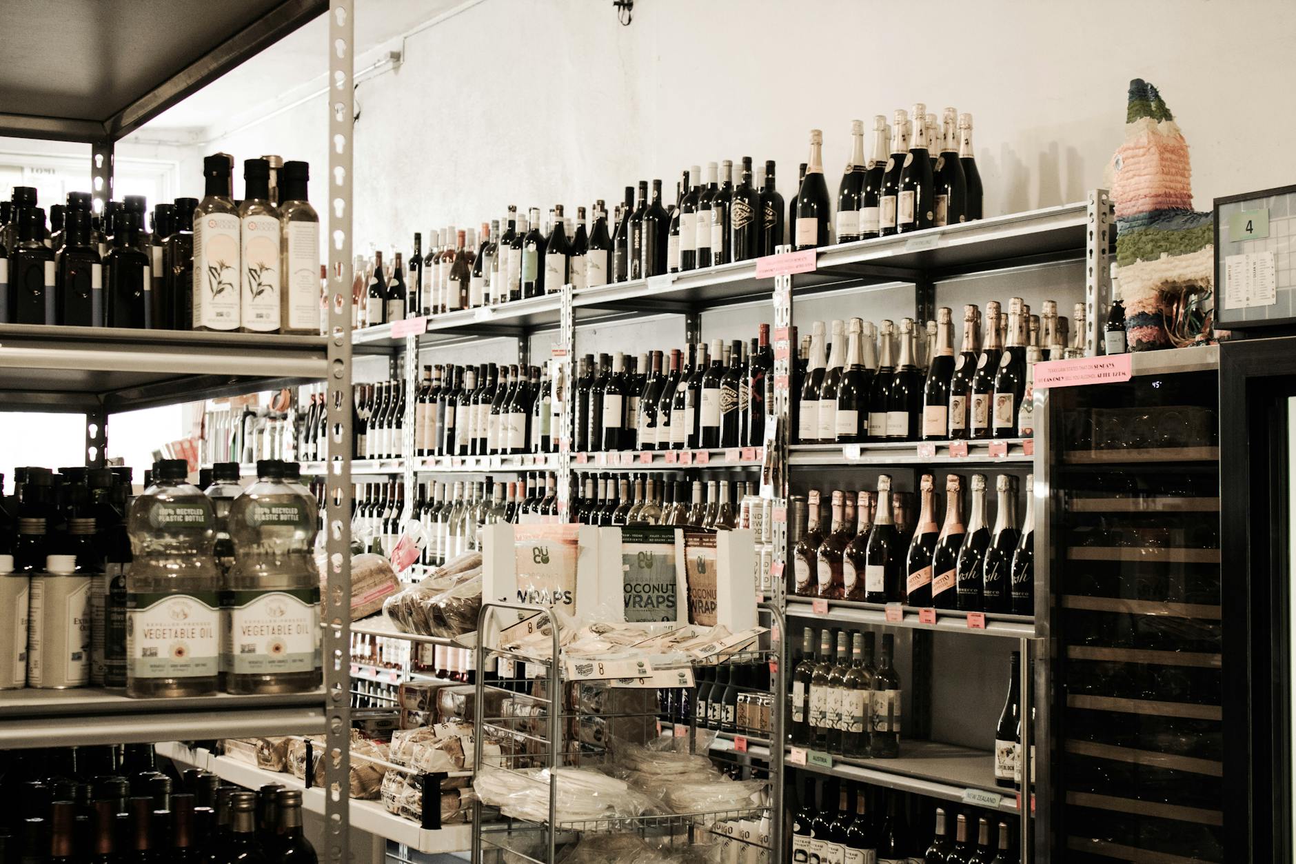
Wine aisles in supermarkets are deliberately complex environments with extensive range depth that induces a phenomenon known in behavioral economics as choice overload. When faced with too many options of similar apparent quality shoppers reliably default to price as the primary decision signal which drives spending toward mid-to-premium price points. Country of origin groupings mixed with grape variety groupings and promotional placements create a navigation challenge that slows movement and increases dwell time in a high-margin category. Staff recommendation labels and award stickers are applied selectively and often reflect commercial agreements with producers rather than independent quality assessments. The wine aisle is one of the most sophisticated behavioral design environments in the entire store.
Meat Counter Lighting
Butcher counters and pre-packaged meat sections use specialized red-spectrum lighting that enhances the color saturation of raw meat products to make them appear more vivid and fresh. The bright pink and red tones produced under this lighting would be noticeably less appealing under the natural or neutral lighting used elsewhere in the store. Packaging materials for pre-packaged meat also include oxygen or nitrogen modified atmospheres specifically to preserve the visual redness associated with freshness. Display cases in attended butcher sections are angled to present the cut face of meat products at the most visually appealing angle relative to the typical viewing height of a standing adult. Color perception in the meat aisle is almost entirely manufactured.
Digital Price Tags
Electronic shelf labels in modernized supermarkets allow pricing to be updated remotely and instantly across the entire store from a central system. This capability enables time-of-day or demand-responsive pricing adjustments that would be impossible with traditional paper labels. Some retailers have trialed dynamic pricing that increases the cost of high-demand products during peak shopping hours in a direct equivalent of surge pricing in other industries. The speed of electronic label updates also makes it significantly more difficult for shoppers to verify whether an advertised promotion has been correctly applied at the shelf versus at the register. The shift to digital pricing infrastructure represents a meaningful increase in the pricing power available to retailers relative to individual shoppers.
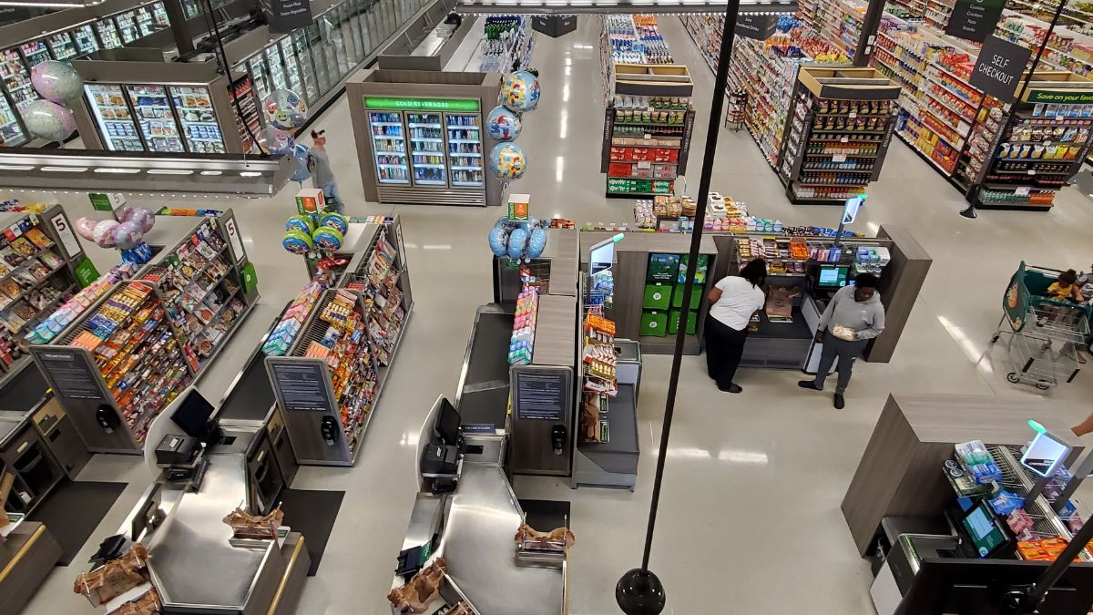
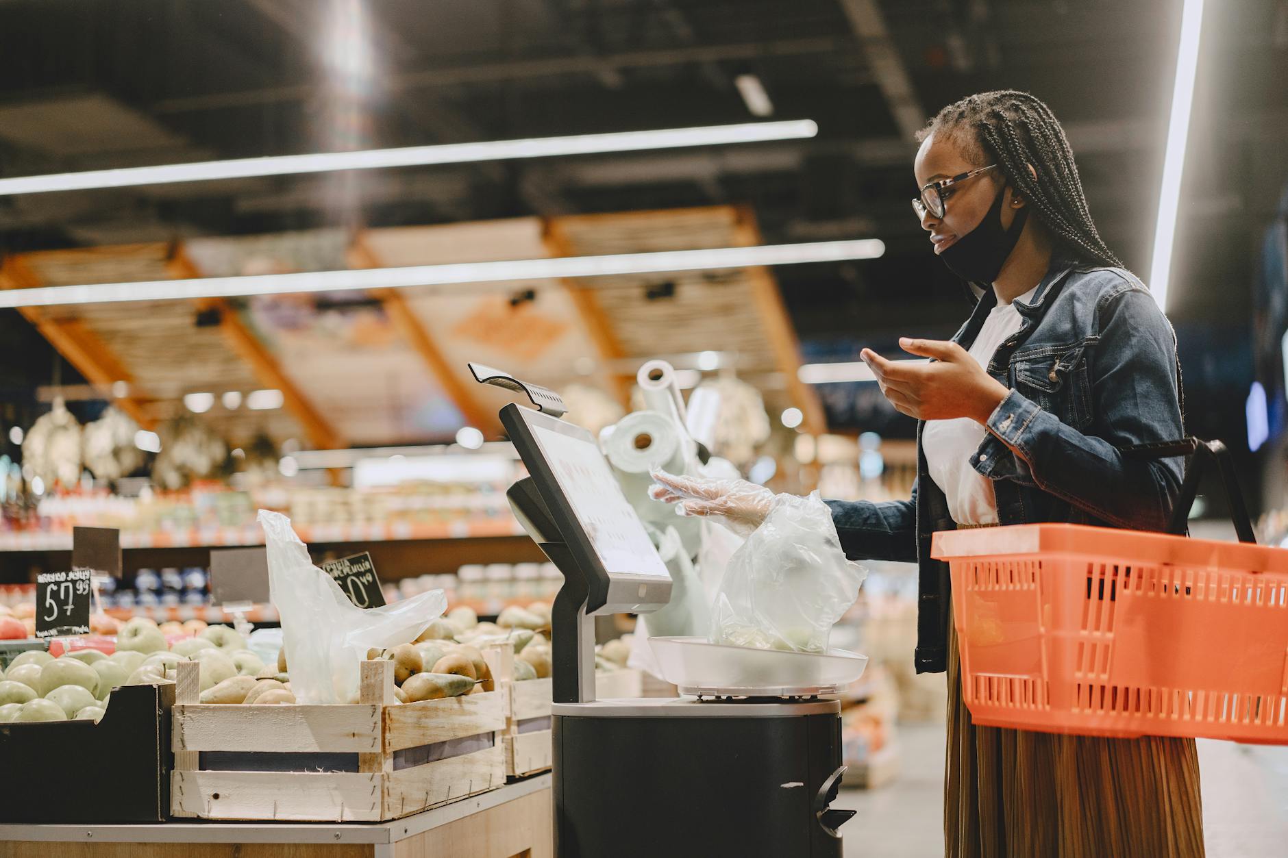
Self-Checkout Design

Self-checkout systems were presented to shoppers as a convenience innovation but were adopted by retailers primarily as a labor cost reduction strategy. The design of self-checkout interfaces has been studied for its effect on scanning speed and error rates with most systems optimized to process transactions quickly rather than to help shoppers review their total spend. Impulse purchase items are positioned around self-checkout terminals in the same way they are around staffed checkouts to capture last-minute additions. Some self-checkout systems include upselling prompts during the transaction process that suggest complementary products based on what has already been scanned. Shoppers using self-checkout consistently report lower engagement with their running total compared to those using staffed checkouts.
Store App Notifications

Supermarket mobile applications are designed to send push notifications timed to typical shopping hours and to days when a user’s purchase history suggests a repeat shop is likely. Personalized offers delivered through apps are calibrated using purchase data to target products a shopper is likely to buy regardless creating the perception of a bespoke deal where none meaningfully exists. App-exclusive offers create a two-tier pricing environment that pressures shoppers to accept data sharing as the cost of access to fair pricing. Navigation features within supermarket apps have been found in several cases to guide shoppers through routes that maximize exposure to promoted products rather than offering the most direct path. The supermarket app is less a shopping assistant than a sophisticated behavioral engagement and data harvesting platform.
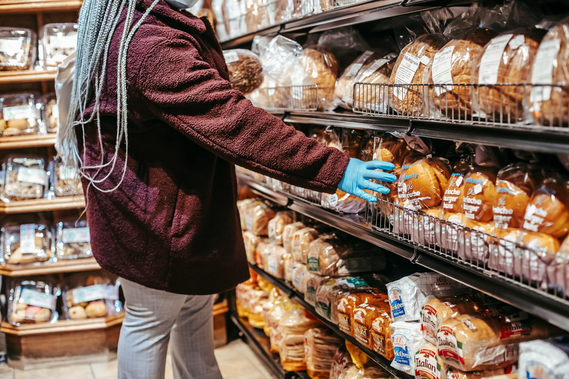
Bread Placement

Bread is one of the most purchased items in a weekly grocery shop and its placement at the back or periphery of the store is entirely intentional. The journey to reach it pulls shoppers past snack aisles, spreads, beverages and seasonal displays in a route that is designed rather than incidental. In-store bakery bread positioned near the store entrance functions as a sensory anchor while packaged bread as a staple sits far away to serve a footfall function. Some stores deliberately separate these two bread categories across the floor plan to create two distinct journey paths for what is functionally the same purchasing need. The location of everyday staples in a supermarket is the most honest map of a retailer’s priorities available to shoppers.
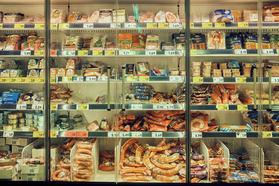
Refrigerator Placement
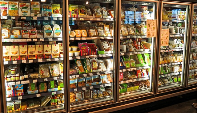
Chilled sections are positioned along the outer walls and back perimeters of most supermarkets for both logistical and behavioral reasons. The logistical rationale involves shared refrigeration infrastructure running behind the walls but the behavioral benefit of anchoring shoppers to the store’s perimeter is equally significant. Shoppers who make a point of “shopping the perimeter” for fresh food still pass cooler doors stocked with premium ready meals, specialty beverages and desserts that carry strong margins. The perimeter itself is not a healthy eating zone but rather a premium-priced fresh food environment that benefits from the health halo shoppers project onto refrigerated products. Layout assumptions that shoppers hold about store organization are regularly leveraged to guide behavior in directions the shopper did not intend.
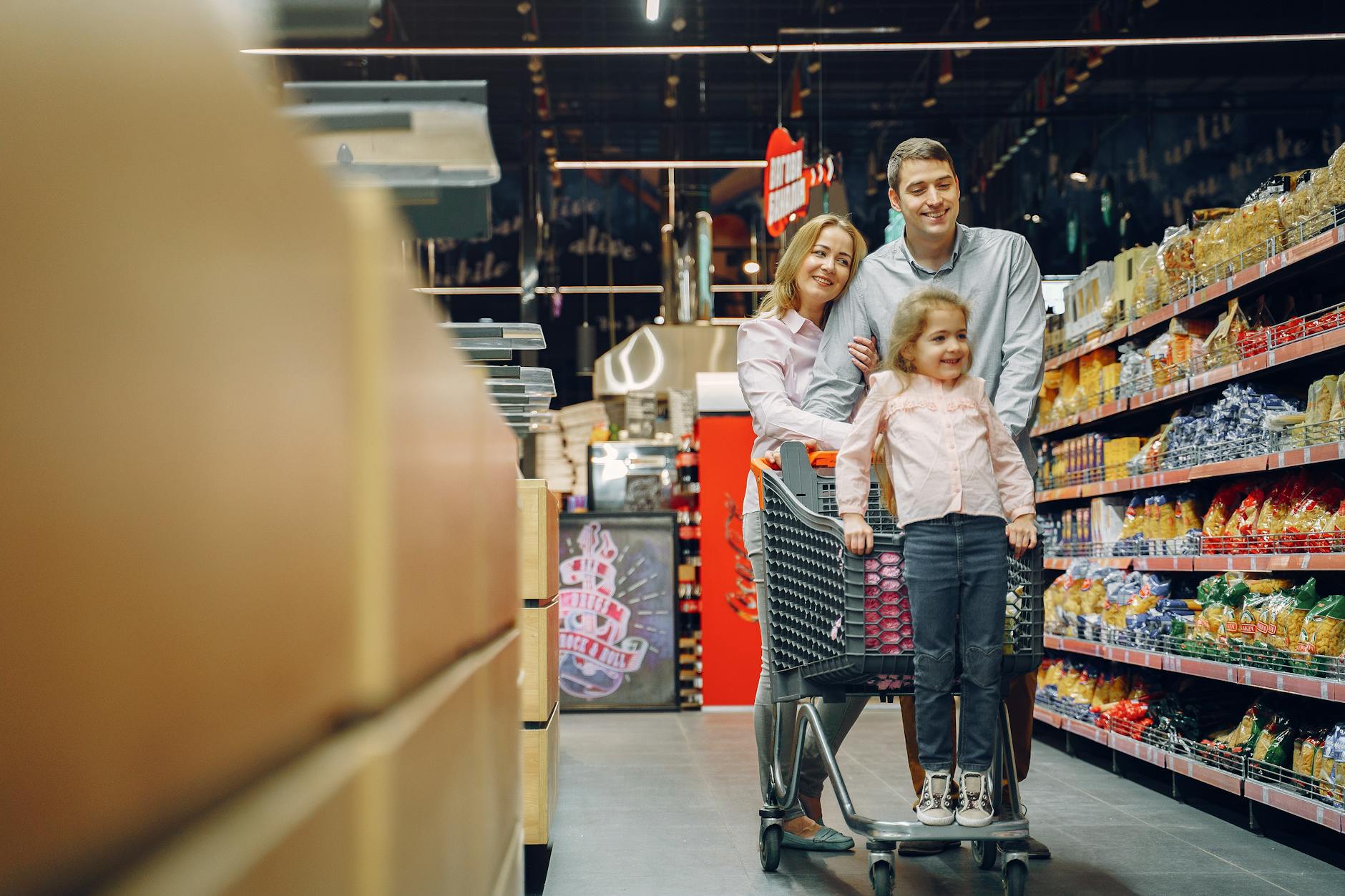
Trolley Seat Positioning
The child seat integrated into the front of a shopping trolley positions a child directly facing the products on shelves as the cart moves through aisles. This placement was standardized across the industry in a way that makes the seated child a captive audience for shelf-level product displays targeted at their age group. The forward-facing orientation also means the child’s attention is directed outward at products rather than toward the parent in a way that increases unsolicited product engagement. Parents pushing a trolley with an occupied child seat consistently report higher rates of unplanned additions to the cart compared to shopping without children. The integration of the child seat into trolley design is among the more quietly consequential pieces of retail infrastructure ever standardized.
Organic Labeling

The placement of organic and natural labeling on products activates what behavioral scientists call the health halo effect causing shoppers to make favorable assumptions about calorie content, quality and value that the label does not actually substantiate. Organic certification applies only to production methods and makes no direct claim about nutritional superiority taste or environmental impact beyond the farm gate. Premium pricing on organic products is often maintained at a level that significantly exceeds the actual cost differential of organic production relative to conventional methods. Products labeled as natural carry no regulated definition in many markets meaning the term functions purely as a positive signal with no enforceable meaning. Supermarkets benefit from this labeling environment because it supports higher price points in categories that shoppers are actively motivated to spend more on.
Return Policy Positioning

Supermarkets that advertise generous satisfaction guarantees and no-quibble return policies use this messaging to reduce purchase hesitation on higher-priced items where a shopper might otherwise deliberate. The psychological safety net of a return policy increases willingness to spend on unfamiliar premium products or larger pack sizes. In practice the friction involved in returning a food product means that a very small percentage of purchases are ever actually returned regardless of the stated policy. The return policy is therefore primarily a marketing tool that costs the retailer very little while meaningfully increasing conversion at the point of sale. Policies that lower perceived risk are among the most cost-effective spending enablers available to a retailer.
Beverage Aisle Temperature
Chilled beverage sections maintain temperatures that encourage immediate consumption while ambient beverage aisles selling the same products at room temperature are positioned less prominently. The premium charged for a pre-chilled drink over its ambient equivalent is one of the highest per-volume markups in the entire store. Chilled multipack sections are positioned adjacent to refrigerated single-serve products to create a comparison that frames the multipack as excellent value while still generating strong margins. Sports and functional beverage products in chilled sections benefit from the halo of a health and performance environment that ambient placement would not provide. Temperature is a silent and highly effective premium pricing mechanism throughout the supermarket.
Membership Tiers

Premium supermarket membership tiers offering free delivery, enhanced discounts and exclusive products are structured to deliver their full value only at spend levels that exceed what the majority of enrolled members actually achieve. The gap between the perceived value of a membership at sign-up and the realized value over a year of actual shopping is where the profitability of these programs is generated. Membership fees create a sunk cost effect that increases loyalty and visit frequency as shoppers subconsciously try to recoup the upfront cost. Exclusive member pricing is sometimes applied to products whose non-member price has been inflated beyond the standard market rate specifically to make the member price appear compelling. The architecture of tiered membership programs is designed to feel premium while reliably generating more revenue than the benefits conferred.
End Cap Rotation
End-of-aisle displays are rotated frequently to create the impression of constant newness and ongoing promotional activity throughout the store. The visual prominence of an end cap implies a deal or featured status that the product does not necessarily merit on its own terms. Shoppers who shop the same store weekly are conditioned to check end caps as reliable deal locations even as the featured products change. This habitual checking behavior is itself a trained response that the store has cultivated through inconsistent but periodic genuine promotions. The end cap is simultaneously the most expensive advertising space in the store and the most effective tool for normalizing browsing behavior that serves the retailer.
Now that you know what to watch for on your next grocery run, share the tactics that surprised you most in the comments.