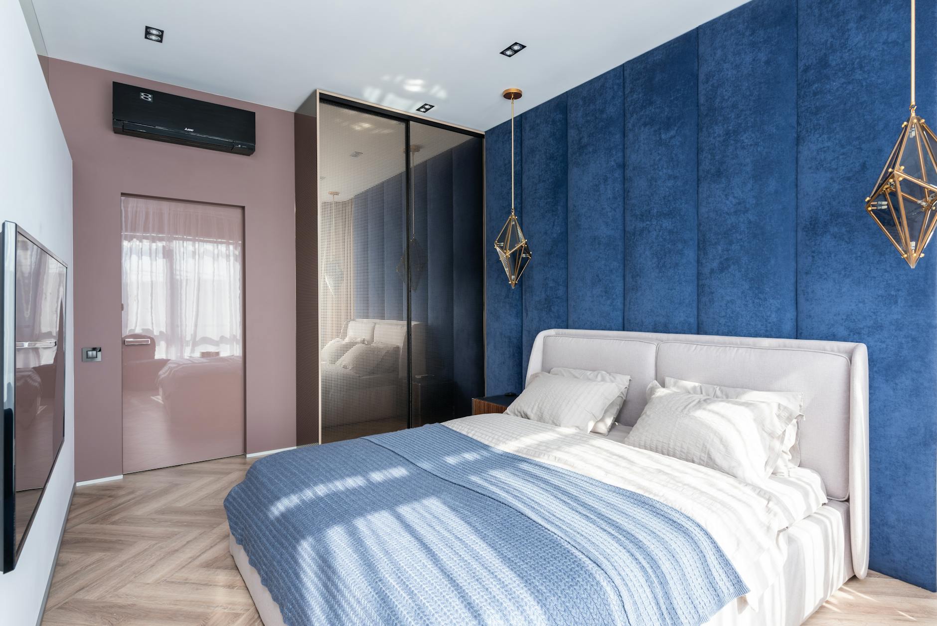
The colors surrounding you at night have a profound impact on how quickly you fall asleep and the quality of rest you achieve. Scientific research shows that certain hues trigger mental alertness, raise heart rate, and stimulate the nervous system in ways that directly interfere with the body’s natural sleep preparation. From overly vibrant shades to psychologically jarring tones, these colors create environments that keep your mind active when it should be winding down. Understanding which colors to avoid in your bedroom can transform your sleep quality and overall wellbeing.
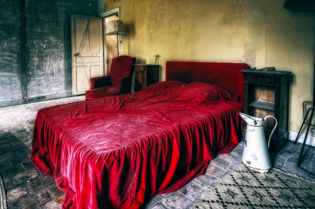
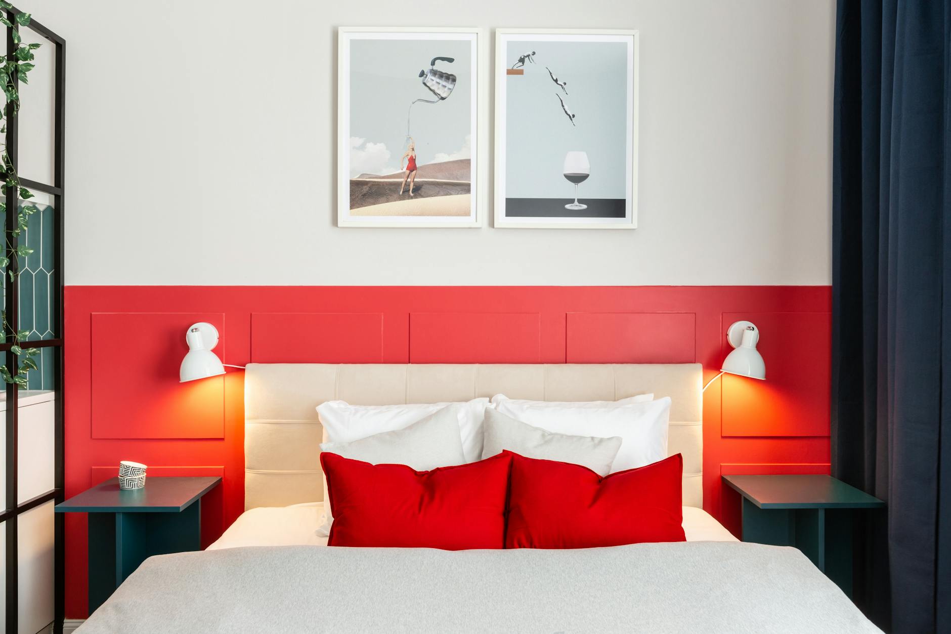
Bright Red
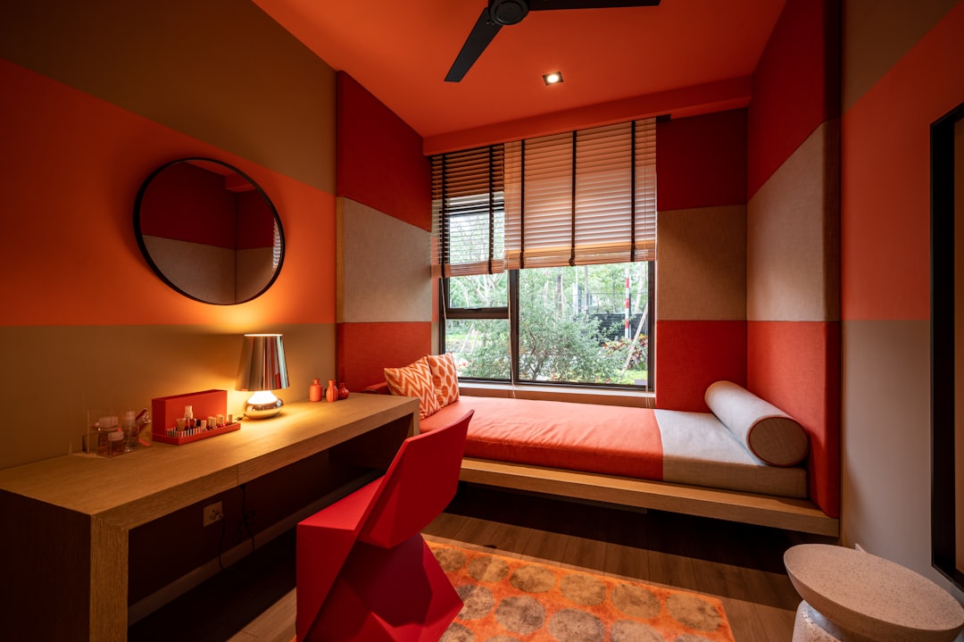
Bright red is one of the most stimulating colors for the human brain and signals urgency, danger, and heightened awareness. This intense hue raises blood pressure and increases heart rate, creating physiological responses that are the opposite of what your body needs for sleep. Red walls or dominant red decor can make a bedroom feel energizing rather than restful, keeping the mind alert and reactive. Studies consistently show that exposure to red tones before bed extends the time it takes to fall asleep and reduces overall sleep duration.
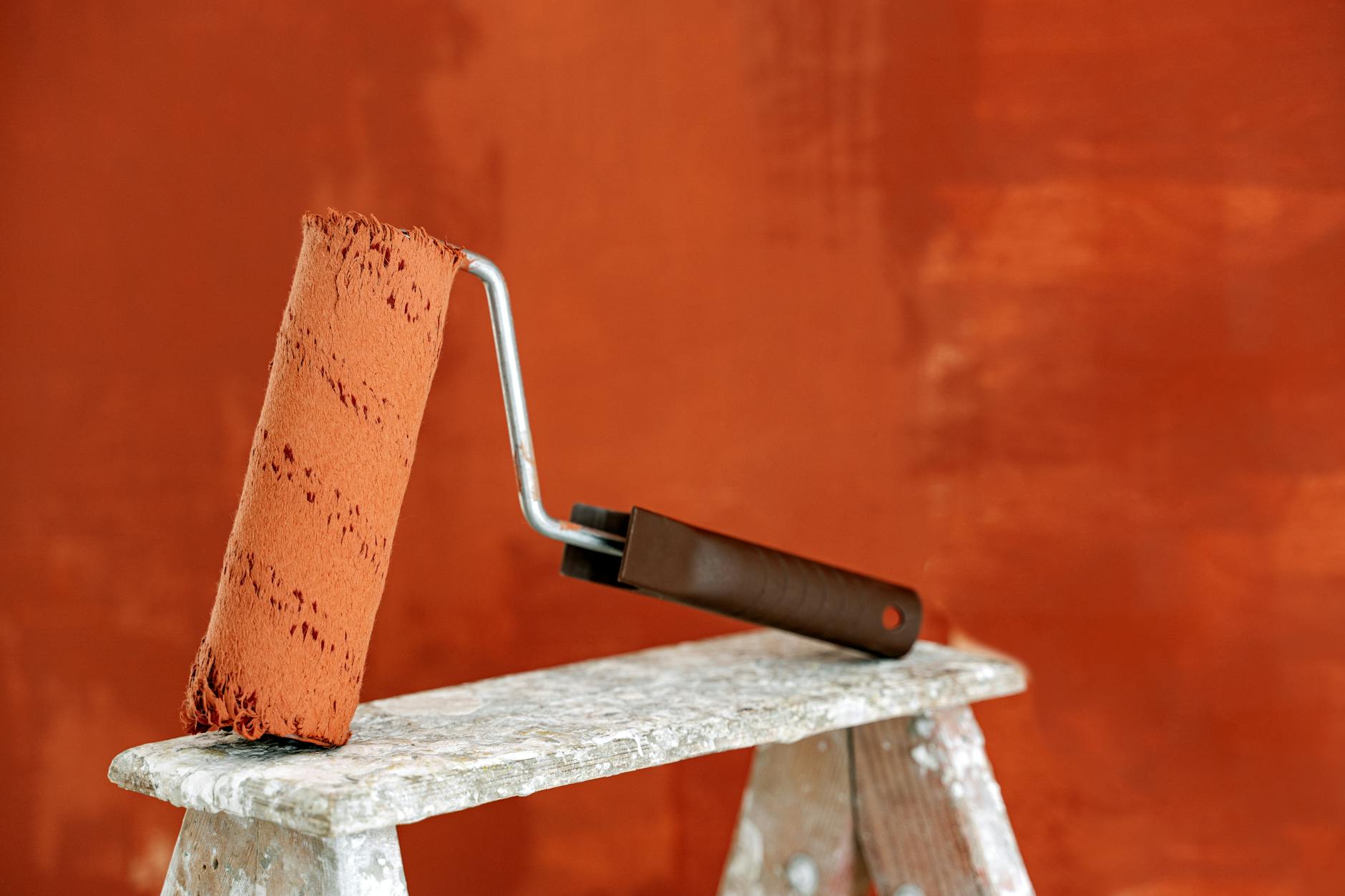
Neon Orange
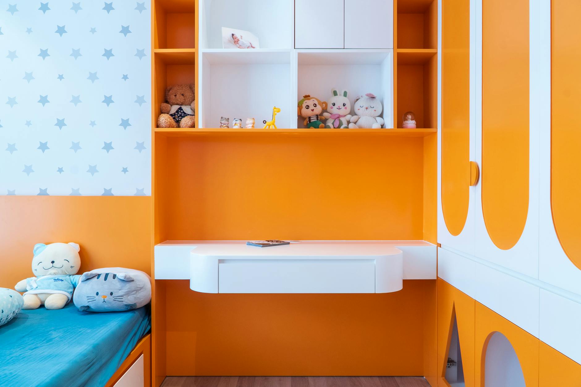
Neon orange creates an almost electric visual experience that floods the brain with stimulation and energy. This aggressive shade is associated with excitement, enthusiasm, and high activity levels, making it particularly disruptive in spaces meant for rest. The brightness of neon orange can feel overwhelming to the eyes and continues to create afterimages even when you close your eyes. Bedrooms painted in this color often leave occupants feeling restless and mentally wired rather than calm and sleepy.
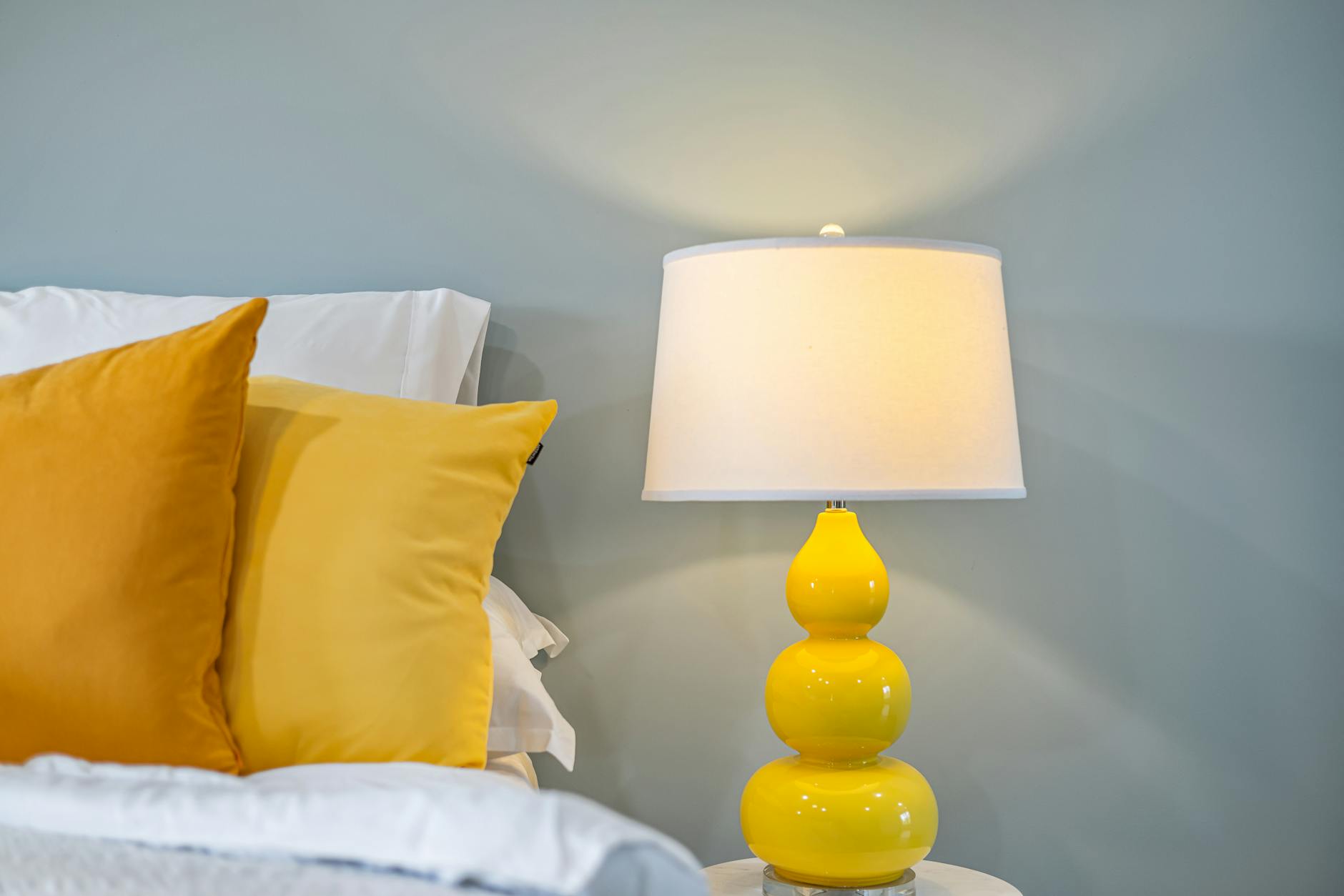
Electric Yellow
Electric yellow mimics the stimulating properties of bright sunlight, signaling to your brain that it is time to be awake and alert. This color triggers serotonin production and promotes mental activity, which is beneficial during daytime hours but problematic at night. The intensity of electric yellow can create visual strain and keep the mind engaged rather than allowing it to disengage for sleep. Prolonged exposure to this shade in a bedroom environment can disrupt circadian rhythms and delay melatonin release.
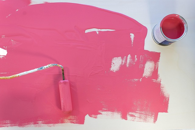
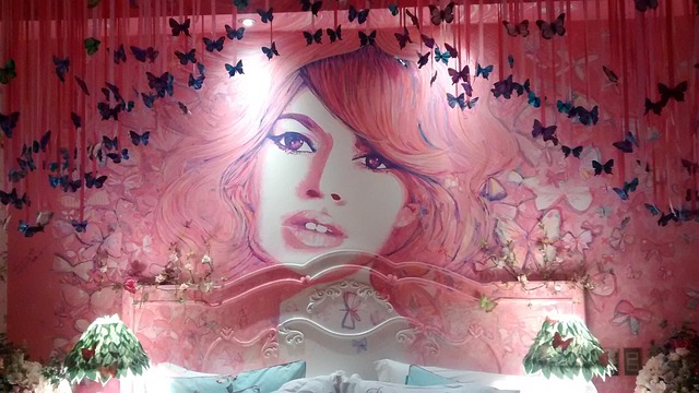
Hot Pink
Hot pink combines the stimulating properties of red with an energetic vibrancy that feels youthful and attention-grabbing. This color excites the visual cortex and can create feelings of restlessness rather than the tranquility needed for quality sleep. Bedrooms featuring hot pink as a dominant color often feel playful and dynamic, which works against the calm atmosphere conducive to rest. The psychological impact of this shade tends to elevate mood and energy rather than facilitate the mental quieting necessary for sleep.
Lime Green
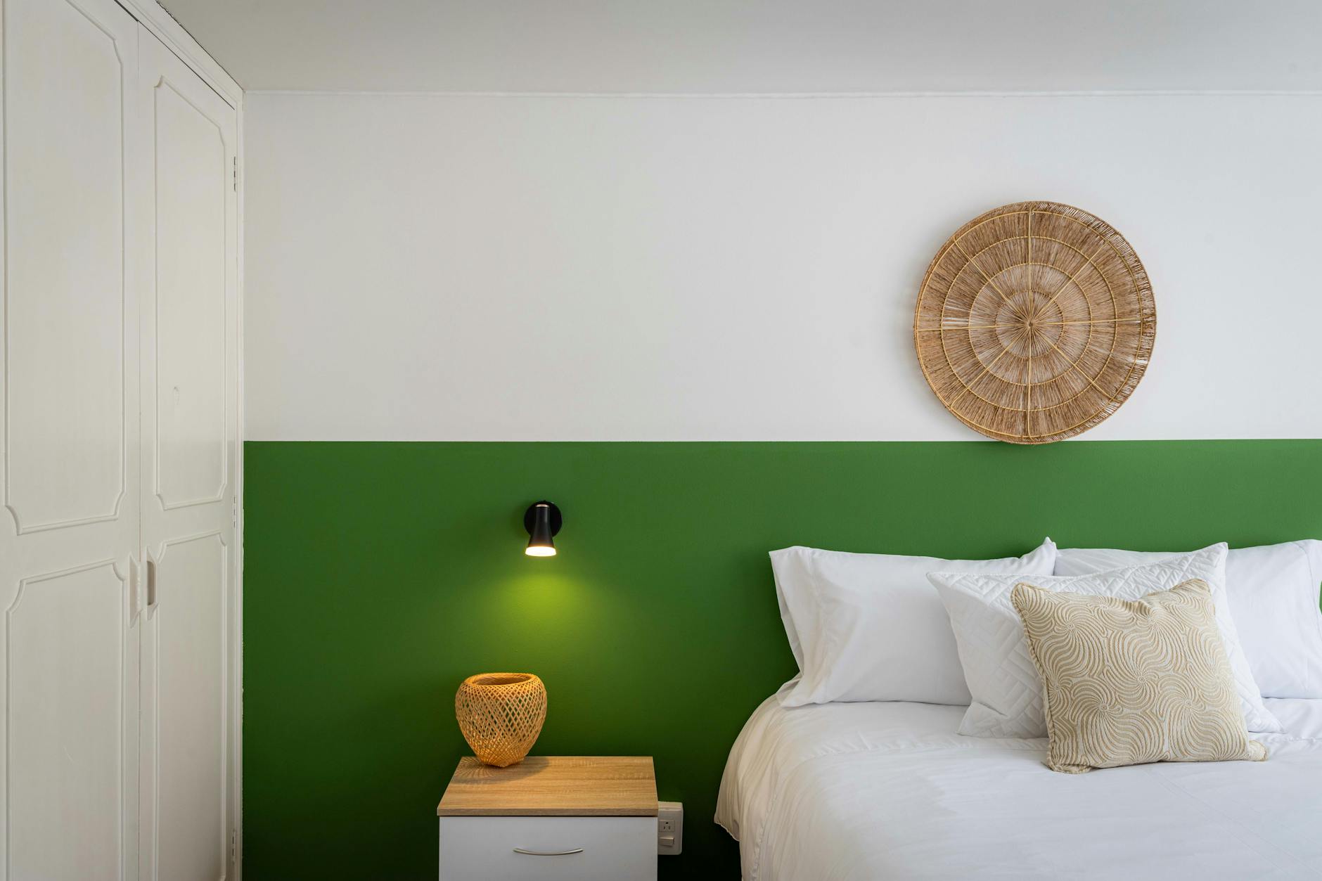
Lime green is a highly saturated color that draws immediate attention and creates a sense of unnatural brightness. This shade can feel jarring to the nervous system and triggers associations with artificial environments rather than natural restfulness. The visual intensity of lime green keeps the eyes engaged and makes it difficult for the mind to enter a state of relaxation. People sleeping in rooms with lime green walls frequently report feeling alert and experiencing difficulty transitioning into deep sleep stages.
Vibrant Purple
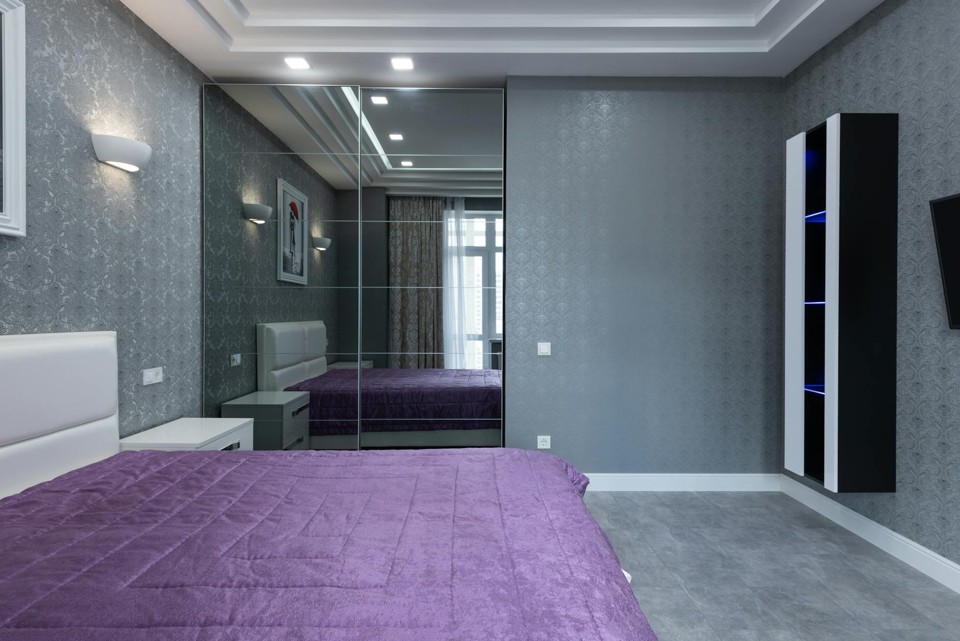
Vibrant purple stimulates creativity and imagination, engaging the mind in active thinking rather than restful contemplation. This rich color can feel luxurious but also mentally demanding, encouraging thought processes that interfere with sleep preparation. Purple activates areas of the brain associated with problem-solving and artistic thinking, which are not ideal mental states for falling asleep. The depth and intensity of vibrant purple can create a sense of drama that keeps emotional energy elevated throughout the night.
Fire Engine Red

Fire engine red is an emergency color that triggers immediate alertness and physiological stress responses in the human body. This shade is specifically designed to capture attention and signal danger, making it one of the worst possible choices for a sleep environment. Rooms painted in fire engine red can create feelings of anxiety and keep the sympathetic nervous system activated. The color’s association with urgency and action directly contradicts the parasympathetic relaxation needed for quality rest.
Bright Coral
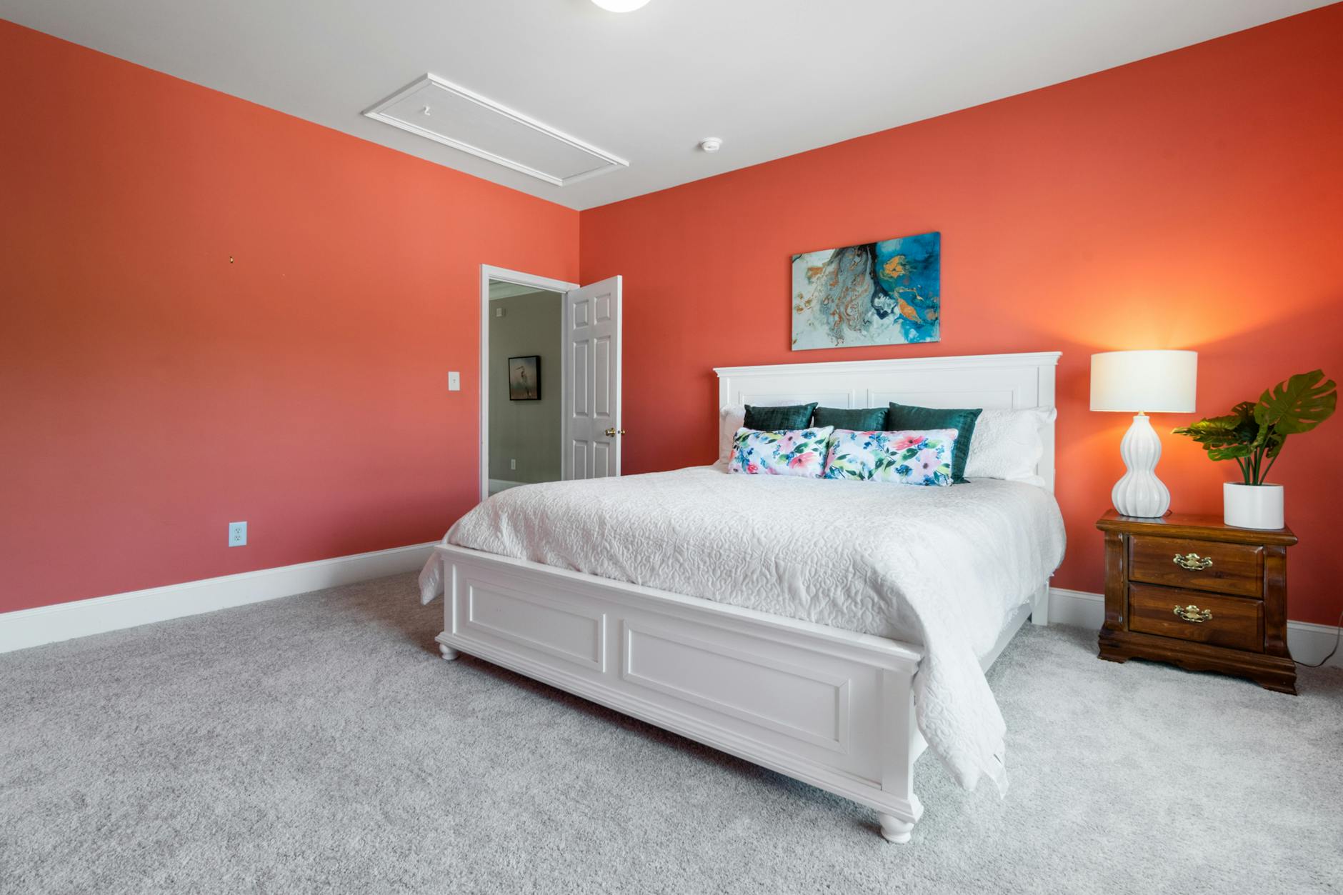
Bright coral blends the energizing properties of orange with the stimulating aspects of pink to create an attention-demanding shade. This tropical color evokes feelings of warmth and vibrancy that are more appropriate for social spaces than bedrooms. The cheerfulness of bright coral can prevent the mind from settling into the neutral emotional state necessary for sleep. Bedrooms featuring this color often feel summery and active rather than calm and conducive to rest.
Sunshine Yellow
Sunshine yellow mimics the awakening properties of morning light and signals to the body that it is time to start the day. This optimistic color promotes mental clarity and alertness, which are counterproductive to the mental fogginess that facilitates sleep. The brightness of sunshine yellow can strain the eyes and create an environment that feels perpetually daytime. People attempting to sleep in rooms painted this color often find their minds remain active and engaged rather than drifting toward unconsciousness.
Tangerine Orange

Tangerine orange is an energetic citrus shade that stimulates appetite, activity, and social engagement. This color creates associations with freshness and vitality that keep the mind focused on daytime activities and tasks. The warmth and brightness of tangerine can elevate body temperature perception, which interferes with the slight cooling that naturally occurs during sleep onset. Bedrooms painted in this shade often feel too lively and dynamic for proper rest.
Magenta
Magenta combines red and blue wavelengths in a way that creates visual tension and mental stimulation. This unconventional color can feel exciting and modern but also psychologically demanding and attention-grabbing. The intensity of magenta engages creative and emotional processing centers in the brain rather than allowing them to quiet down. Sleeping environments dominated by magenta often feel too stimulating and can lead to vivid dreams or restless sleep.
Chartreuse
Chartreuse is a yellow-green hybrid that appears unnatural and visually startling to most people. This unusual color demands attention and can create feelings of unease rather than the comfort necessary for sleep. The brightness and oddity of chartreuse keep the brain engaged in processing the unusual visual input rather than settling into rest. Bedrooms featuring this color frequently feel eccentric and mentally stimulating rather than soothing.
Crimson
Crimson is a deep, intense red that carries associations with passion, power, and heightened emotions. This dramatic color elevates heart rate and creates a sense of intensity that is incompatible with sleep preparation. The richness of crimson can feel luxurious but also emotionally demanding and mentally engaging. Research shows that sleeping in crimson environments can lead to more frequent nighttime awakenings and reduced overall sleep quality.
Bright Turquoise
Bright turquoise is a highly saturated blue-green that creates visual excitement and tropical associations. While turquoise can be calming in softer shades, the bright version stimulates the mind and evokes feelings of energy and adventure. This color’s intensity keeps the eyes engaged and prevents the visual system from relaxing into darkness. Bedrooms painted in bright turquoise often feel too vibrant and mentally stimulating for restful sleep.
Neon Green

Neon green is an artificial-looking color that appears unnatural and visually jarring in most contexts. This shade stimulates the nervous system and can create feelings of unease rather than comfort. The brightness of neon green continues to register with the visual system even in low light, preventing proper darkness perception. People sleeping in rooms with neon green elements frequently report feeling wired and experiencing difficulty achieving deep sleep.
Scarlet
Scarlet is a brilliant red shade that commands attention and creates immediate visual impact. This color raises physiological arousal levels and triggers the fight-or-flight response in subtle but measurable ways. The intensity of scarlet keeps the brain in an alert state rather than allowing it to transition into sleep mode. Bedrooms featuring scarlet as a primary color often create environments that feel too charged and energetic for quality rest.
Electric Blue
Electric blue is an intensely bright shade that stimulates mental activity and creates associations with technology and artificial light. This color can feel cold yet energizing, creating a contradictory sensory experience that interferes with sleep. The brightness of electric blue suppresses melatonin production similarly to blue light from screens. Sleeping environments dominated by this color often feel clinical and overly stimulating rather than restful.
Bold Orange

Bold orange combines warmth with high energy to create a color that feels invigorating and action-oriented. This shade is often used in spaces designed to promote activity and social interaction rather than rest. The vibrancy of bold orange keeps the mind engaged and prevents the mental quieting necessary for falling asleep. Bedrooms painted in this color can feel too lively and prevent the body from recognizing nighttime as rest time.
Fuchsia
Fuchsia is an intense pink-purple hybrid that feels modern and attention-grabbing. This dramatic color stimulates emotional responses and creative thinking rather than promoting calm neutrality. The saturation of fuchsia keeps the visual system actively processing color information instead of settling into darkness. People sleeping in fuchsia bedrooms often report feeling mentally active and experiencing vivid, sometimes disruptive dreams.
Cherry Red
Cherry red is a rich, glossy shade that feels indulgent but also highly stimulating to the nervous system. This color creates associations with sweetness and intensity that keep the mind engaged rather than relaxed. The depth and saturation of cherry red can elevate mood and energy in ways that work against sleep preparation. Bedrooms featuring this color as a dominant element often feel too emotionally charged for restful sleep.
Highlighter Yellow
Highlighter yellow is specifically designed to capture attention and stand out visually, making it extremely disruptive in a sleep environment. This artificial shade creates a sense of urgency and importance that keeps the brain in an alert, processing mode. The extreme brightness of highlighter yellow can cause eye strain and continues to affect vision even after lights are dimmed. Sleeping in rooms with this color can significantly delay sleep onset and reduce sleep quality.
Vivid Teal
Vivid teal is an energetic blue-green that feels fresh and stimulating rather than restful. This color promotes mental clarity and focus, which are beneficial during waking hours but problematic at bedtime. The saturation of vivid teal keeps the eyes engaged and prevents the visual system from fully relaxing. Bedrooms painted in this shade often feel too bright and mentally activating for proper sleep.
Bright Lavender
Bright lavender combines the stimulating properties of saturated color with the creative energy of purple tones. While softer lavenders can be calming, bright lavender feels too energetic and visually demanding. This shade stimulates imagination and emotional processing rather than allowing the mind to settle into neutral rest. People sleeping in bright lavender environments often report active minds and difficulty achieving deep, dreamless sleep.
Tomato Red
Tomato red is a warm, intense shade that signals ripeness, warmth, and immediate attention. This color raises body temperature perception and creates a sense of warmth that can feel uncomfortable for sleep. The vibrancy of tomato red keeps the nervous system activated and prevents the cooling and quieting necessary for rest. Bedrooms featuring this color often feel too warm and energetically charged for quality sleep.
Lemon Yellow
Lemon yellow is a citrus-bright shade that feels refreshing and awakening rather than sleep-inducing. This color mimics morning light and signals to the circadian system that it is time to be alert and active. The sharpness of lemon yellow can feel almost acidic to the visual system, creating subtle discomfort. Sleeping environments dominated by this color often feel perpetually daytime, confusing the body’s natural sleep-wake cycle.
Bright Aqua
Bright aqua is a saturated blue-green that feels tropical and energizing rather than calming. This color creates associations with swimming pools and vacation activities that promote wakefulness and energy. The intensity of bright aqua keeps the visual cortex actively processing color information instead of settling into darkness. Bedrooms painted in this shade often feel too stimulating and prevent the mind from achieving the stillness needed for sleep.
Ruby Red
Ruby red is a deep, jewel-toned shade that feels luxurious but also emotionally and mentally stimulating. This color carries associations with wealth, passion, and intensity that keep the mind engaged in active processing. The richness of ruby red can feel beautiful but also psychologically demanding in a sleep environment. People sleeping in ruby red bedrooms frequently report feeling emotionally activated and experiencing difficulty achieving neutral calm.
Neon Pink
Neon pink is an artificial-looking shade that creates immediate visual impact and mental stimulation. This color feels youthful and energetic in ways that directly oppose the calm maturity needed for quality sleep. The brightness of neon pink continues to register with the visual system even in low light conditions. Bedrooms featuring this color often feel too playful and stimulating for adults seeking restful sleep.
Safety Orange
Safety orange is specifically designed to capture attention and signal caution, making it extremely disruptive in rest environments. This utilitarian color triggers alertness responses and creates associations with danger and awareness. The intensity of safety orange keeps the nervous system in a vigilant state rather than allowing it to relax. Sleeping in rooms painted this color can significantly interfere with the body’s natural transition into rest mode.
Bright Periwinkle
Bright periwinkle is a saturated blue-purple that feels whimsical and mentally engaging. This color stimulates creative thinking and emotional processing rather than promoting neutral calm. The brightness of periwinkle keeps the eyes active and prevents the visual system from settling into darkness. Bedrooms featuring this shade often feel too cheerful and stimulating for the serious business of quality sleep.
Hot Coral
Hot coral combines the energy of orange with the intensity of pink to create an extremely stimulating shade. This color feels tropical and vacation-like, promoting thoughts of activity and adventure rather than rest. The warmth and brightness of hot coral can elevate perceived body temperature and prevent the cooling necessary for sleep. Sleeping environments dominated by this color often feel too energetic and summery for restful nights.
Brilliant Purple
Brilliant purple is a highly saturated shade that stimulates imagination, creativity, and emotional depth. This color engages the mind in active thinking rather than allowing it to settle into the emptiness conducive to sleep. The intensity of brilliant purple can feel inspiring but also mentally demanding and visually overwhelming. Bedrooms painted in this color frequently create environments that feel too rich and stimulating for quality rest.
Shocking Pink
Shocking pink is an attention-grabbing shade that lives up to its name by creating immediate visual impact. This color stimulates the nervous system and triggers heightened awareness rather than relaxation. The intensity of shocking pink can feel almost aggressive to the visual system, preventing calm settling. People attempting to sleep in rooms featuring this color often report feeling wired and mentally active rather than peaceful.
Traffic Light Green
Traffic light green is a standardized shade designed to signal movement and action, making it problematic in sleep spaces. This color creates associations with go, proceed, and activity that keep the mind in an action-oriented state. The brightness and specificity of traffic light green can feel utilitarian and mentally engaging. Bedrooms painted in this shade often fail to create the sanctuary feeling necessary for deep, restorative sleep.
Candy Apple Red
Candy Apple Red is a glossy, sweet shade that feels indulgent and visually exciting. This color stimulates appetite and desire while creating associations with treats and special occasions that promote wakefulness. The shininess and intensity of candy apple red keep the eyes engaged and prevent visual relaxation. Sleeping in environments dominated by this color can lead to restless nights and difficulty achieving the neutral state necessary for deep sleep.
What colors have you found most disruptive to your sleep quality, and which calming shades have transformed your bedroom into a true sanctuary? Share your experiences in the comments.