Creating a luxurious and inviting home environment often has less to do with budget and more to do with thoughtful curation. Many homeowners inadvertently sabotage their design aesthetic by falling into common traps that cheapen the overall look of a space. Small details like lighting choices and furniture placement play a monumental role in how a room is perceived by guests. Avoiding these specific decorating errors can instantly elevate the sophistication of any interior regardless of the price point. The following list highlights frequent missteps that detract from a high-end atmosphere and offers insight into correcting them.
Postage Stamp Rugs
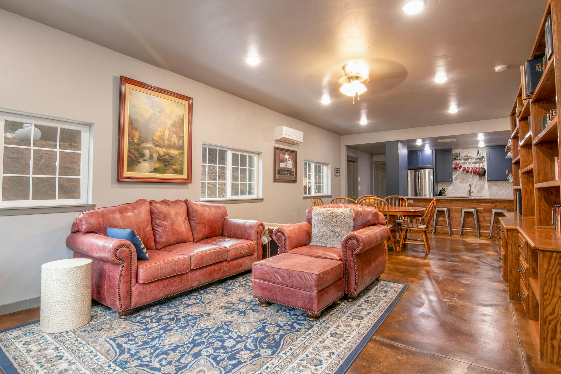
Area rugs serve as a visual anchor for furniture arrangements and help define distinct zones within an open floor plan. A common error involves selecting a rug that floats in the center of the room without touching the legs of the surrounding furniture. This creates a disconnected look that makes the room feel smaller and disjointed rather than cohesive. Designers generally recommend that at least the front legs of sofas and chairs rest on the rug to ground the space effectively. Proper scaling ensures the floor covering complements the room dimensions rather than appearing like an afterthought.
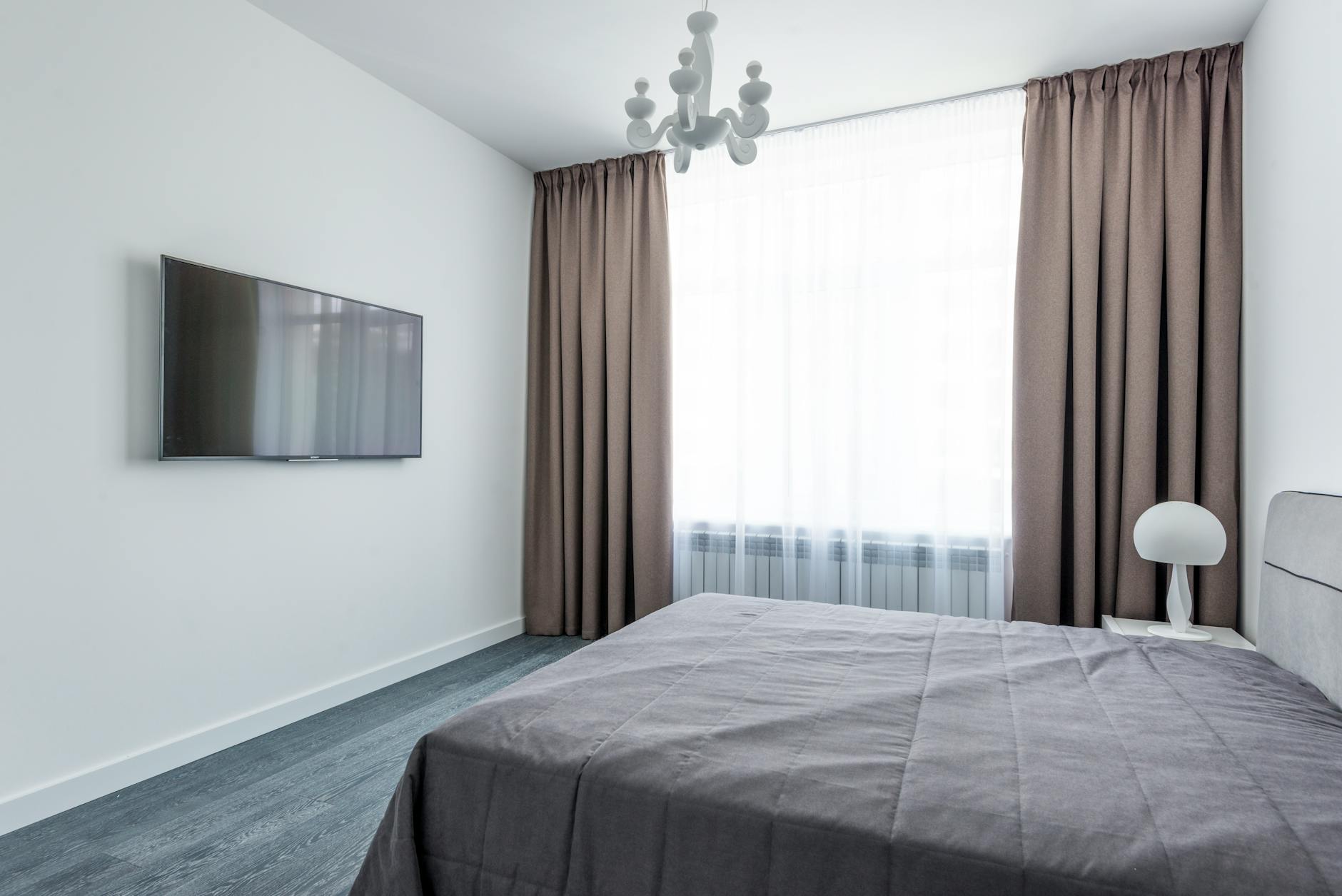
Low Hanging Curtain Rods
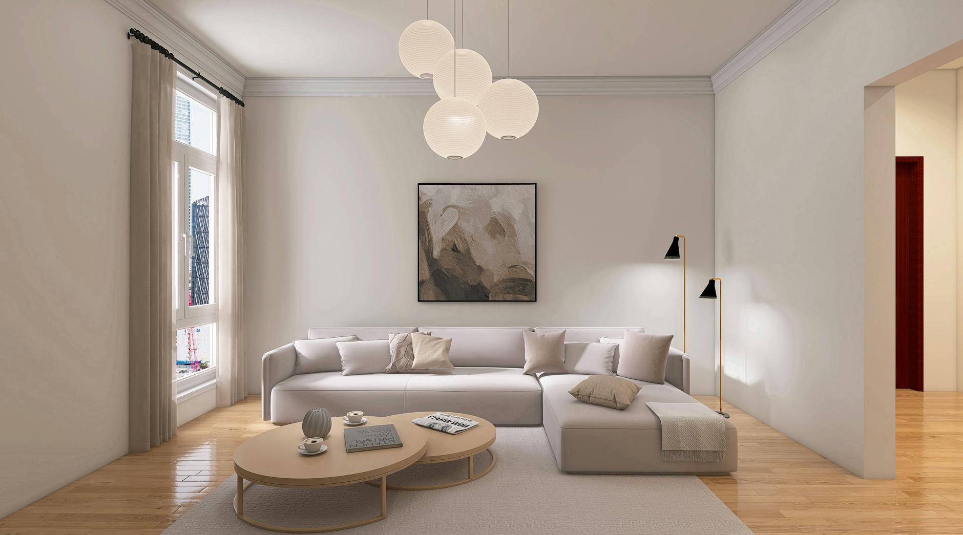
Mounting curtain rods directly above the window frame can visually stunt the height of a room and make ceilings feel lower. This placement draws the eye downward and emphasizes standard dimensions rather than maximizing vertical space. Installing hardware closer to the ceiling line creates an illusion of grandeur and makes windows appear significantly larger. Drapery panels should kiss the floor rather than pooling excessively or hovering several inches above the ground. Extending the rod width beyond the window frame also allows maximum natural light to enter the space.
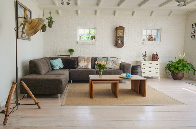
Matching Furniture Sets
Buying a complete suite of matching furniture for the bedroom or living room often results in a generic showroom aesthetic. Relying on identical pieces removes the opportunity to inject personality and texture into a design scheme. A curated mix of materials and styles creates a layered look that feels collected over time rather than purchased in bulk. High-end interiors usually blend vintage finds with modern staples to establish visual interest. Breaking up a set allows each piece to stand out and contributes to a more custom environment.
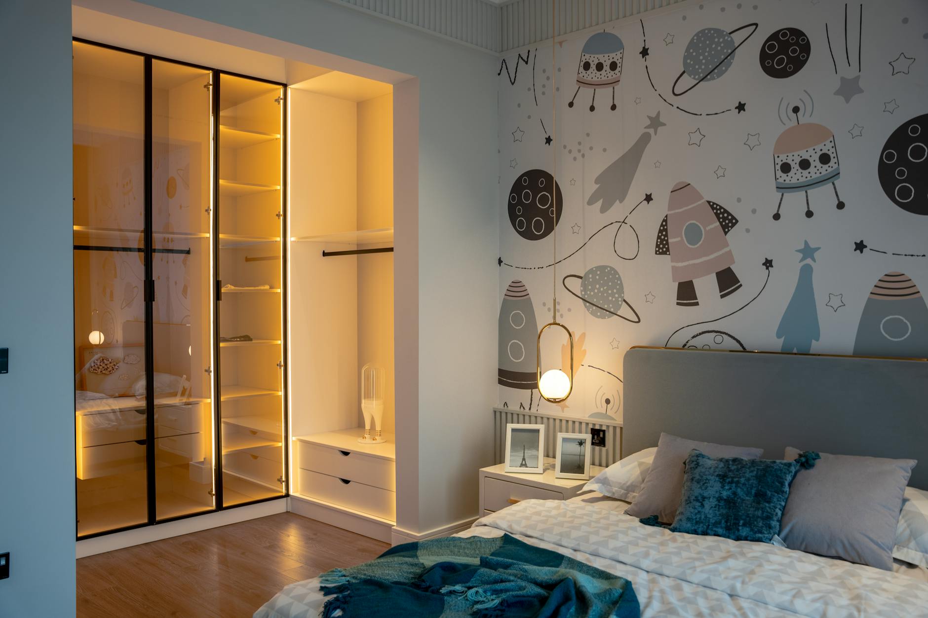
Harsh Overhead Lighting
Relying solely on a single overhead fixture casts unflattering shadows and creates a sterile atmosphere reminiscent of a hospital. Lighting should be layered throughout a room to provide warmth and functionality for different times of day. Floor lamps and table lamps introduce ambient light that softens the edges of a space and makes it feel welcoming. Installing dimmer switches offers control over intensity and helps set the mood for evening relaxation. Avoiding cool toned bulbs in favor of warm white options prevents the room from feeling clinical.
Artwork Hung Too High
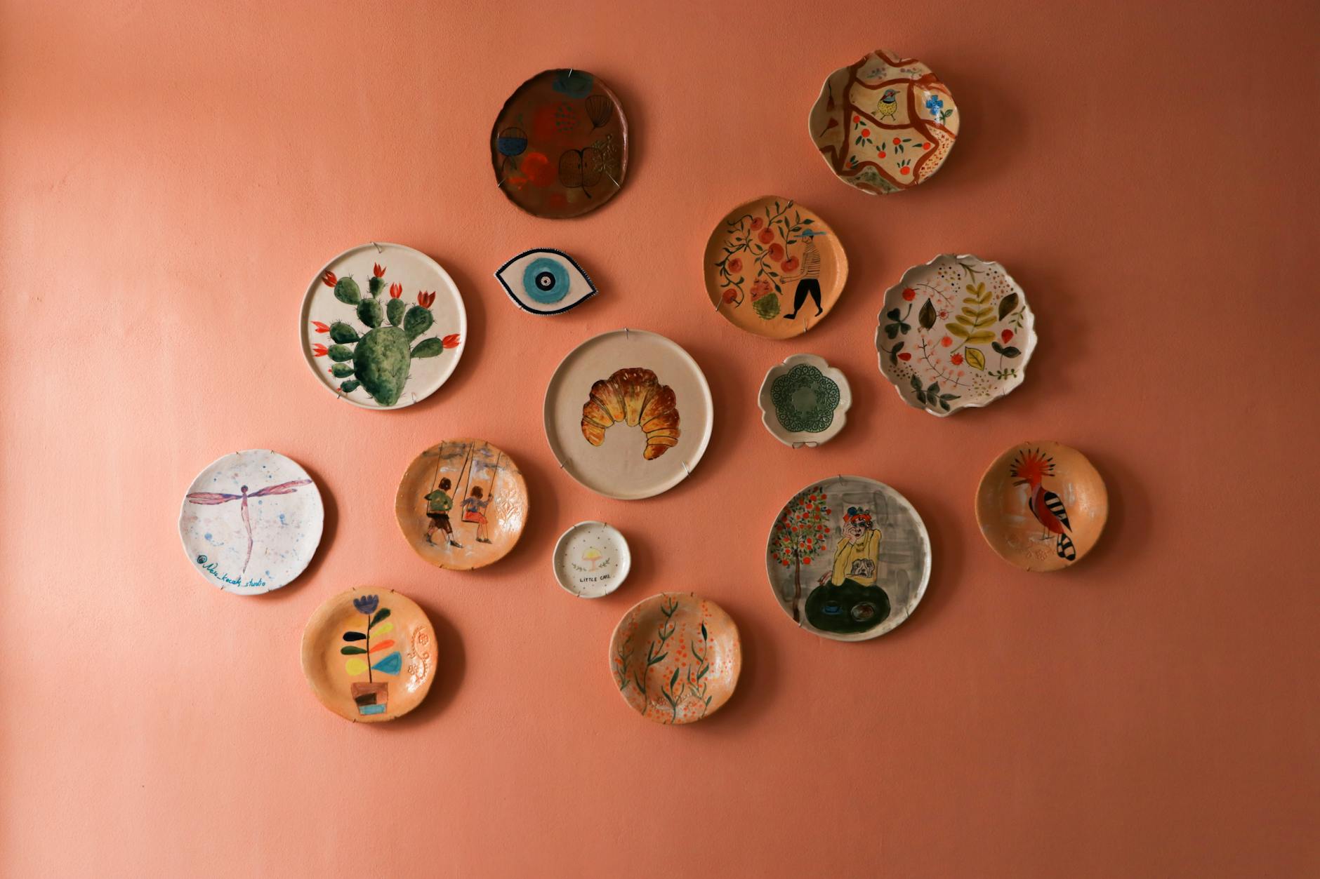
Placing artwork too high on the wall is a frequent mistake that disrupts the balance of a room. Galleries and museums typically hang pieces so the center of the image sits at eye level for the average viewer. When art is positioned too close to the ceiling it feels disconnected from the furniture below it. The piece should relate to the sofa or console table underneath it to create a unified vignette. Keeping art at the correct level creates a more intimate and professional presentation.
Cluttered Surfaces
Excessive knick-knacks and decorative items on every available surface can make a home feel chaotic and messy. Visual clutter prevents the eye from resting and obscures the actual design features of the room. Editing accessories down to a few meaningful pieces allows them to be appreciated fully without competition. Negative space is a crucial element of luxury design that allows a room to breathe. Grouping items in odd numbers usually yields a more pleasing arrangement than scattering them everywhere.
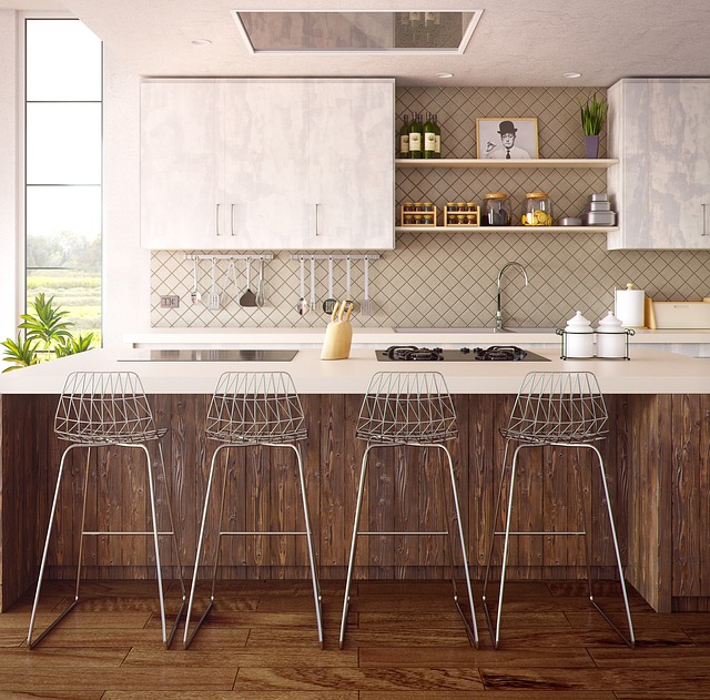
Furniture Pushed Against Walls
Lining the perimeter of a room with furniture is a default layout that often leaves an awkward empty space in the center. This arrangement can make conversations difficult and creates a waiting room atmosphere rather than a cozy living area. Pulling seating away from the walls encourages social interaction and creates better traffic flow. Floating furniture can also define specific areas within a larger room for better functionality. Even a few inches of breathing room between the sofa and the wall adds depth.
Visible Cords and Cables
Tangled wires and exposed extension cords instantly degrade the polished look of an entertainment center or home office. Managing technology clutter is essential for maintaining a clean and streamlined aesthetic. Simple solutions like cord covers or cable ties can hide the mess behind furniture legs or along baseboards. Wireless devices help reduce the sheer volume of cabling required in modern living spaces. Taking the time to conceal these functional elements shows an attention to detail that characterizes high-end homes.
Mass Produced Art
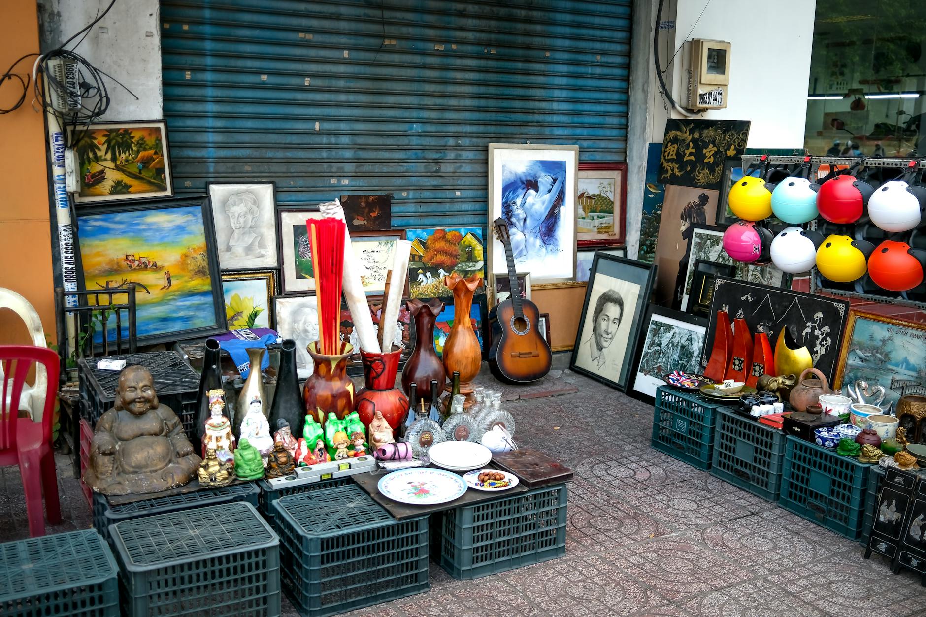
Generic prints found in big box stores often lack the character and texture needed to elevate a wall. Relying on widely recognizable imagery can make a home feel impersonal and lacking in unique style. Sourcing original art from local markets or vintage shops adds a layer of authenticity to the decor. Framing personal photography or unique textiles offers a budget-friendly alternative to standard store-bought canvases. Custom framing can also transform a simple print into something that looks significantly more expensive.
Toilet Contour Rugs
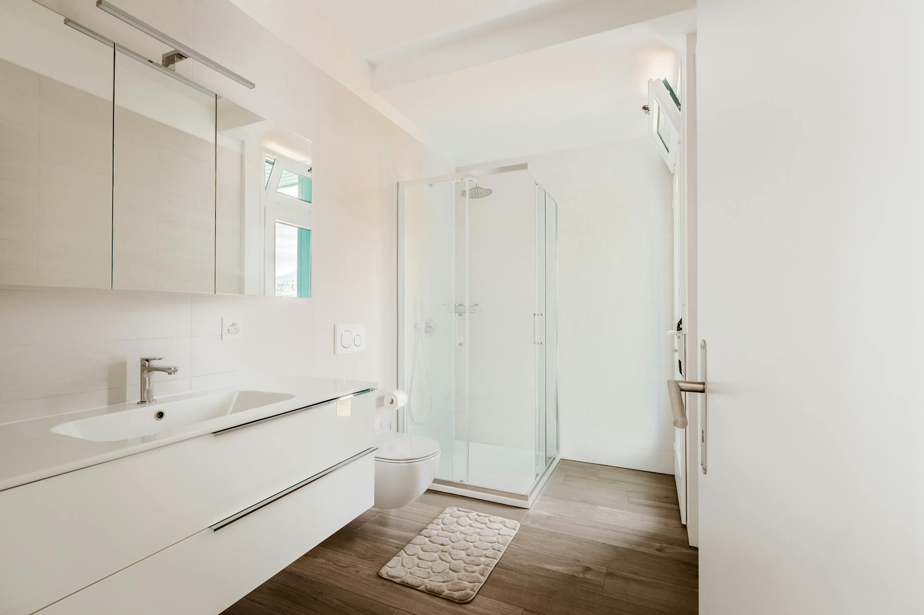
The U-shaped rug designed to fit around the base of a toilet is a dated accessory that disrupts the clean lines of a bathroom. These mats often trap dust and bacteria while visually chopping up the floor space. A simple rectangular bath mat placed in front of the vanity or shower offers a more modern and sanitary solution. Removing the contour rug exposes more tile and makes the bathroom appear larger and more hygienic. Opting for high-quality textiles elsewhere in the room provides enough softness without the need for a toilet mat.
Dusty Artificial Plants
Fake greenery can be a viable decor option but low-quality versions often look plastic and gather noticeable dust. Neglecting to clean artificial plants reveals their synthetic nature and makes the room feel neglected. Real plants purify the air and add a vibrancy that is difficult to replicate with synthetic alternatives. If using faux botanicals is necessary investing in high-quality silk versions is crucial for a realistic look. Rotating them out or dusting them regularly preserves the illusion of life.
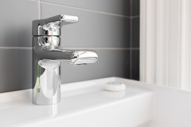
Builder Grade Hardware

Standard knobs and pulls installed by developers are often lightweight and lack distinct style or durability. Swapping out basic hardware is one of the easiest and most effective ways to upgrade kitchen cabinets and bathroom vanities. selecting substantial pieces with interesting finishes like brushed brass or matte black adds a custom touch. Mixing metals intentionally can also modernize a space and move it away from a cookie-cutter appearance. This small investment pays off by adding weight and elegance to everyday touchpoints.
Dirty Switch Plates
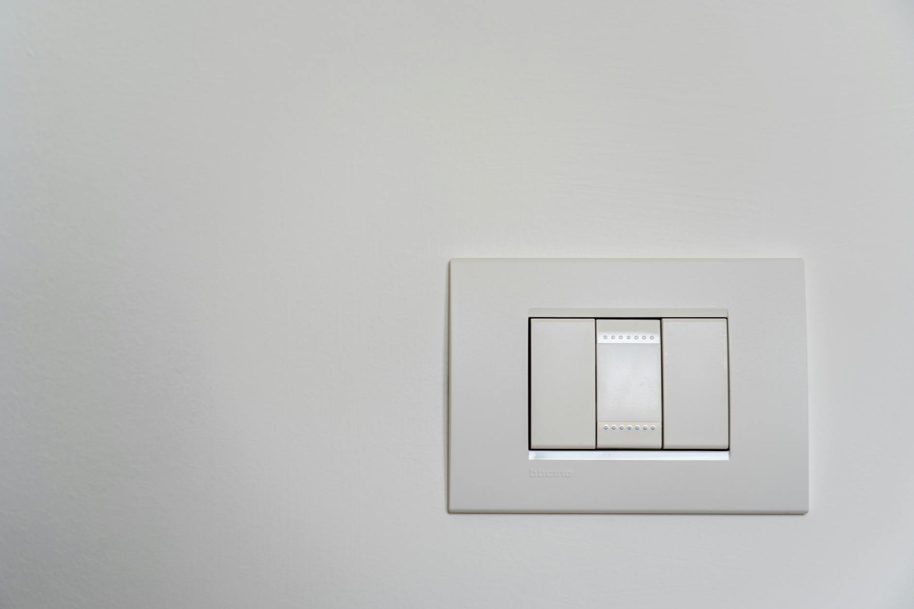
Light switches and outlet covers are frequently touched but often overlooked during routine cleaning sessions. Discolored or cracked plastic plates detract from the overall cleanliness and finish of a room. Replacing cheap plastic covers with screwless models or metal alternatives provides a sleeker profile. Ensuring these small fixtures match the wall color or hardware finish creates a seamless look. Clean and updated switch plates suggest that the home is well-maintained down to the smallest detail.
Word Art

Signs that command residents to live or laugh have become a cliché that dates a home to a specific trend era. These typographic elements often feel mass-produced and lack personal meaning or artistic merit. Replacing text-based decor with landscape paintings or abstract art adds more visual depth and sophistication. Art should evoke emotion through color and composition rather than literal instructions. A home feels more timeless when the walls display diverse imagery rather than phrases.
Overly Themed Rooms
Adhering too strictly to a specific theme like nautical or farmhouse can result in a caricature of a design style. A room that looks like a movie set lacks the nuance and layering of a professionally designed space. Subtle nods to a style through color palettes and textures are more effective than literal interpretations. Mixing elements from different eras and regions creates a more dynamic and personalized environment. Restraint is key when incorporating thematic elements to avoid a kitschy outcome.
Ill-Fitting Sofa Covers
Loose slipcovers that constantly require tucking and adjusting can make a living room look messy and unkempt. While protecting upholstery is important the cover should look intentional rather than like a temporary sheet. Tailored slipcovers that fit the specific dimensions of the furniture maintain the structural integrity of the piece. Upholstery cleaning is often a better investment than covering a sofa with ill-fitting fabric. A tight fit ensures the furniture retains its silhouette and elegance.
Bed in a Bag Sets
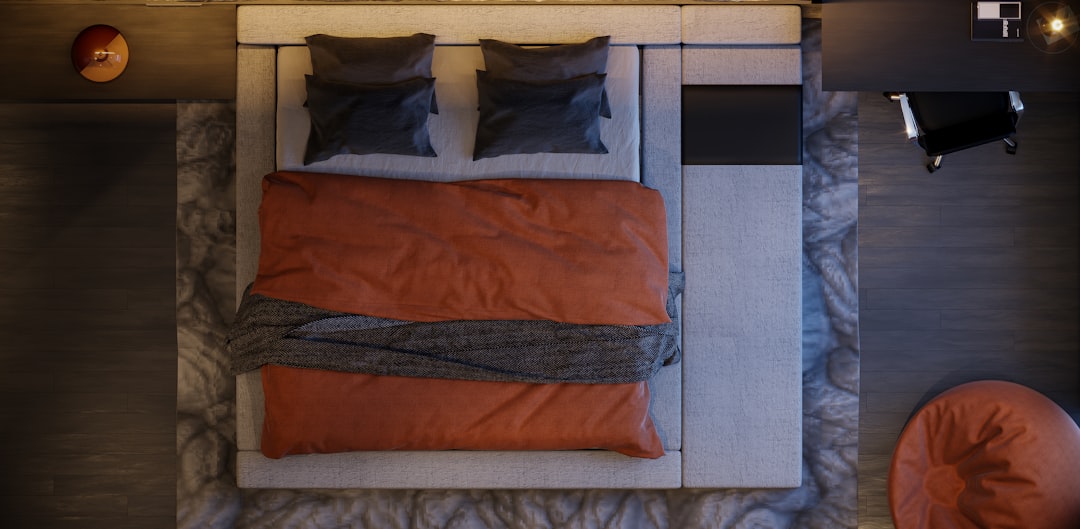
Pre-packaged bedding sets where the comforter matches the shams and the window treatments often look flat and uninspired. These all-in-one solutions lack the textural variety that makes a bed look plush and inviting. Layering different fabrics and coordinating colors creates a more luxurious hotel-like experience. Mixing a linen duvet with cotton sheets and a velvet throw adds dimension to the bedroom design. Breaking up the set allows for a more customized and sophisticated sleeping area.
Plastic Lampshades
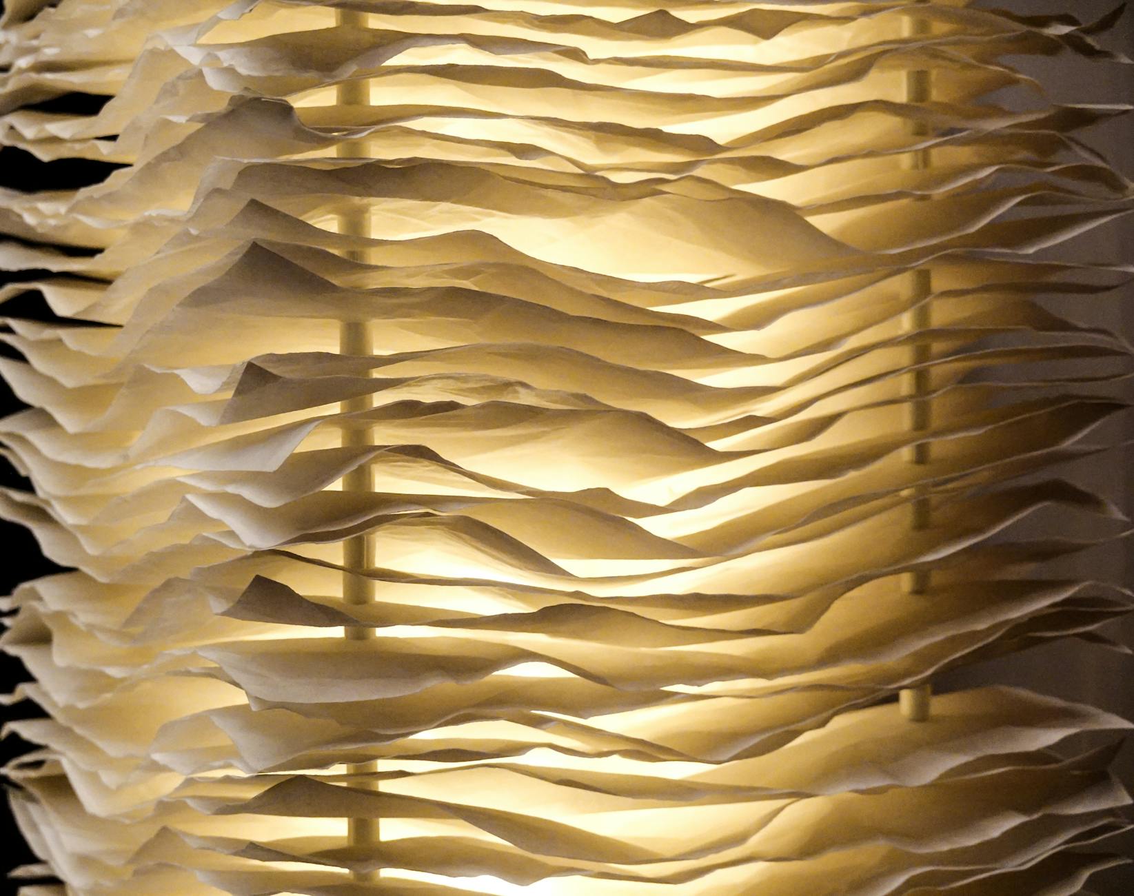
Lighting fixtures with cheap plastic or paper shades can yellow over time and emit a harsh quality of light. Upgrading to linen or silk shades diffuses the light more softly and adds a tactile element to the fixture. The texture of a lampshade contributes to the daytime aesthetic of the room even when the light is off. Selecting a shade with the proper scale and shape balances the lamp base effectively. This simple swap instantly increases the perceived value of the lighting.
Mismatched Photo Frames
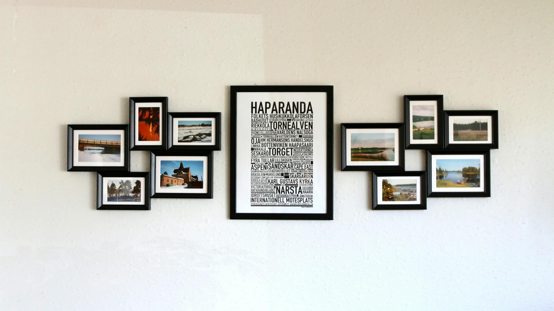
A collection of photos displayed in a random assortment of cheap frames can look chaotic on a wall or shelf. Unifying the frames by color or material creates a cohesive gallery that looks intentional and curated. Matting photographs within the frames adds a professional touch that separates the image from the glass. Grouping photos in a grid or a planned layout prevents the display from feeling like clutter. Consistency in framing elevates family photos into a proper design element.
Cluttered Bookshelves
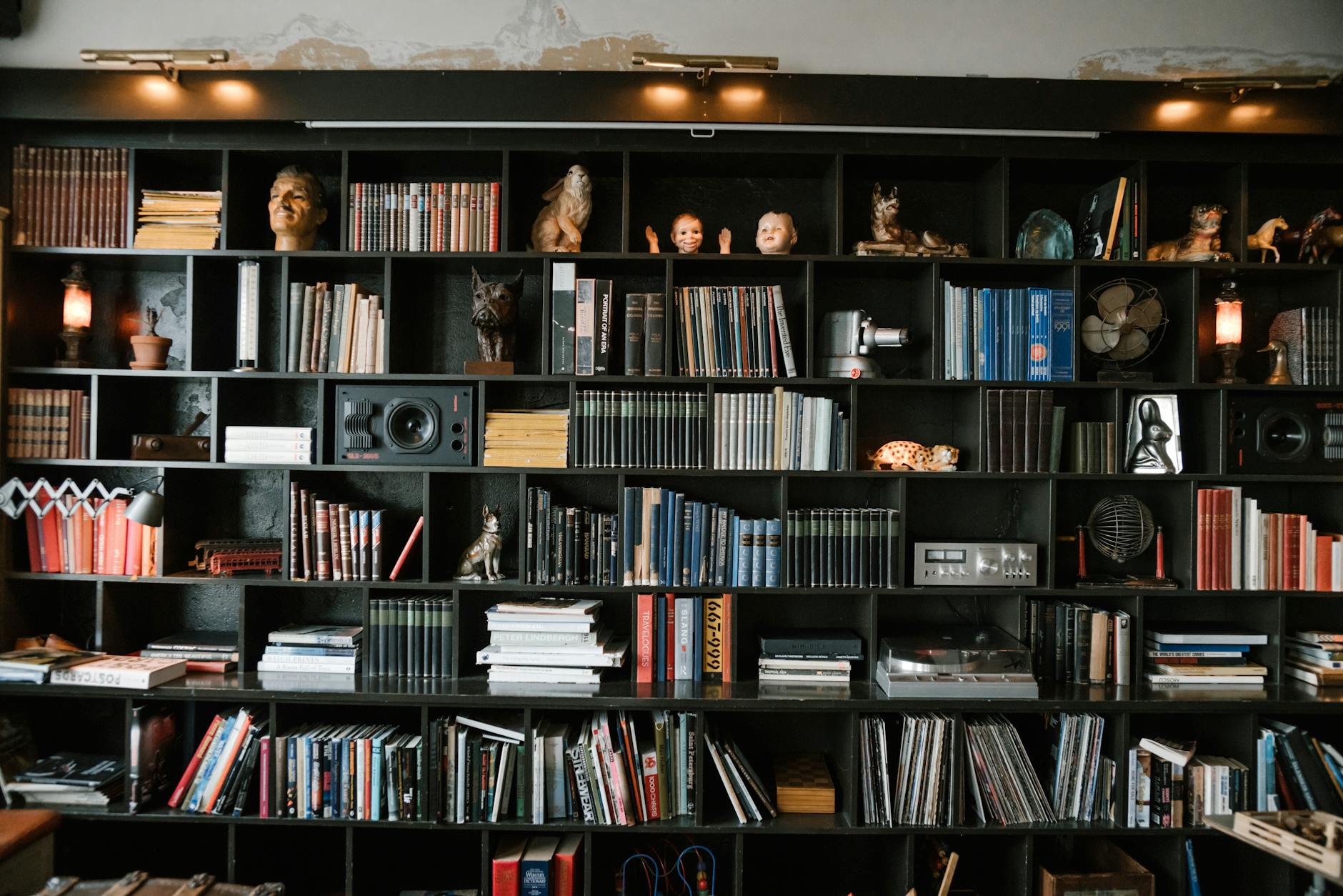
Bookshelves stuffed to the brim with paperbacks and random items can dominate a room with visual noise. Styling shelves involves balancing books with decorative objects and leaving some empty space for the eye to rest. organizing books by color or size can reduce the chaotic appearance of a large collection. Placing some books horizontally and others vertically adds rhythm and interest to the display. Curated shelving acts as a display case rather than just storage.
Incorrect Paint Finishes
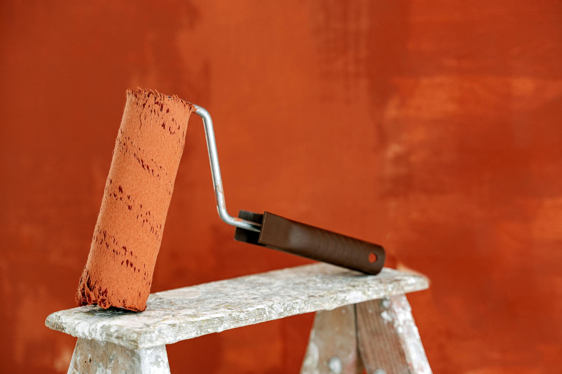
Using flat paint in high-traffic areas or high-gloss paint on imperfect walls highlights flaws and makes maintenance difficult. Satin or eggshell finishes are generally preferred for living areas as they offer durability without excessive shine. Flat paint is best reserved for ceilings where it hides imperfections and does not reflect light. Selecting the right sheen is as important as selecting the right color for a professional finish. Testing patches in different lights ensures the finish works for the specific room conditions.
Random Accent Walls
Painting a single wall a different color without an architectural reason often makes a room feel unbalanced and unfinished. Accent walls work best when they highlight a focal point like a fireplace or a headboard. If there is no distinct feature to emphasize painting all four walls creates a more enveloping and high-end feel. The single colored wall trend can sometimes appear as a lack of commitment to a bold color choice. Wrapping the color around the room adds drama and sophistication.
Disposable Paper Goods on Display
Keeping a stack of paper napkins or plastic cutlery on the kitchen counter signals a lack of permanence. Using proper storage or decanting items into nice containers hides the visual noise of branded packaging. For dining occasions using cloth napkins elevates the meal and reduces waste significantly. If paper products are necessary they should be kept inside a drawer or pantry until needed. The kitchen counter should be reserved for functional appliances and decorative elements.
Fake Fruit Bowls
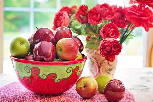
Bowls filled with plastic fruit are a dated decor trick that rarely looks convincing in a modern home. These accessories gather dust and offer no genuine aesthetic value to the kitchen or dining area. A bowl of real seasonal fruit adds natural color and a fresh scent that plastic cannot mimic. Alternatively an empty ceramic or wooden bowl can stand alone as a sculptural object. Authentic elements always trump imitation when trying to create a welcoming atmosphere.
Fridge Front Clutter
Covering the refrigerator door with magnets and papers creates a large block of visual chaos in the kitchen. This surface often becomes a catch-all that distracts from the cabinetry and clean lines of the room. relocating important papers to a designated command center or inside a cabinet door keeps the clutter hidden. A clean fridge front helps the appliance blend more seamlessly into the kitchen design. Minimizing visual noise in the kitchen makes the entire space feel cleaner.
Bathroom Counter Product Overload
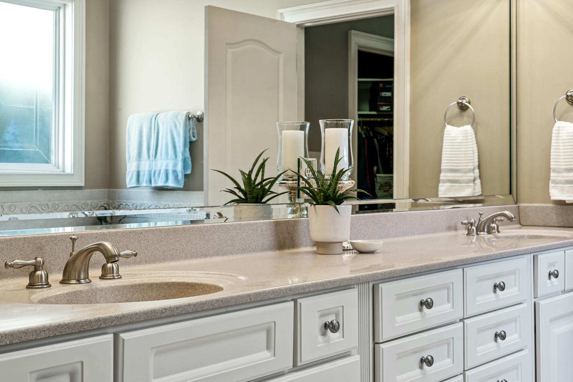
Leaving every daily grooming product out on the vanity makes the bathroom feel small and disorganized. Storing items in drawers or medicine cabinets keeps the surfaces clear and easy to wipe down. Using trays to corral the few essential items left out creates a deliberate and tidy appearance. Decanting soaps and lotions into matching dispensers eliminates the visual noise of branded bottles. A clear counter mimics the spa-like atmosphere found in luxury hotels.
Too Many Throw Pillows
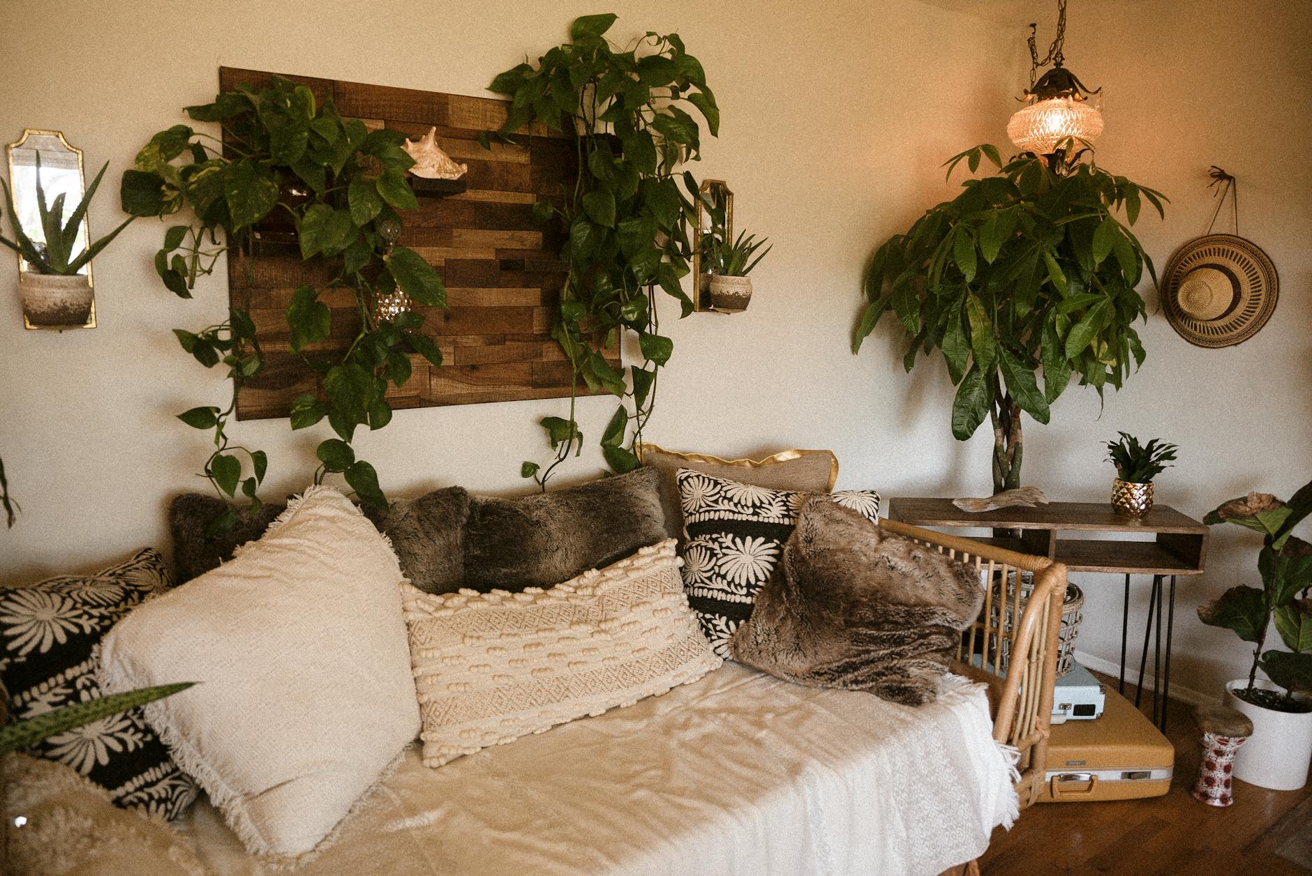
Overloading a sofa or bed with so many pillows that there is no room to sit looks impractical and cluttered. The purpose of throw pillows is to add comfort and an accent of color rather than to build a barricade. A few high-quality pillows with down inserts look better than a mountain of stiff polyester ones. Editing the number of cushions ensures that the furniture remains functional and inviting. Balance is achieved when the pillows enhance the furniture rather than overwhelming it.
Vertical Blinds
Plastic vertical blinds are often associated with office buildings and rentals rather than cozy residential spaces. These window treatments can be noisy and often break easily leaving gaps in privacy. Replacing them with curtains or roman shades softens the window and improves the acoustics of the room. Fabric treatments add texture and warmth that rigid plastic slats lack entirely. This upgrade dramatically changes the light quality and feel of the room.
Cold Color Temperature Bulbs
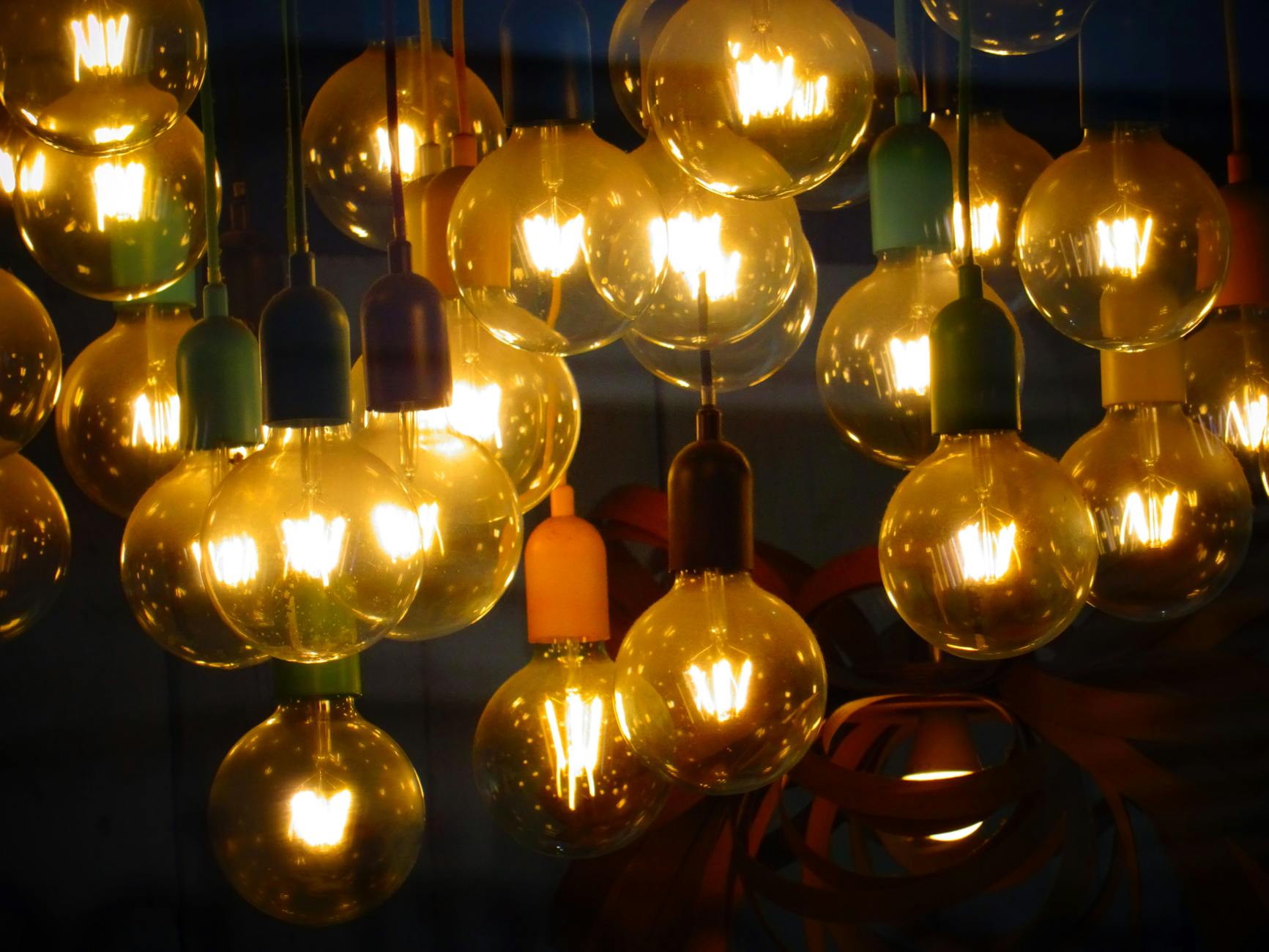
Using daylight or cool white bulbs in living areas creates a stark and uncomfortable environment at night. Warm white bulbs measuring between 2700K and 3000K mimic the glow of incandescent light and feel much cozier. Lighting affects how paint colors reads and how skin tones appear in a space. Ensuring all bulbs in a room match in temperature prevents a jarring visual mismatch. Warm lighting is essential for creating a relaxing and intimate home atmosphere.
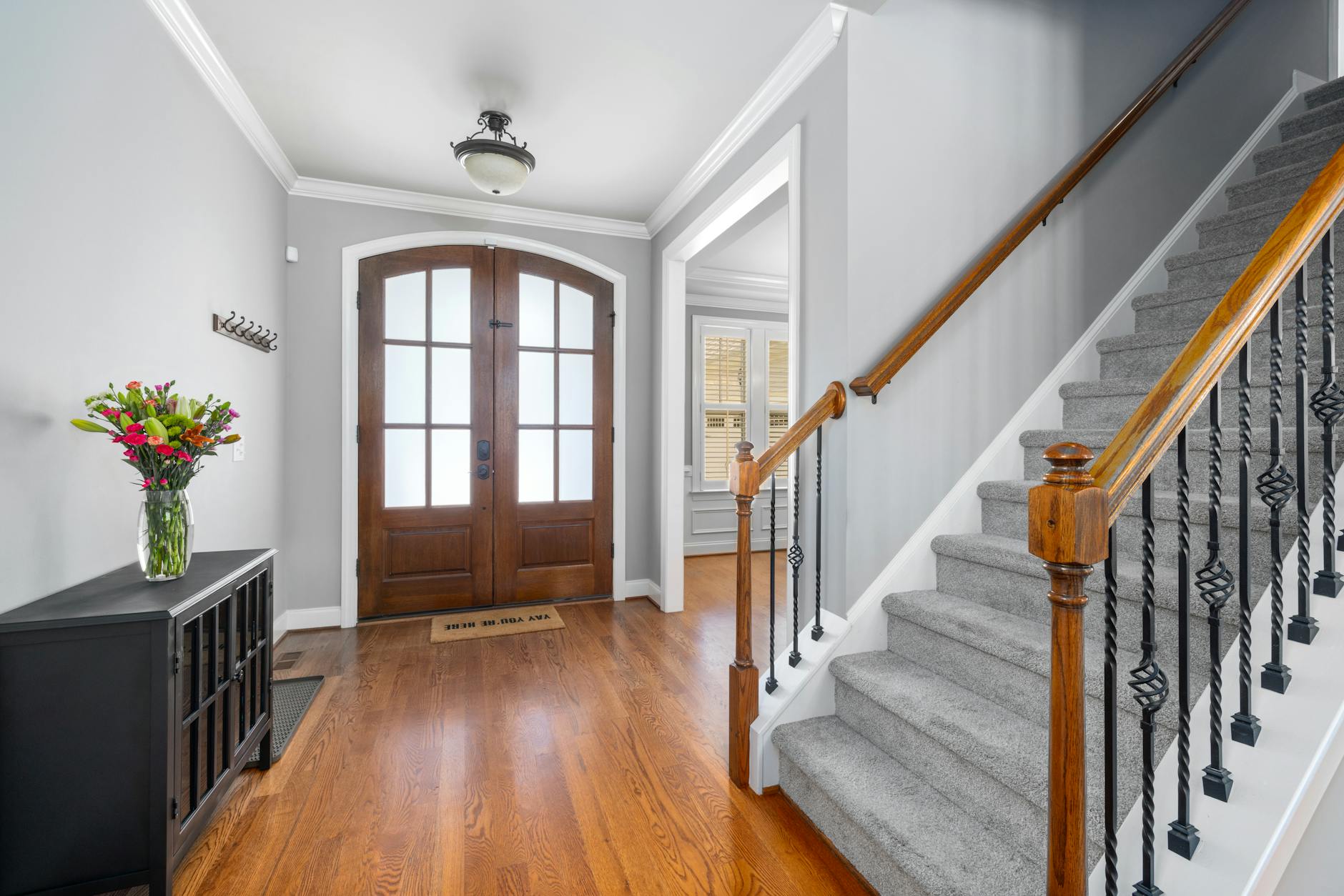
Ignoring the Entryway
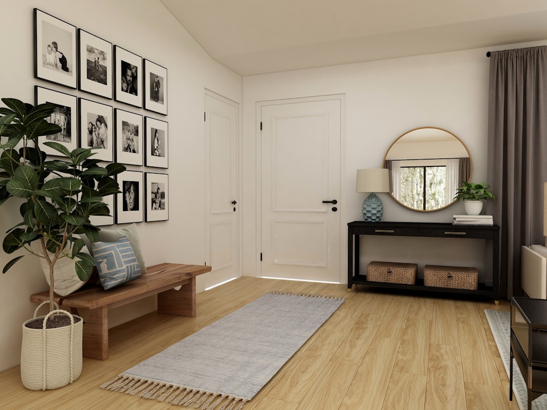
The entryway sets the tone for the entire home but is often treated as a dumping ground for shoes and mail. Failing to design this space with storage and style makes the home feel chaotic from the moment one enters. A console table with a mirror and a designated place for keys establishes order and beauty. Rugs in the foyer trap dirt and define the entry zone clearly. A well-considered entry welcomes guests and organizes daily life.
Sheer Window Treatments Only
Relying exclusively on thin sheer curtains can make a room feel unfinished and offer little privacy at night. Layering sheers with heavier drapes adds richness and allows for better light control throughout the day. Substantial fabrics help insulate the windows and improve the energy efficiency of the room. The contrast between the sheer and opaque fabrics adds texture and visual interest. Proper window dressing requires weight to frame the view effectively.
Pattern Overload
Mixing too many conflicting patterns without a unifying color palette creates a dizzying and anxious energy. Successful pattern mixing requires a balance of scale with large prints paired with smaller geometric designs. Solid colors are necessary to provide visual breaks and let the patterns stand out. A cohesive color thread must run through all the patterned elements to tie them together. Restraint ensures the room feels curated rather than thrown together haphazardly.
Dirty Windows
Grime and water spots on windows block natural light and make the entire home feel dingy from the inside out. Clean glass allows maximum sunlight to enter which naturally brightens the interior and highlights the decor. Regular window cleaning is a maintenance task that yields a high return on visual impact. Sparking windows blur the line between indoors and outdoors effectively. Neglecting the glass makes even expensive furnishings look dull.
Visible Grout Grime
Discolored or dirty grout lines in tiled areas can make a renovated bathroom or kitchen look old and unsanitary. Scrubbing grout or applying a grout pen can instantly refresh the look of the tile work. Clean lines emphasize the geometric pattern of the tile and make the floor look new again. Sealing grout prevents future staining and reduces the labor needed for cleaning. Attention to this detail signals a high level of home maintenance.
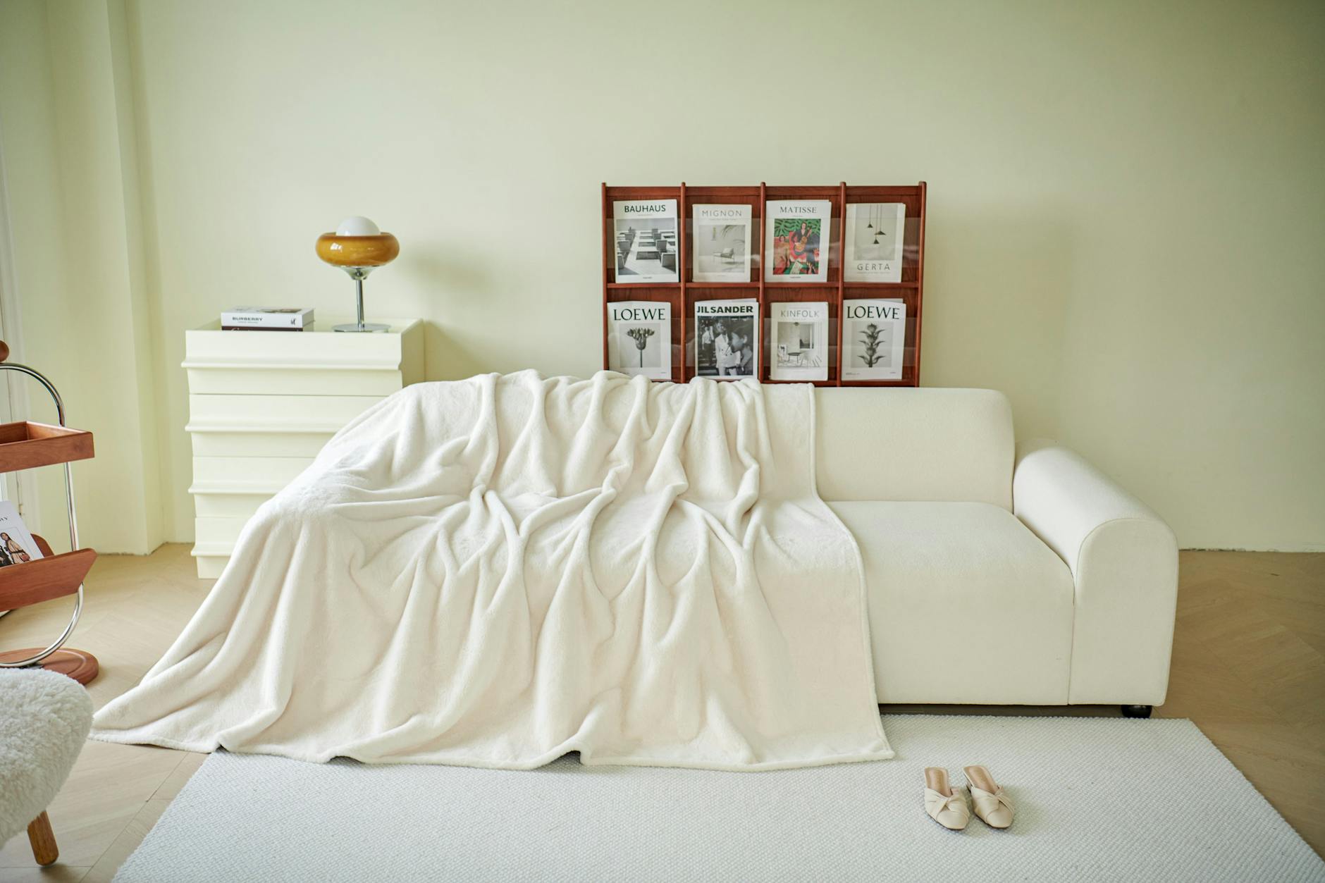
Cheap Fleece Blankets
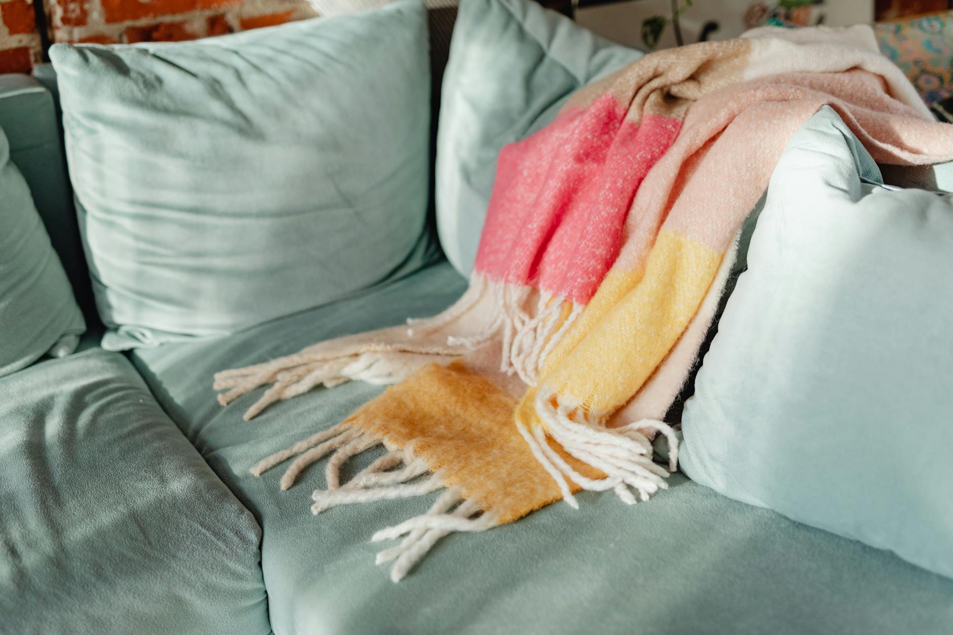
Thin fleece throws with finished edges often look cheap and pill easily after a few washes. Chunky knits or woven blankets in natural fibers like wool or cotton add sophisticated texture to a sofa. A high-quality throw serves as a decor element even when it is not in use. Drapery and weight are important factors in how a blanket looks when tossed over a chair. Investing in better textiles elevates the tactile experience of the living room.
Bowls of Potpourri
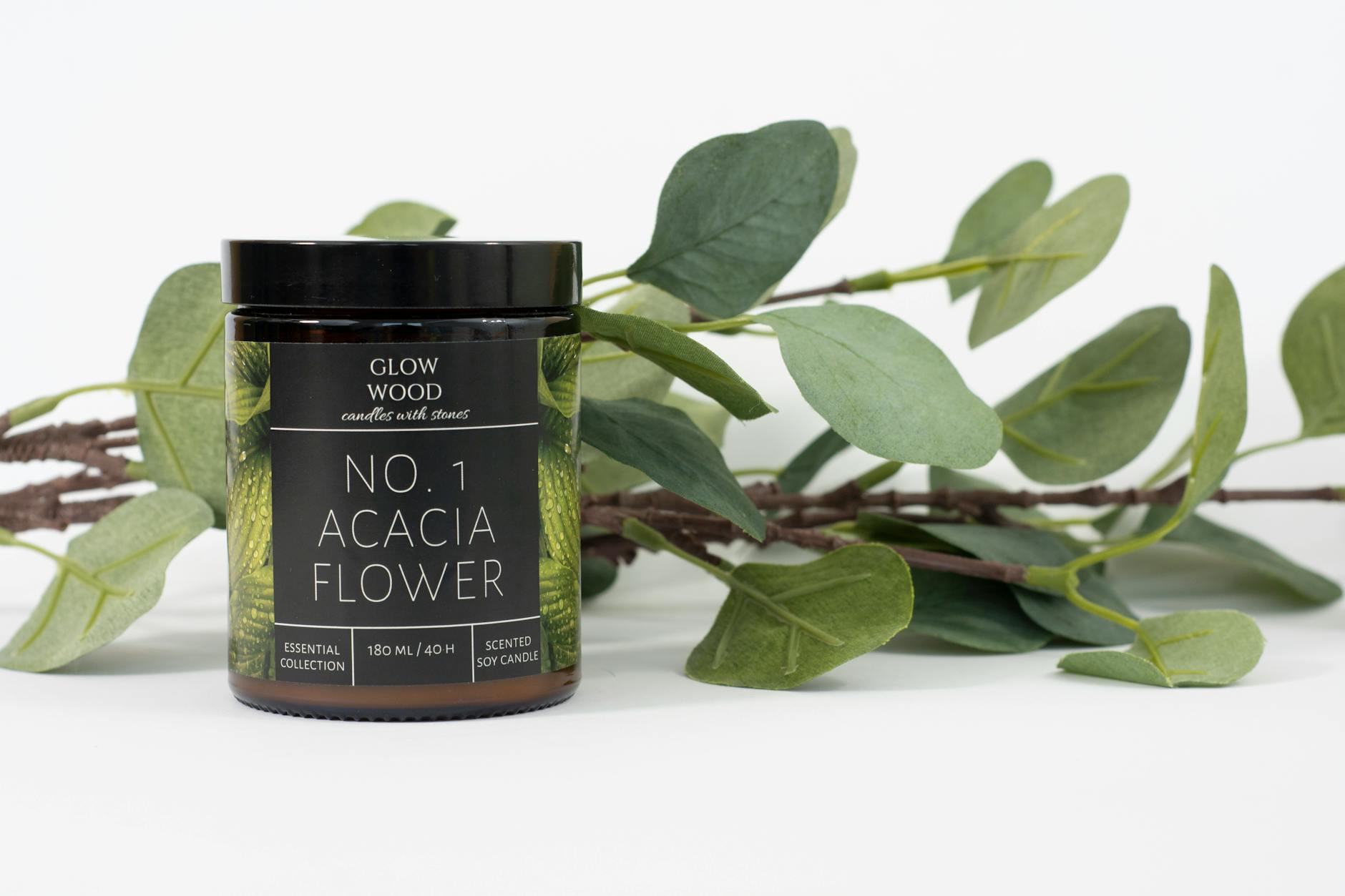
Dried flower petals heavily scented with artificial fragrances are a dated method of freshening a room. These bowls collect dust and often contribute to a musty smell rather than a fresh one. Scenting a home with natural soy candles or essential oil diffusers offers a more modern and subtle approach. Fresh flowers or eucalyptus provide a pleasant scent along with a visual upgrade. Clean air is preferable to masking odors with dusty dried florals.
Interior Welcome Mats
Using a rugged outdoor doormat inside the front door looks utilitarian and out of place in a polished interior. Indoor rugs should be softer and coordinate with the decor while still being durable enough for traffic. Relegating the heavy-duty scraper mats to the exterior keeps the dirt outside where it belongs. The transition from outside to inside should be marked by a shift in material quality. A beautiful runner or area rug sets a better tone for the foyer.
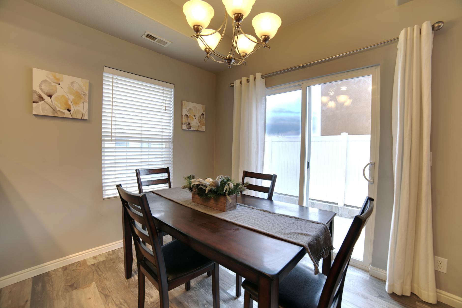
Naked Tables
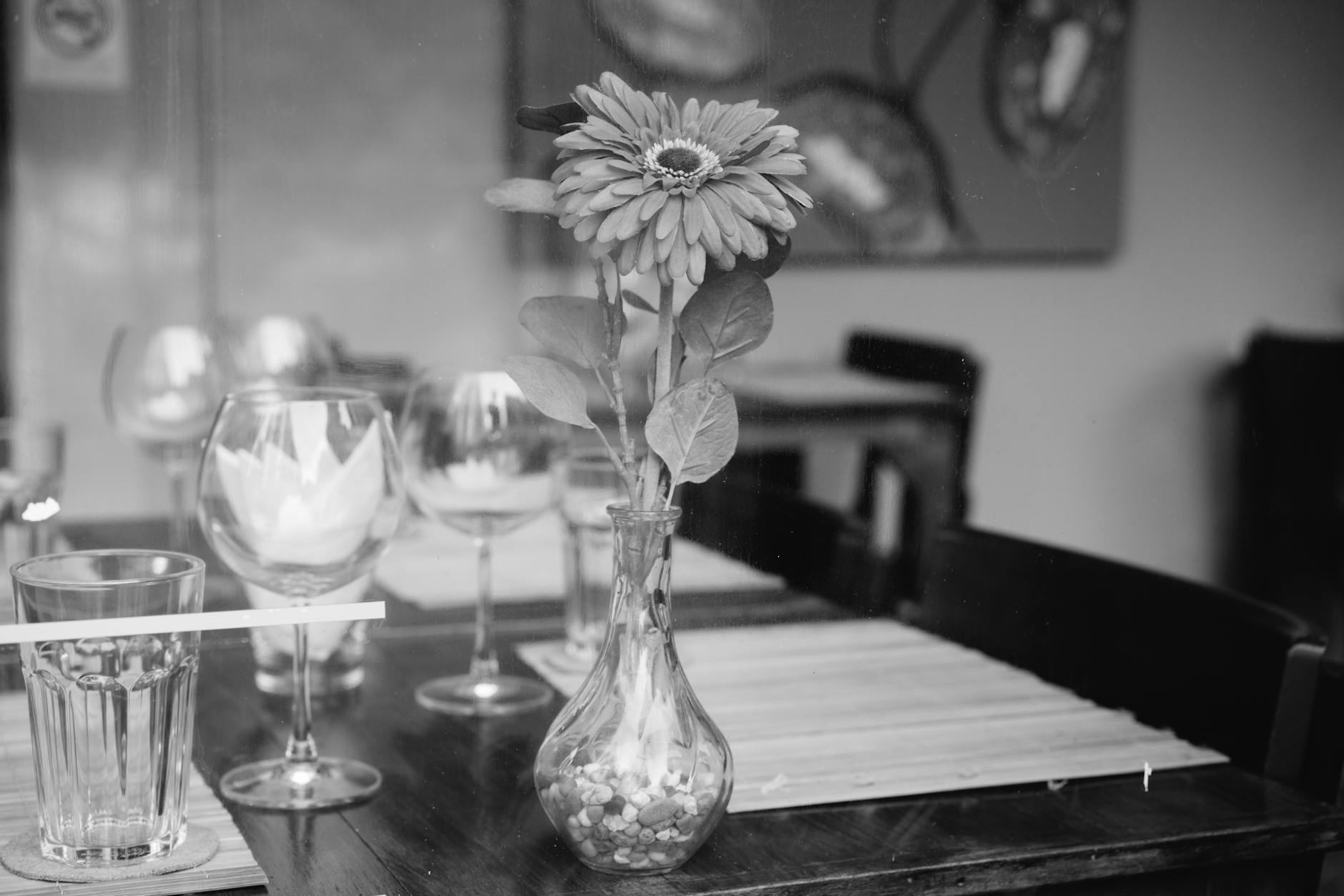
Dining tables that are completely bare can look stark and uninviting when not in use. A simple centerpiece or a table runner adds warmth and breaks up the large expanse of wood or glass. This does not require setting the table fully but rather adding a focal point. A large vase or a low bowl provides scale and interest to the furniture piece. Styling the table makes the dining room feel like an integrated part of the home.
Excessive Doilies
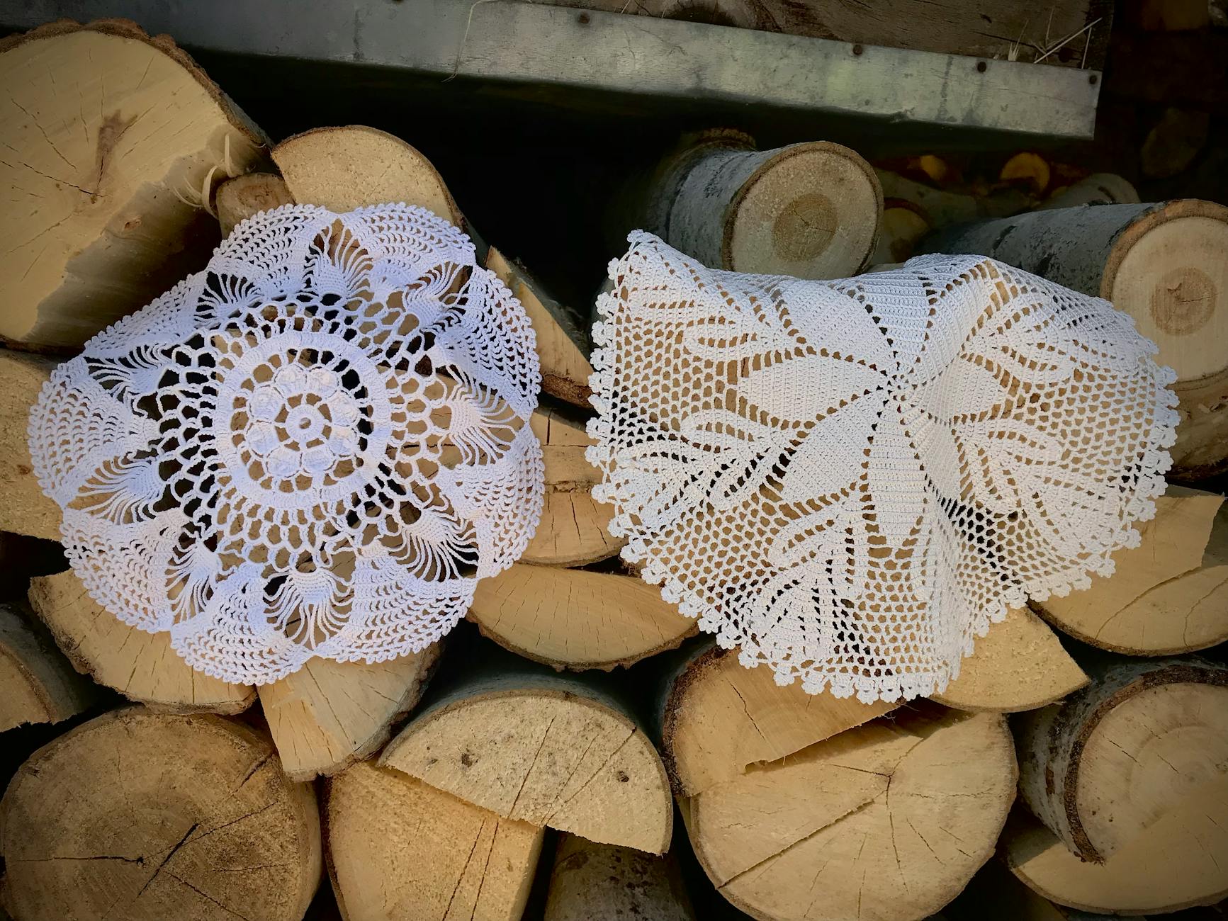
Lace doilies under every lamp and vase create a grandmotherly aesthetic that clashes with modern design sensibilities. These fabric pieces distract from the furniture and add unnecessary visual noise to surfaces. Removing them reveals the clean lines of the tables and simplifies the overall look. Felt pads can be used under objects to protect wood finishes without being visible. A cleaner surface allows the decor items to take center stage.
Keeping Broken Items
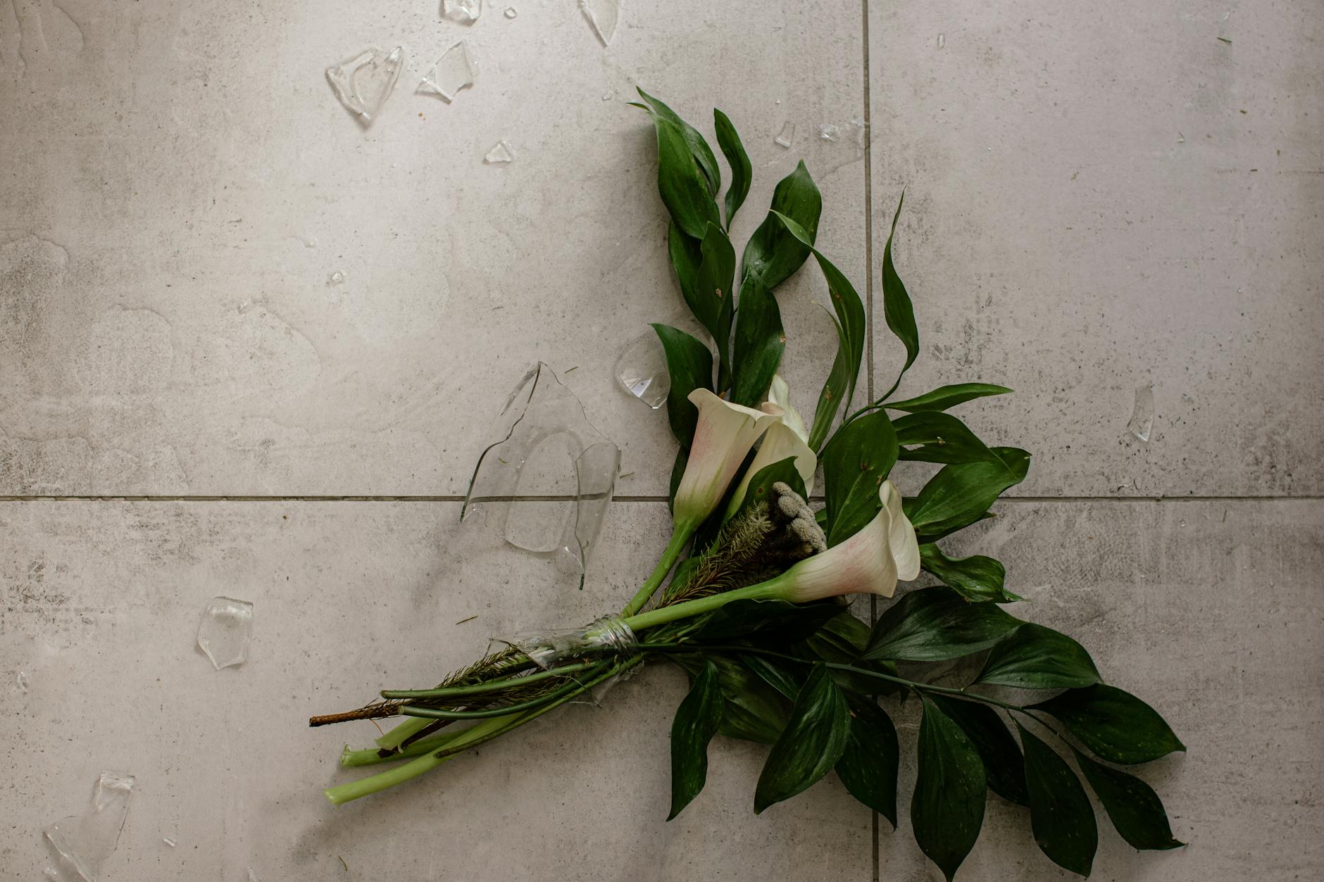
Displaying chipped vases or furniture with missing trim creates an impression of disrepair and neglect. Items that cannot be repaired should be removed to maintain the standard of the environment. Holding onto broken decor detracts from the pieces that are in good condition. A home feels more luxurious when everything in it functions correctly and looks whole. Editing out damaged goods is essential for a polished look.
Share your thoughts in the comments.