The color of your bedroom walls plays a far greater role in sleep quality than most people realize. Certain shades signal the brain to slow down, lower cortisol levels, and ease the body into a restful state. Choosing the right paint color is one of the simplest and most effective changes you can make to your sleep environment. These ten colors are consistently recommended by sleep experts and interior designers alike for their ability to create a calm and restorative atmosphere.
Soft Lavender
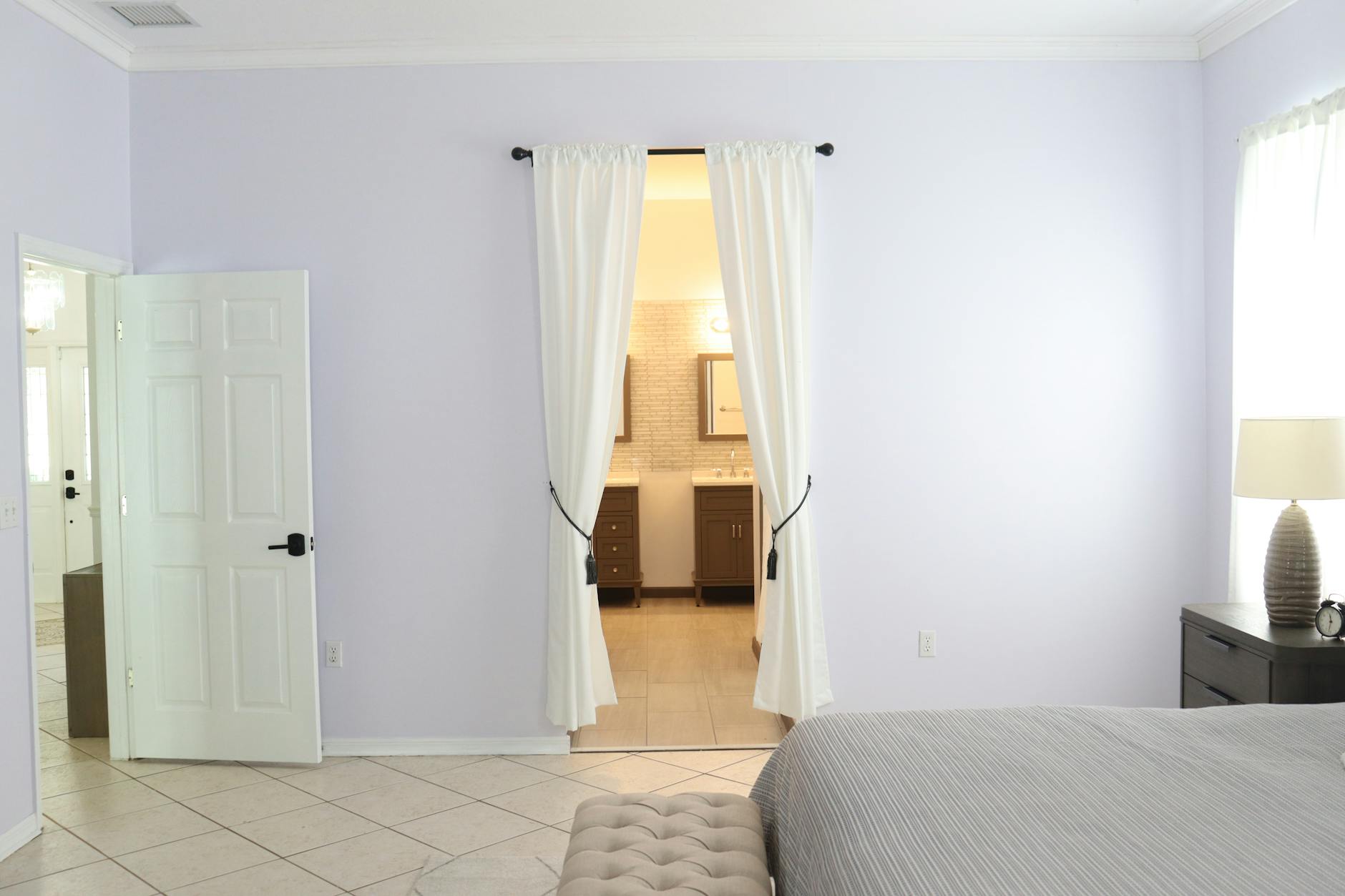
Lavender is one of the most universally recognized colors for promoting relaxation and restful sleep. Its gentle violet undertones have a mild sedative effect on the nervous system, helping to slow racing thoughts at bedtime. Studies in color psychology have consistently linked soft lavender walls to lower heart rate and reduced feelings of anxiety. The color pairs beautifully with white trim and natural wood furniture for a serene and cohesive look. A muted rather than bright lavender keeps the energy soft and conducive to winding down.
Dusty Blue
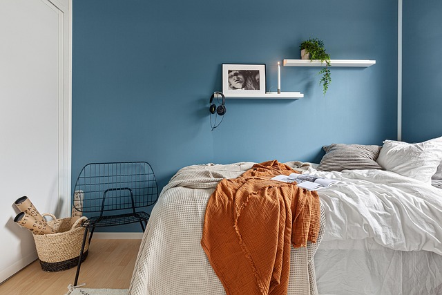
Dusty blue is widely regarded as one of the most sleep-friendly colors available on the paint spectrum. Its cool, muted tone mimics the calming visual quality of open skies and still water, both of which naturally lower mental stimulation. The color communicates tranquility without feeling cold or unwelcoming, making it ideal for bedrooms that also serve as a personal retreat. Dusty blue pairs well with warm neutral bedding and wooden accents to prevent the space from feeling too stark. Homeowners who switch to this shade frequently report falling asleep faster and waking up feeling more refreshed.
Warm Taupe
Warm taupe sits at the intersection of comfort and calm, offering a grounding neutral that feels inherently restful. Unlike stark white or cool grey, taupe carries earthy undertones that create a cocooning effect in the bedroom. It works with virtually any decor style and adds a sense of warmth without introducing stimulating energy. The color is particularly effective in rooms with limited natural light, where cooler shades might feel flat or uninviting. Its understated nature means the mind is not visually activated upon entering the room.
Sage Green
Sage green draws on the restorative qualities associated with nature, making it a powerful color choice for sleep spaces. The muted green tone connects the room to the visual calm of forests and meadows, triggering a gentle parasympathetic nervous system response. It works especially well in bedrooms that receive morning sunlight, as the natural light brings out its softer and more soothing qualities throughout the day. Sage pairs harmoniously with linen textures, rattan furniture, and terracotta accents for a grounded, organic feel. Its connection to the natural world makes it one of the most psychologically comforting colors available for interior spaces.
Pale Gray
Pale gray creates a neutral and visually quiet backdrop that allows the mind to decompress without distraction. Unlike brighter whites, pale gray absorbs the edges of a room and reduces the feeling of visual noise before sleep. It is a highly versatile base color that coordinates well with virtually any bedding palette or bedroom furniture. The key is choosing a shade with warm undertones rather than a stark or blue-based gray to maintain a sense of comfort. When paired with soft lighting, pale gray transforms a bedroom into a genuinely restful retreat.
Soft Peach
Soft peach introduces warmth into the bedroom without the stimulating energy associated with brighter or more saturated shades. Its gentle blush undertones create a nurturing atmosphere that many sleepers find deeply comforting and emotionally soothing. The color is particularly flattering in candlelight and warm lamp settings, which enhances the sense of relaxation during the evening wind-down period. Soft peach works well in smaller bedrooms where a lighter, warm-toned shade can make the space feel more expansive and inviting. It strikes an ideal balance between visual interest and restful calm.
Muted Terracotta

Muted terracotta brings the grounding energy of earth tones into the bedroom in a way that feels both sophisticated and deeply calming. When desaturated and lightened, terracotta loses its bold quality and instead reads as warm, enveloping, and restorative. The color is particularly effective in bedrooms styled with natural materials such as linen, jute, and unfinished wood. It encourages a sense of being settled and anchored, which is psychologically beneficial for those who struggle with restlessness at night. Choosing a dusty rather than vivid version of this shade is essential for preserving the sleep-friendly quality of the room.
Pale Blush Pink
Pale blush pink has gained significant recognition in sleep and wellness circles for its genuinely calming effect on the human nervous system. Research into color and aggression reduction identified the specific phenomenon of pink lowering feelings of tension and physical agitation, an effect observed even during short exposure. In a bedroom setting, the color creates a soft and enveloping atmosphere that is welcoming without being stimulating. It suits a wide range of decor styles from modern minimalist to classic romantic and flatters most natural and artificial lighting conditions. Its gentle femininity makes it a popular choice without being overpowering or distracting to the senses.
Warm Ivory
Warm ivory offers all the brightness of white without the clinical sharpness that can make a bedroom feel stark or overly alert. The subtle yellow and cream undertones add a layer of visual warmth that contributes to a sense of ease and comfort throughout the room. Ivory reflects light gently rather than aggressively, creating a soft glow in the evening that is far more conducive to sleep than pure white walls. It serves as an excellent base for layering in richer textures and tones through bedding, curtains, and accent pieces. Its timeless quality means it never feels trendy or jarring, keeping the room in a perpetual state of calm.
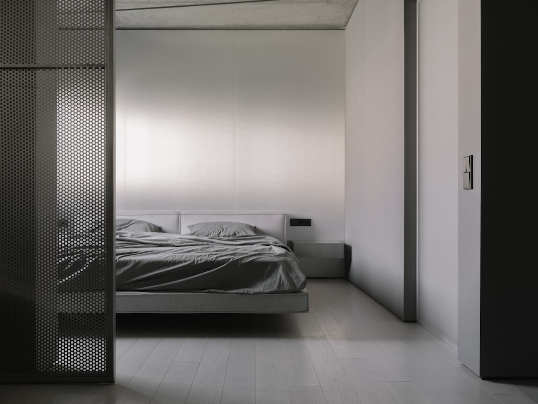
Soft Charcoal
Soft charcoal may seem counterintuitive as a sleep color, but when used correctly it creates one of the most deeply immersive and restful bedroom environments possible. The dark, enveloping tone absorbs light and minimizes visual distractions, encouraging the brain to shift quickly into a state of low alertness. It mimics the natural darkness that signals the body to produce melatonin, effectively reinforcing the sleep environment at a sensory level. The shade works best in bedrooms with warm-toned lighting and plush textiles to prevent the space from feeling oppressive. Those who have made the switch to soft charcoal walls often describe the experience of entering the room as immediately and noticeably calming.
Have you tried any of these colors in your bedroom? Share your experience in the comments.