Supermarkets are meticulously engineered environments designed to maximize consumer spending through psychological cues and strategic layouts. Every aspect of the store from the flooring to the lighting serves a specific purpose in guiding purchasing decisions. Shoppers often feel they are making rational choices while actually responding to subtle environmental triggers. Understanding these hidden tactics can help consumers stick to their budgets and avoid unnecessary impulse buys.
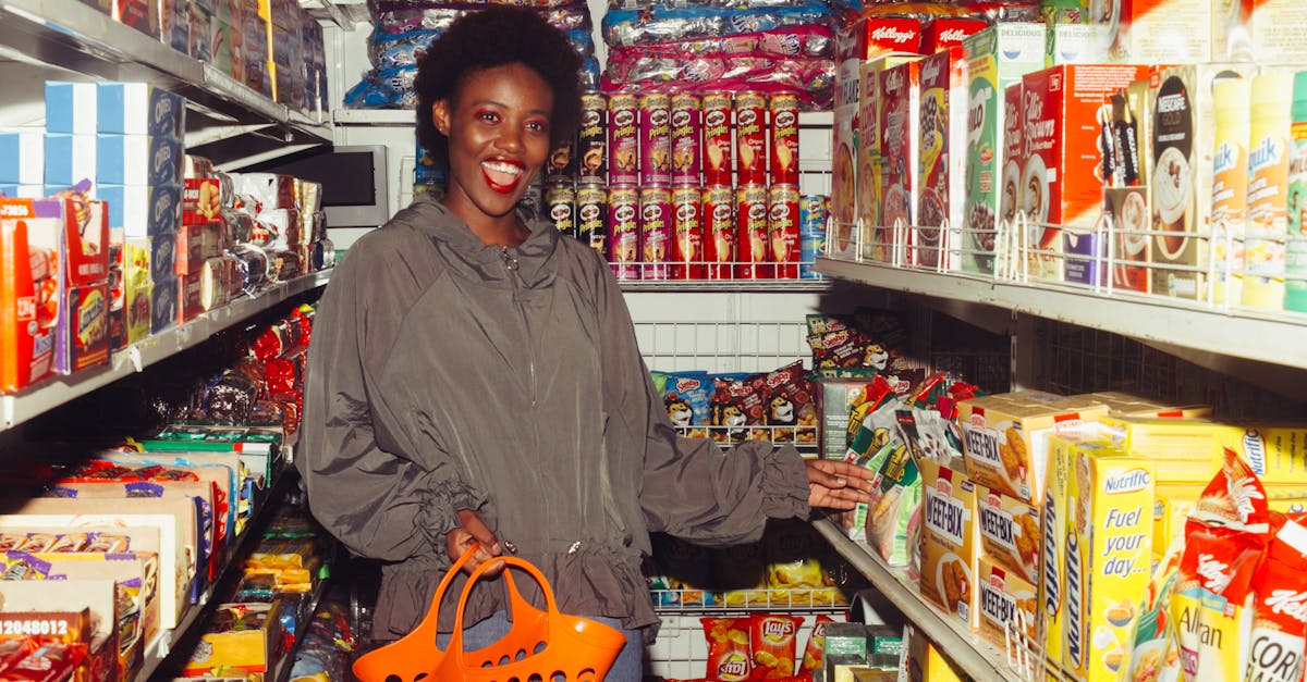
Oversized Shopping Carts

Retailers provide significantly larger carts than necessary to subconsciously encourage customers to fill the empty space. A mostly empty cart creates a psychological sense of incompleteness that shoppers feel compelled to resolve by adding more items. Studies suggest that doubling the size of a shopping cart can lead customers to purchase significantly more than they originally intended. This visual trick leverages the human desire for abundance and makes large hauls feel normal rather than excessive.
The Floral Welcome

Supermarkets frequently position the floral department right at the main entrance to greet customers with bright colors and fresh scents. This sensory stimulation immediately triggers a positive emotional response and boosts the mood of the shopper before they begin their task. A happy consumer is statistically more likely to spend freely and be open to impulse purchases throughout the store. The perception of freshness established here creates a halo effect that extends to the processed foods in the inner aisles.
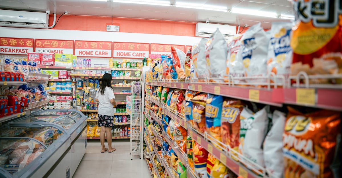
Essentials at the Back

Staple items like milk and eggs are almost always located in the furthest corners of the store layout. This placement forces shoppers to walk past thousands of other tempting products just to reach the necessities on their list. The long journey increases the likelihood of impulse purchases as customers navigate through aisles filled with promotions and displays. Retailers count on the fact that visual exposure triggers latent desires for items that were not originally planned.
Eye-Level Placement

Brands pay a premium specifically to have their products placed at the eye level of the average adult shopper. This prime real estate is known as the buy level because it requires the least amount of effort to see and grab. Cheaper generic alternatives are usually relegated to the very bottom or top shelves where they are harder to locate. This vertical hierarchy ensures that the most profitable items are the first ones a customer considers.
Kid-Level Temptations
Marketing teams design planograms that place sugary cereals and toys on lower shelves to catch the wandering eyes of children. Colorful mascots on packaging often gaze downward to make direct eye contact with kids riding in shopping carts. This strategy relies on the pester power phenomenon where children demand specific items from their parents. Exhausted guardians often succumb to these requests to avoid a public tantrum in the aisle.
The End Cap Display

The shelving units at the end of aisles are highly coveted spaces used to showcase high-margin items or promotional deals. Shoppers are conditioned to believe that products on end caps are currently on sale or offer exceptional value. In reality the items placed here are often regular price or positioned to move excess inventory quickly. The prominent visibility disrupts the flow of traffic and draws attention away from the standard aisle selection.
Slow Music Tempo
Stores play background music with a slower beat to subconsciously encourage shoppers to move at a more leisurely pace. A relaxed walking speed leads to more time spent in the store and a closer examination of the shelves. Research indicates that slower music can significantly increase the gross sales volume compared to faster tracks or silence. This auditory cue works in the background to alter the physical behavior of the crowd.
Missing Clocks and Windows
Supermarkets share a design tactic with casinos by removing time references to keep people immersed in the consumption environment. The absence of windows and clocks separates the shopper from the outside world and the passage of time. This temporal distortion allows customers to browse without feeling the pressure of their next appointment or the setting sun. The goal is to create a suspended reality where the only focus is on the products available for purchase.
The Checkout Gauntlet

The checkout lane is the final hurdle designed to break down consumer resistance with an array of small and rewarding items. Candy bars and magazines capitalize on decision fatigue after a long shopping trip has depleted willpower. These low-cost items seem insignificant in price compared to the total cart value and are easy to grab while waiting. Retailers make high profits on these last-minute gratification purchases that require zero planning.
Free Samples

A smiling employee handing out a free piece of cheese or meat triggers a deep psychological instinct known as reciprocity. When someone does something nice for us we feel an internal obligation to return the favor. This social pressure often results in the customer buying the full product even if they did not originally want it. Samples also engage the sense of taste and smell to whet the appetite and increase overall hunger levels.
Produce Misting Systems

Automatic misting machines spray water on fresh vegetables to give them a glistening and healthy appearance. The water reflects light to make the colors pop and creates an illusion of garden-fresh quality. This moisture adds significant water weight to produce that is sold by the pound. The periodic sound of the misting spray also draws attention to the high-margin produce section.
Multi-Buy Promotions

Signs that advertise ten items for ten dollars trick the brain into thinking the full volume must be purchased to get the deal. In many cases the individual item price is exactly the same whether you buy one or ten. This phrasing anchors the number ten in the mind of the shopper and boosts the quantity added to the cart. It exploits the fear of missing out on a perceived bulk discount.
Cross-Merchandising

Retailers place complementary items next to each other to suggest a usage occasion that drives add-on sales. You might find boxes of vanilla wafers hanging directly in front of the banana display or salsa jars next to the tortilla chips. This convenient grouping reminds shoppers of ingredients they might need to complete a snack or meal. It saves the customer a trip to another aisle while guaranteeing an extra sale for the store.
Warm Lighting

Lighting specialists use specific color temperatures in different departments to enhance the visual appeal of the food. The meat department typically uses reddish lighting to make beef look fresh and vibrant rather than brown or gray. Bakeries use golden lighting to emphasize the warm tones of bread and pastries. These subtle adjustments manipulate perception to make food look more appetizing than it would under standard fluorescent bulbs.
Loss Leaders

Stores advertise staple items like turkey or milk at a price lower than their cost to draw massive crowds into the building. Once shoppers are inside to buy the cheap item they inevitably purchase high-margin sides and snacks. The retailer accepts a small loss on one product to secure the total profit from the entire shopping trip. This tactic is especially prevalent during major holidays or seasonal events.
Artificial Scarcity
Signs that limit purchases to a specific number per customer create a sense of urgency and perceived value. The restriction suggests that the deal is so good that the store is in danger of running out of stock. Shoppers often buy the maximum limit allowed simply because the constraint makes the item seem desirable. This reverse psychology turns a standard promotion into a must-have acquisition.
Frequent Layout Changes
Supermarkets periodically rearrange their aisles to disrupt the habitual routines of their regular customers. When a shopper can no longer find their favorite coffee on autopilot they are forced to scan the shelves again. This renewed search exposes them to new products and promotions they would have otherwise ignored. The confusion is intentional and serves to increase the time spent looking at inventory.
Loyalty Card Tracking

Store loyalty programs track purchasing habits to build a detailed profile of consumer behavior and preferences. Retailers use this data to send targeted coupons that are designed to trigger a specific trip to the store. The perceived savings from the card gamify the shopping experience and encourage brand loyalty. These programs ensure that the store remains the primary destination for the household budget.
Pre-Cut Convenience

The convenience of sliced fruit and vegetables commands a massive markup compared to the whole raw ingredients. Stores capitalize on the desire to save time by charging significantly more for the labor of chopping and packaging. The plastic containers also preserve the modified atmosphere to keep the cut fruit looking fresh for longer. Shoppers pay a premium for this service that requires zero effort in their own kitchens.
Bulk Bin Illusion

Scooping items from a large bin creates a tactile experience that gives an illusion of savings and wholesomeness. Shoppers often assume that avoiding packaging means the price per pound is lower than the boxed alternatives. Price comparisons frequently reveal that bulk items can actually be more expensive than pre-packaged goods. The lack of clear branding makes it difficult to compare value directly at a glance.
Odd Pricing Strategy

Prices ending in nine make a product feel significantly cheaper than it actually is due to the left-digit bias. A price of four dollars and ninety-nine cents is processed by the brain as four dollars rather than five. This small psychological gap is enough to make a price point seem acceptable to a hesitant buyer. It effectively lowers the barrier to entry without significantly reducing the retailer’s margin.
Color Psychology

The color red is universally associated with urgency and stopping power which is why it is used for sale signs. Yellow captures attention and is often used to signal clarity and low costs in budget aisles. Retailers use these color associations to direct the eye toward specific promotions and high-priority stock. The visual landscape is color-coded to influence the emotional state of the buyer.
The Decoy Effect

Stores often present three size options where the medium size is priced very close to the large size. This pricing structure makes the medium option look like a bad deal and the large option look like incredible value. The medium size exists primarily as a decoy to push customers toward the most expensive option. Shoppers feel smart for choosing the large size even though they are spending more money.
Artisanal Packaging
Buzzwords like natural or artisan are used on packaging to justify higher price points for standard ingredients. Brands use matte finishes and handwritten-style fonts to convey a sense of small-batch quality. These aesthetic choices differentiate products that are chemically very similar to generic alternatives. Consumers willingly pay more for the story and lifestyle image that the packaging projects.
Shelf Wobblers

Little plastic signs that stick out from shelves break the visual monotony of the aisle to grab attention. These agitators physically interrupt the line of sight and force the shopper to focus on a specific brand. They often highlight a new product launch or a temporary discount to stimulate interest. The motion of the sign creates a dynamic element on an otherwise static shelf.
Flooring Texture Changes
Some stores install smaller floor tiles in expensive aisles to make the shopping cart wheels click more rapidly. This sound tricks the shopper into thinking they are moving too fast and causes them to instinctively slow down. Slowing the physical pace allows more time for the eyes to scan the premium products on display. It is a subtle environmental brake that modulates traffic flow.
Removing Currency Signs
High-end grocery sections sometimes remove the dollar sign from shelf tags to reduce the psychological pain of paying. Seeing just a number makes the price feel abstract and separates it from the concept of hard currency. This tactic focuses attention on the product attributes rather than the financial cost. It is a technique borrowed from fine dining menus to encourage higher spending.
Narrow Aisles

Certain store sections create bottlenecks intentionally to force customers to stop and wait for others to pass. While stopped the shopper has no choice but to look at the adjacent products and displays. This forced pause increases the dwell time in specific high-margin zones of the store. It turns traffic congestion into an opportunity for additional product exposure.
Instant Coupons

Peel-off stickers attached directly to products give a dopamine hit of savings that encourages the immediate purchase. The physical act of peeling the coupon makes the shopper feel involved and lucky to have found the deal. It creates an immediate discount that rewards the decision to buy the item right now. This tactile interaction creates a stronger commitment to the purchase than a digital discount.
Weighted Freezer Doors
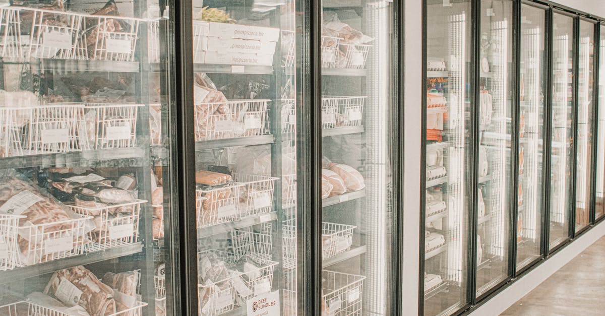
Freezer doors are often heavy and weighted to create a sense of solidity and quality when opened. The effort required to open them subconsciously encourages the shopper to grab what they need quickly or stay committed. Once the door is open the cold air creates a physical sensation that demands attention. The design keeps customers paused in front of the frozen selection for just a moment longer.
Please describe in the comments which of these marketing tricks you have noticed during your weekly grocery run.