The window treatment decisions in most homes are made by guesswork, retail suggestion, or the vague memory of something that looked appealing in a showroom, and the results consistently betray that process. Professional interior designers apply a set of precise, counterintuitive, and rarely publicized rules to every window they dress, rules that explain why the same curtain panel that looked stunning in a design magazine looks deflated and wrong in a real living room. The gap between amateur and professional window treatment results is almost never about budget and almost always about the application of specific technical knowledge that the industry has little commercial incentive to distribute freely. Understanding these rules changes not just how a window looks but how the entire room reads spatially, tonally, and architecturally. Here are 24 bizarre window treatment rules that interior professionals apply consistently but rarely share, ordered from the most transformative to the subtly essential.
Curtain Height
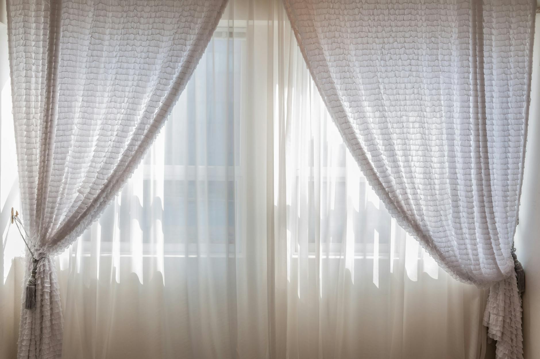
Professional designers almost universally mount curtain rods at ceiling height or within two to four inches of the ceiling cornice regardless of where the actual window frame ends, a practice that strikes most homeowners as excessive until they see the spatial result. The vertical distance between the top of the window frame and the ceiling is a dead zone that, when included within the curtain’s visual territory, adds perceived ceiling height and wall scale in a way that no paint color or furniture arrangement can replicate. Retailers and big-box home stores display curtains mounted at or just above the window frame because that installation requires the shortest and therefore least expensive rod hardware, which creates a commercially convenient but spatially damaging visual norm. The ceiling-mount rule applies regardless of window size, room scale, or curtain style because the architectural benefit operates independently of those variables. Designers who work on budget renovations consistently identify rod repositioning from frame height to ceiling height as the highest-impact zero-cost improvement available in most residential rooms.
Puddle Length

The deliberate floor puddle, in which curtain fabric extends between two and six inches beyond the floor and pools softly at the base, is a rule applied by professional designers to formal living spaces, primary bedrooms, and dining rooms where a sense of luxury, permanence, and architectural weight is the intended effect. The puddle length communicates that the curtain was made for the exact space it inhabits rather than purchased from a standard size range and hemmed to clear the floor, which is the visual story that a precisely floor-grazing curtain tells. Most homeowners avoid puddle lengths out of practical concerns about dust and cleaning but designers working on high-end residential projects treat these concerns as secondary to the spatial and tonal benefit the puddle delivers. The amount of puddle required varies by fabric weight with heavier linens and velvets requiring a shorter puddle of two to three inches while lighter silks and sheers can carry a more generous trail of four to six inches without appearing unkempt. The puddle rule is reserved for rooms where the curtains are primarily architectural and decorative rather than operationally opened and closed multiple times daily.
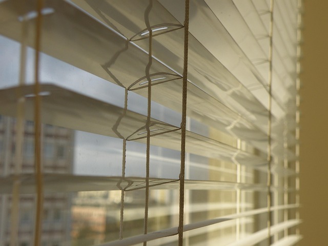
Fabric Stack Width

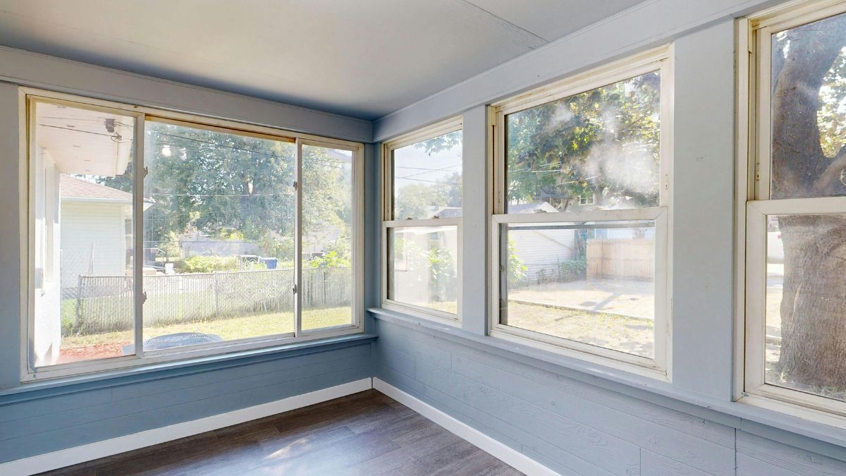
The stack width rule specifies that when curtain panels are fully open they should stack back onto the wall surface beside the window rather than onto the window glass itself, which requires the rod to extend far enough beyond the window frame on each side to accommodate the full compressed width of the panel. Most homeowners install rods that extend four to six inches past the frame while professional designers extend them ten to sixteen inches per side for standard fabric weights, ensuring that the view and light from the window are completely unobstructed when the panels are drawn back. A curtain that stacks partially onto the glass when open reduces the effective window area by a significant margin and makes the room feel smaller and darker than the window’s actual dimensions would suggest. The stack width calculation is done before rod purchase and requires knowing the compressed width of the chosen panel at its specific fullness ratio, a calculation that retail environments never walk customers through. The visual difference between a window with correct stack clearance and one without is dramatic and immediately perceptible even to untrained observers.
Pattern Scale Matching

Interior professionals match curtain pattern scale to room volume rather than to window size or furniture pattern, selecting large-scale patterns for rooms with high ceilings and generous floor area and reserving small-scale patterns for compact rooms where a large repeat would read as chaotic rather than bold. The pattern scale rule operates on the principle that visual pattern creates a spatial texture and the density of that texture should match the room’s capacity to absorb it without becoming visually overwhelming or, conversely, so fine as to disappear into indistinction at normal viewing distance. A small geometric print that looks refined and elegant on a fabric sample in a store reads as visual noise on a floor-to-ceiling panel in a large room with ten-foot ceilings. Designers also apply the pattern scale rule in reverse by using deliberately oversized prints in small rooms as a visual expansion technique that disrupts the eye’s ability to accurately read the room’s dimensions. The repeat height of a pattern is the specific metric used in professional pattern scaling with repeats above twelve inches reserved for rooms with ceiling heights above nine feet.
Lining Rules
Every curtain panel installed in a professionally designed room is lined, without exception, regardless of the fabric’s weight, opacity, or the room’s light requirements. The lining rule exists because unlined curtains hang differently, move differently in air currents, read as flat and insubstantial from both inside and outside the home, and deteriorate from sun exposure at a rate that makes them a poor investment regardless of the original fabric cost. Professional designers use a minimum of standard cotton lining for every panel and upgrade to blackout lining, interlining, or thermal lining based on the room’s functional requirements layered on top of the baseline aesthetic requirement that the lining rule addresses. An interlined curtain, which has a layer of bump interlining sandwiched between the face fabric and the lining, hangs with a fullness and weight that makes even an inexpensive fabric read as luxurious and considered. Home retailers sell unlined panels as a standard and affordable option without communicating that lining transforms the panel from a fabric rectangle into a functioning architectural element.
Rod Diameter Proportion

The diameter of the curtain rod is selected in proportion to the visual weight of the curtain fabric rather than to the width of the window or the weight load the rod must carry, with heavier and more voluminous fabrics requiring thicker and more visually substantial rods and sheer or lightweight fabrics paired with thinner and more refined rod profiles. A standard one-inch rod beneath a heavy velvet or wool curtain reads as visually undersupported and creates a subliminal sense of structural inadequacy that registers as a design flaw even when its specific cause goes unidentified. Conversely a thick ornate two-inch rod supporting a delicate sheer panel overwhelms the fabric and shifts the visual hierarchy of the window treatment toward the hardware rather than the textile. Professional designers treat rod selection as a proportional design decision equivalent to selecting the correct scale of furniture leg for an upholstered piece, applying the same logic of visual support and mass relationship. Rod finials are selected on the same proportional basis with oversized decorative finials reserved for rooms where the rod itself is an intended design feature rather than a recessive supporting element.
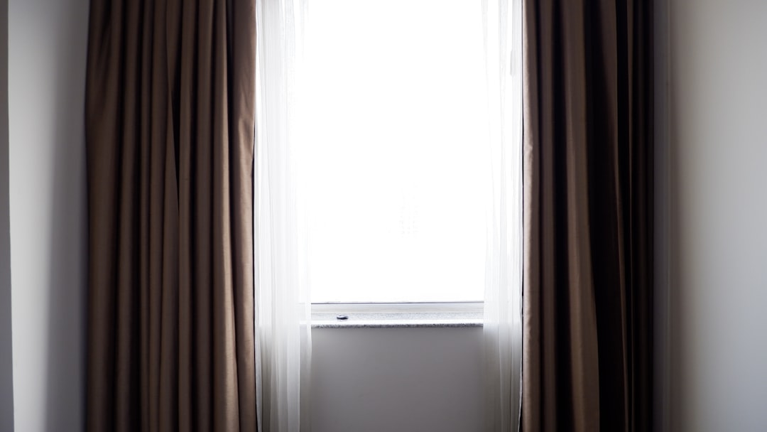
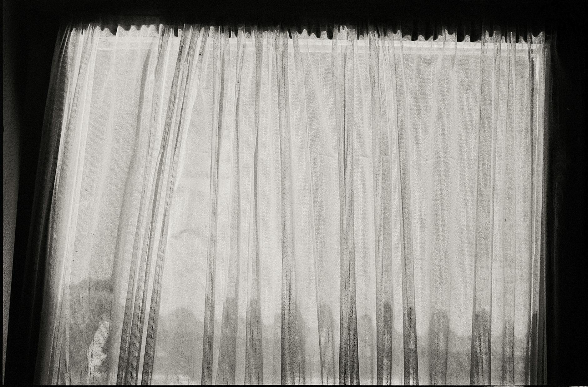
Sheer Layering
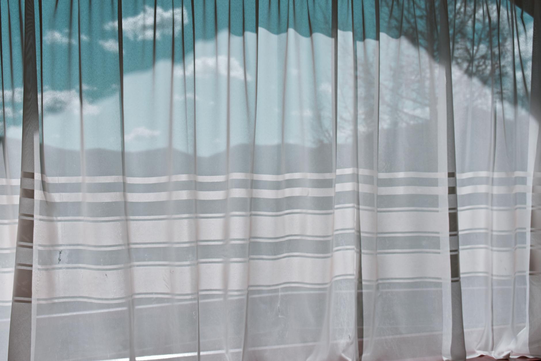
Professionals layer sheer curtains beneath opaque panels as a standard window treatment construction rather than treating sheers as a standalone or budget alternative to full panels. The sheer layer diffuses direct sunlight into a soft ambient glow during the day while the opaque layer provides full privacy and darkness control when drawn, giving the window treatment a functional range that neither layer alone can provide. The sheer is always hung on a separate rod or track positioned between the window glass and the opaque panel, allowing each layer to be operated independently and creating the depth and dimensionality that single-layer treatments lack. Designers select sheer fabric weights and weave densities specifically for the orientation of the window being dressed, with south and west-facing windows requiring denser sheers to manage the intensity of direct afternoon sun. The layered window treatment reads architecturally as a complete and finished element in a way that a single panel or a sheer alone never achieves regardless of the quality of the individual components.
Color Temperature Alignment

Curtain fabric color is selected to align with the dominant color temperature of the light entering the room at the time the room is primarily used rather than to match or complement the fixed elements of the room under artificial lighting conditions. A north-facing room that receives cool blue-toned daylight requires warm ivory, amber, or warm white curtains to counteract the light’s natural color cast and prevent the room from reading as cold and unwelcoming during the day. South-facing rooms bathed in warm golden light can carry cooler linen tones and soft grays that would appear flat and cold in a north-facing equivalent. Professional designers assess every window treatment decision in the actual light conditions of the room at the room’s primary use time rather than in a showroom or under artificial store lighting. The color temperature alignment rule is consistently violated in retail environments where fabric samples are evaluated under standardized commercial lighting that bears no relationship to the specific light conditions of the room being designed.
Hardware Visibility

Interior professionals make a deliberate decision about whether the rod and hardware of a window treatment should be visible as a design feature or visually recessive and supporting, and they never allow the hardware to occupy an ambiguous middle ground where it is neither intentionally prominent nor successfully hidden. When hardware is intended to be visible it is selected in a finish and profile that contributes actively to the room’s material palette, with brass hardware in rooms with warm metal accents, matte black in rooms with industrial or contemporary references, and unlacquered metals in rooms where patina and organic material quality are design priorities. When hardware is intended to recede it is mounted within a deep return that prevents it from being visible from the front of the panel, the rod is wrapped in the same fabric as the panel, or a ceiling-mounted track system is used that disappears entirely above the panel heading. The ambiguous hardware installation, in which a standard silver or chrome retail rod is mounted without intentional consideration of its visual role, is one of the most common and identifiable markers of an amateur window treatment installation. Hardware finish is always decided after the room’s metal accents are established rather than before.
Roman Blind Stacking
Professional designers specify the stack height of a Roman blind as a critical measurement that must be confirmed before fabric selection rather than after, because the stacked blind at its fully raised position occupies a defined height at the top of the window that can block light, obscure architectural details, or interrupt the visual proportions of the window opening depending on the fabric weight and the number of folds. A Roman blind made in a heavy linen will stack to a significantly greater height than the same blind made in a medium-weight cotton, which will in turn stack higher than a fine weave, and the stack height must be factored into the mounting position to ensure that the raised blind clears the glass entirely. Designers who ignore the stack height calculation frequently produce installations where the blind at its fully raised position blocks the upper quarter of the window glass, permanently reducing the light and view even when the blind is nominally open. The stack height rule also influences the choice between an inside mount and an outside mount installation, with outside mounting preferred when the calculated stack height would encroach significantly on the glass area in an inside mounted configuration. Stack height is calculated from the fabric weight specification and the number of folds programmed into the blind’s construction before fabrication begins.
Heading Fullness Ratios
The fullness ratio of a curtain heading, which is the ratio of the flat fabric width to the finished installed width, is specified by professional designers at a minimum of two to one and more commonly at two and a half to one for most heading styles, meaning the fabric used is between two and two and a half times the width of the space the curtain covers when installed. Retail curtain panels are almost universally manufactured at a one and a half to one fullness ratio or below because the reduced fabric quantity lowers production costs while fitting the price expectations of the mass market. The visual difference between a curtain at standard retail fullness and one at professional fullness specification is the difference between flat fabric hanging at a window and a genuinely sculptural and architecturally present textile element. A pencil pleat heading at one and a half times fullness hangs in limp, unconvincing folds that expose the backing between pleats while the same heading at two and a half times fullness produces a dense and uniform pleat structure that holds its form and moves fluidly. The fullness ratio is the single specification that most consistently explains the gap between curtains that look expensive and those that look cheap regardless of the fabric’s actual cost.
Blackout Layer Positioning

When blackout functionality is required, professional designers never use blackout fabric as the face fabric of the curtain panel, instead specifying a separate blackout roller blind or blackout lining positioned behind a face fabric chosen entirely on its aesthetic merits without compromise to its visual qualities. Blackout fabrics have a characteristic stiffness, sheen, and drape behavior that is incompatible with the soft and flowing qualities that make curtain fabric architecturally effective regardless of their color or pattern. The separation of the blackout function into a dedicated layer preserves the aesthetic integrity of the face fabric while providing complete light control from a separate operationally independent element. Designers also position the blackout layer as close to the glass as physically possible to prevent light transmission through the side gaps that occur when a blackout blind is mounted too far from the glass plane. The blackout layer positioning rule is routinely violated in retail environments where blackout curtain panels are sold as a single product combining aesthetic and functional requirements in a fabric that serves neither purpose optimally.
Tassel and Trim Scale

Decorative trim including tassel fringe, bullion fringe, ribbon borders, and leading edge banding is selected at a scale that is proportional to the panel’s drop length rather than to the heading style or the furniture scale in the room. A tassel fringe with a three-inch drop applied to a floor-to-ceiling panel reads as a delicate accent while the same trim on a short café curtain overwhelms the panel’s proportions completely. Professional designers calculate trim scale as a percentage of panel drop, typically selecting trims whose depth falls between three and five percent of the total panel length for most applications. The leading edge trim rule also specifies that banding and border treatments are applied to the leading edge of the panel only and never to the heading or hem, which would interrupt the vertical reading of the panel and create a framing effect that conflicts with the curtain’s role as a soft architectural element. Trim selection is always the final specification made after panel dimensions, fabric, and heading are confirmed because trim proportions cannot be accurately assessed in isolation from the completed panel dimensions.
Inside Mount Reveal

When specifying a blind or shade for inside window mount installation, professional designers require a minimum reveal depth of two and a half inches between the front face of the mounted blind and the plane of the surrounding wall or architrave. An inside mount installation with insufficient reveal depth produces a blind that appears compressed into the window opening and reads as undersized regardless of its actual dimensions, while an adequate reveal allows the blind to read as a deliberate and confident design element within the window architecture. The reveal depth also affects the operational clearance of the blind mechanism and determines whether the blind can be raised fully without the roller or headrail making contact with the window glass. Designers who inherit existing window architectures with shallow reveals typically specify outside mount installations rather than compromise the visual integrity of the treatment with an inside mount that lacks adequate depth. The minimum reveal specification is confirmed by physical measurement before fabrication is ordered and never estimated from visual assessment alone.
Cord and Control Placement
The operating controls of every window treatment including cords, wands, chains, and motorized switches are positioned on the side of the window closest to the room’s primary entry point so that the treatment can be adjusted upon entering the room without crossing the room or reaching behind furniture. This placement rule is a functional ergonomics standard in professional installation that is almost universally ignored in retail and amateur installation where controls end up positioned on whichever side happens to be more convenient during installation. A curtain cord or blind chain positioned on the far side of the window from the entry point creates a habitual friction that reduces the likelihood of the treatment being adjusted and results in fixed positions that defeat the purpose of an operable window treatment. Motorized systems eliminate the placement constraint entirely and professional designers increasingly specify motorization for this reason in addition to its convenience and operational precision advantages. The cord and control placement rule also has a significant child safety dimension as controls positioned away from primary traffic paths reduce the incidental contact that creates strangulation risk with looped cord systems.
Contrast Lining
When a window faces a street, garden, or other exterior view where the curtain lining is visible from outside, professional designers specify a lining fabric in a color that relates to the building’s exterior palette rather than selecting a standard cream or white lining that creates a visually inconsistent exterior appearance across multiple windows. The standard cream lining rule, which specifies cream or off-white lining for all interior installations, is modified for street-facing windows to include the exterior visual consequence of the lining selection as a design parameter. A building with multiple street-facing windows dressed in curtains with mismatched visible linings reads as unfinished and organizationally inconsistent from the street regardless of how considered the interior presentation may be. Professional designers who work on townhouses, apartment buildings, and historically sensitive properties treat the exterior lining color as a façade design decision and specify accordingly. The contrast lining rule applies most critically to rooms where the curtains are frequently partially drawn, which is the condition that exposes the most lining area to exterior view.
Pleat Spacing Geometry

The spacing between pleats in a pinch pleat, goblet pleat, or inverted box pleat heading is calculated geometrically from the panel’s finished width and fullness ratio rather than estimated visually or left to the workroom’s standard spacing default. An incorrectly spaced pleat heading produces irregular gaps between pleat groups that read as a manufacturing error rather than a design decision and undermines the architectural credibility of the entire installation. Professional designers specify the exact number of pleat groups, the pleat spacing in centimeters, and the return width as numerical dimensions in their workroom briefs rather than using descriptive terms like evenly spaced or standard spacing. The pleat spacing calculation also determines how the panel behaves when drawn back, with correctly spaced pleats stacking in uniform and consistent folds while incorrectly spaced pleats create random and unpredictable fold behavior. Workrooms that receive geometrically specified pleat briefs consistently produce installations that hold their designed form across years of operation while standard-spaced panels degrade visually within the first season of use.
Warm White Only
Professional designers specify warm white and off-white curtain fabrics in preference to cool or bright whites for the vast majority of residential applications regardless of the room’s color palette or the homeowner’s expressed preference for a clean and contemporary white. Bright white curtain fabric reads as institutional, clinical, and visually harsh in residential light conditions, particularly in rooms with warm-toned flooring, furniture, and paint colors that are the statistical majority of residential interiors. The warm white rule becomes most critical in rooms with incandescent or warm LED lighting where bright white fabric reflects the warm light back as a yellowish tone that reads as stained or aged rather than crisp and clean. Professional designers maintain a physical swatch library of warm white fabrics graduated from the warmest ivory through natural linen white to the coolest acceptable off-white and never work from digital color representations alone when specifying whites. The specific warm white that works in any given room is always determined by holding the physical fabric swatch in the room’s actual light conditions rather than by assessing color in a showroom or on a screen.
Motorization Threshold
Interior professionals apply a motorization threshold rule specifying that any window treatment with a drop exceeding nine feet, a width exceeding six feet, or an installation height that places operating controls above comfortable arm reach is automatically specified as motorized rather than manually operated. The motorization threshold exists because manually operated treatments beyond these dimensions are routinely left in fixed positions by occupants who find the physical effort or reach required for adjustment inconvenient, which defeats the functional purpose of an operable treatment entirely. A twelve-foot ceiling installation with a manually operated cord that requires a pole or significant arm extension to reach will be adjusted far less frequently than a motorized equivalent operated from a wall switch or phone app, and the reduced operation frequency means the investment in a high-quality operable treatment is substantially wasted. Motorization also eliminates the aesthetic problem of visible cords and chains on large-scale installations where the operating hardware becomes visually significant at proportional scale. The motorization threshold rule is applied as a functional specification standard rather than as a luxury upgrade and is presented to clients in terms of operational reality rather than aspirational technology.
Floor Clearance Precision
The clearance between the hemline of an operational curtain panel and the finished floor surface is specified by professional designers at between three eighths of an inch and half an inch for panels in high-traffic rooms and rooms with uneven floors, and at a true zero clearance for panels in formal or low-traffic spaces where a precise graze is the intended effect. The standard half-inch clearance recommended in most retail installation guides produces a visible gap between the panel and the floor that reads as imprecision rather than functional clearance at normal viewing distance. A panel that grazes the floor at true zero clearance moves and hangs with an anchored quality that communicates intentionality and finish while a panel with a standard retail clearance appears to be hanging in midair above the floor surface. Professional installers measure floor clearance at multiple points across the window width rather than at the center only because floor levels in residential properties frequently vary across a single window’s width by up to half an inch. The floor clearance specification is confirmed after the rod is mounted and the panel is hung rather than calculated theoretically during the planning phase.
Repeat Matching at Eye Level

When curtain fabric carries a repeat pattern, professional designers specify that the pattern is centered and fully visible at eye level rather than at the mathematically centered point of the panel’s total drop. The distinction between eye-level centering and geometric centering is significant because a panel with a large repeat centered mathematically from the top of the rod to the floor will position the dominant motif at a height determined by arithmetic rather than by how the human eye engages with the panel in normal use. Eye-level centering places the focal point of the pattern at between five and five and a half feet from the floor which is the height at which a standing adult’s gaze naturally rests on a vertical surface. The repeat match at eye level also determines where the fabric cut begins at the workroom, which in turn determines how much fabric is required to achieve the specified match position and professionals always factor the additional fabric requirement of eye-level centering into their yardage calculations. Retail curtain panels with repeat patterns are cut without reference to eye-level positioning because the manufacturing process optimizes for fabric efficiency rather than visual result.
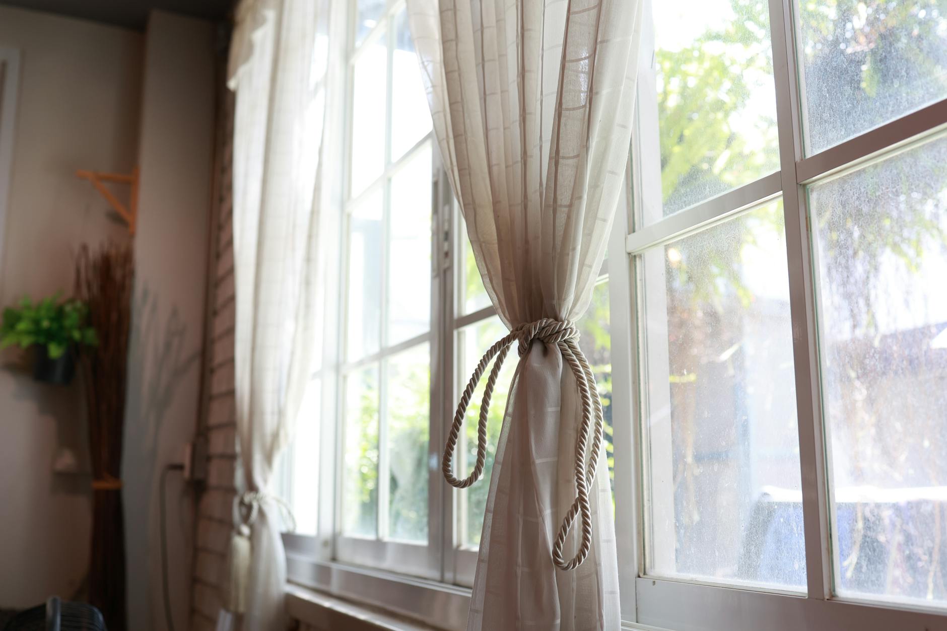
Tieback Height Geometry
The height at which a tieback holds an open curtain panel is calculated from the panel’s total drop using a proportion derived from classical drapery practice rather than installed at the height that feels visually balanced or convenient during hanging. The traditional professional specification places the tieback at approximately one third of the panel’s total drop from the floor for formal and classical treatments and at the midpoint of the drop for contemporary treatments, with these proportions producing the characteristic drape curve that reads as architecturally resolved rather than accidentally pleasing. A tieback installed at an intuitive or convenient height rather than a calculated one produces a drape curve that sits incorrectly in the panel’s geometry and reads as slightly wrong even to observers who cannot identify the source of their dissatisfaction. The tieback position also affects how the panel stacks at the wall when open and a correctly positioned tieback produces a consistent and predictable stack form that a mispositioned one disrupts. Designers mark the calculated tieback height on the wall before hanging the panel and confirm the visual result by stepping back to the room’s primary viewing position before finalizing the installation.
If these rules have shifted the way you see the windows in your own home, share your thoughts in the comments.