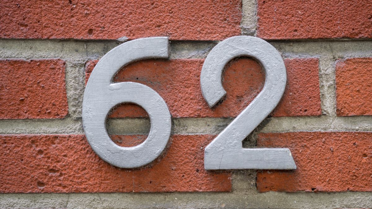
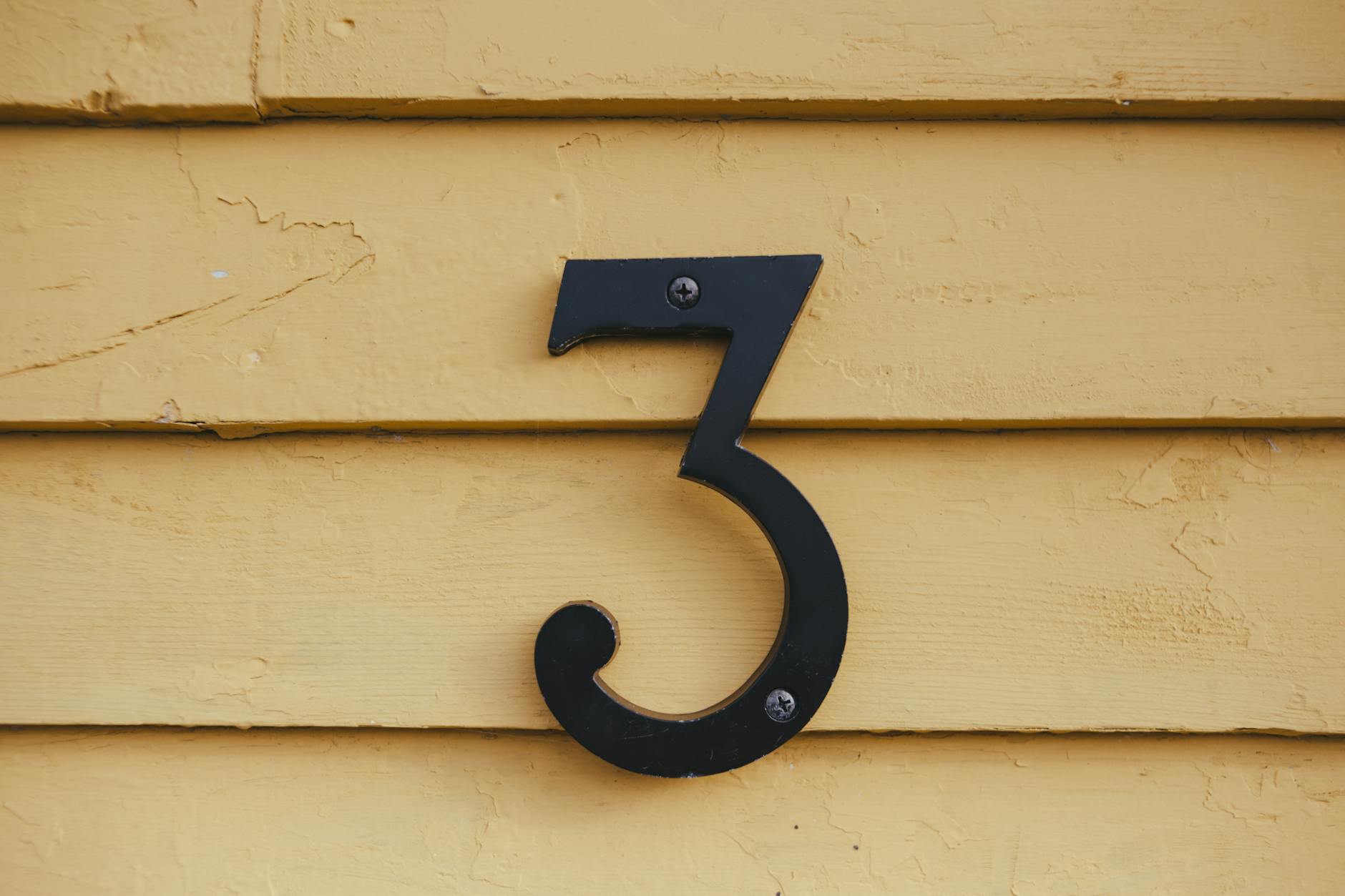
The numbers displayed on the front of your home communicate far more than a simple address. Visitors, delivery drivers, estate agents and potential buyers all form an instant judgment based on what they see before they even reach the front door. The style, material, placement and condition of house numbers work together to signal the overall care and personality of the property. Research in environmental psychology consistently shows that exterior details shape perceived home value and resident character within seconds of arrival. Understanding these subtle cues gives homeowners a powerful and often overlooked tool for managing the impression their property makes on the world.
Brushed Brass
Brushed brass house numbers carry a quiet sense of tradition and established taste that resonates strongly with visitors. The warm gold tone reads as confident and considered rather than flashy or temporary. Properties displaying brushed brass fittings are frequently associated with attentive ownership and long-term investment in the home. The finish works particularly well against painted brick, stone and rendered facades where its warmth contrasts naturally with cooler background tones. It remains one of the most enduring choices across both period and contemporary residential architecture.
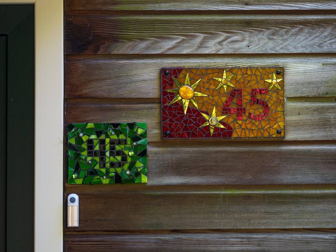
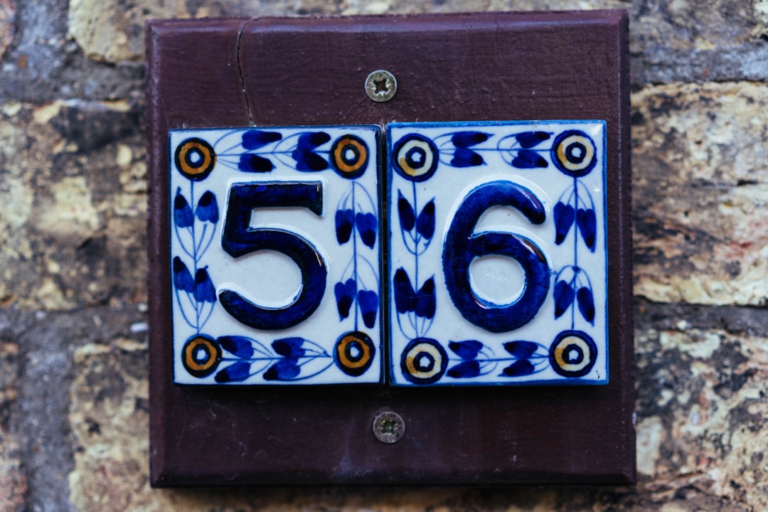
Ceramic Numbers
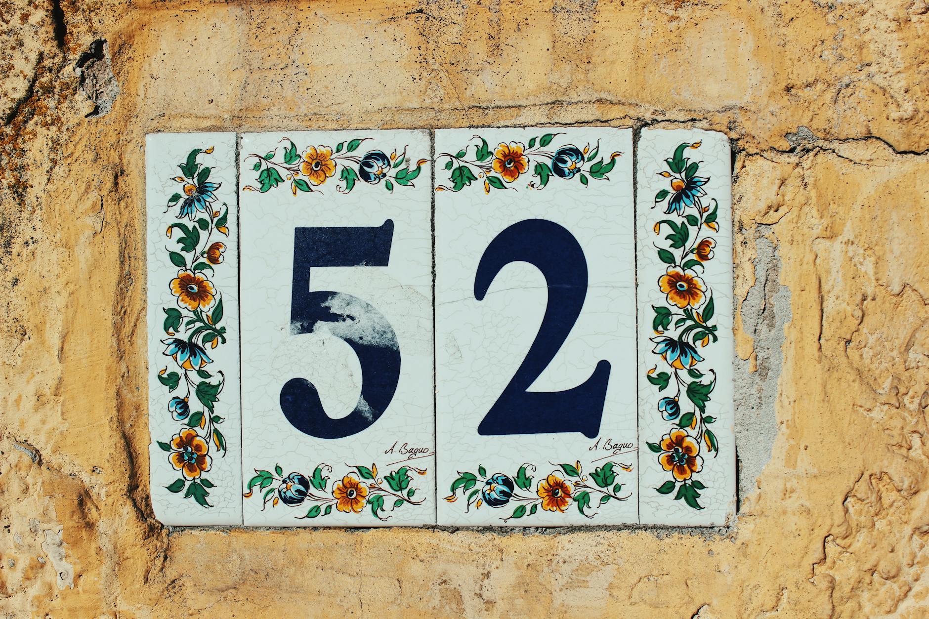
Hand-painted ceramic house numbers introduce an artisanal quality that immediately distinguishes a property from its neighbours. The crafted appearance suggests a homeowner who values individuality and has invested personal thought in exterior presentation. Colour choices within ceramic designs can subtly echo garden planting or door paint, creating a visual coherence that registers even at a glance. Buyers and visitors often interpret this level of detail as a reliable indicator of care taken throughout the rest of the property. Ceramic numbers are particularly effective on cottage-style homes, terraces and properties with Mediterranean or bohemian aesthetic leanings.
Floating Numerals
Floating numerals mounted away from the wall create a three-dimensional effect that signals modern design awareness and architectural confidence. The shadow cast by the gap between the number and the surface changes throughout the day, giving the entrance an almost living quality. This style is strongly associated with newly renovated or purpose-built homes where design decisions have been made deliberately and cohesively. Estate agents consistently note that shadow-mount numbers elevate perceived property value in photography used for listings. The clean profiles available in steel, aluminium and powder-coated finishes make this format highly adaptable across exterior colour palettes.
Illuminated Numbers
Backlit or internally illuminated house numbers solve a functional problem while simultaneously making a strong aesthetic statement. Warm white or amber illumination creates a welcoming glow that is particularly effective during winter evenings when kerb appeal is hardest to maintain. The presence of lighting around numbers suggests a homeowner who has thought carefully about safety, accessibility and the experience of arriving after dark. Emergency services and delivery logistics companies have flagged visible numbering as a meaningful factor in response times and accuracy. Illuminated numbers also photograph exceptionally well, giving properties a polished appearance in twilight estate agency shoots.
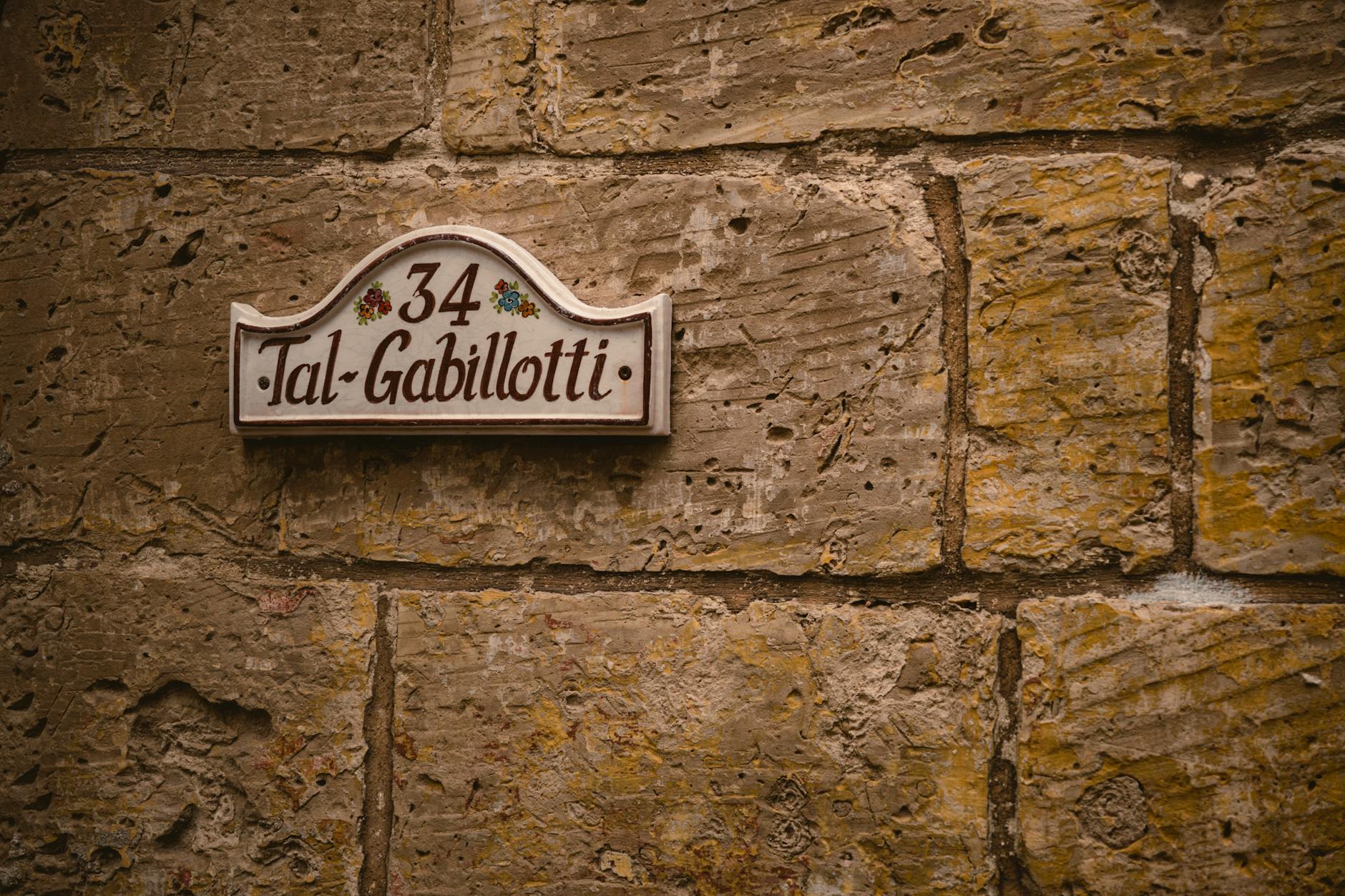
Slate Plaques
Natural slate number plaques connect a property to landscape and materiality in a way that manufactured finishes rarely achieve. The variation in tone and texture within each slate piece means no two plaques are identical, lending the entrance a quietly bespoke character. Slate reads as grounded and permanent, subtly communicating that the homeowner has made choices with longevity in mind rather than following short-lived trends. The matte surface absorbs rather than reflects light, which softens the entrance and makes it feel less transactional and more residential. Properties in rural settings, conservation areas and older streetscapes benefit particularly from the organic authority slate provides.
Recessed Numbers
Numbers carved or recessed directly into gate pillars, rendered walls or stone surrounds represent the highest level of integration between signage and architecture. This approach removes any sense of the number being an afterthought and instead makes it feel as though the address has always belonged to the structure itself. Planning consultants and architects frequently recommend recessed numbering on high-specification new builds where surface-mounted fittings would interrupt clean lines. The permanence of the technique signals serious investment and a long-term relationship between the owner and the property. Visitors and passersby consistently rate recessed addresses among the most impressive exterior details on residential streets.
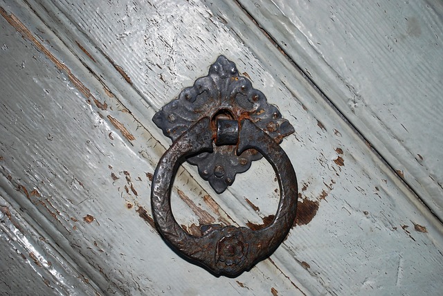
Victorian Cast Iron
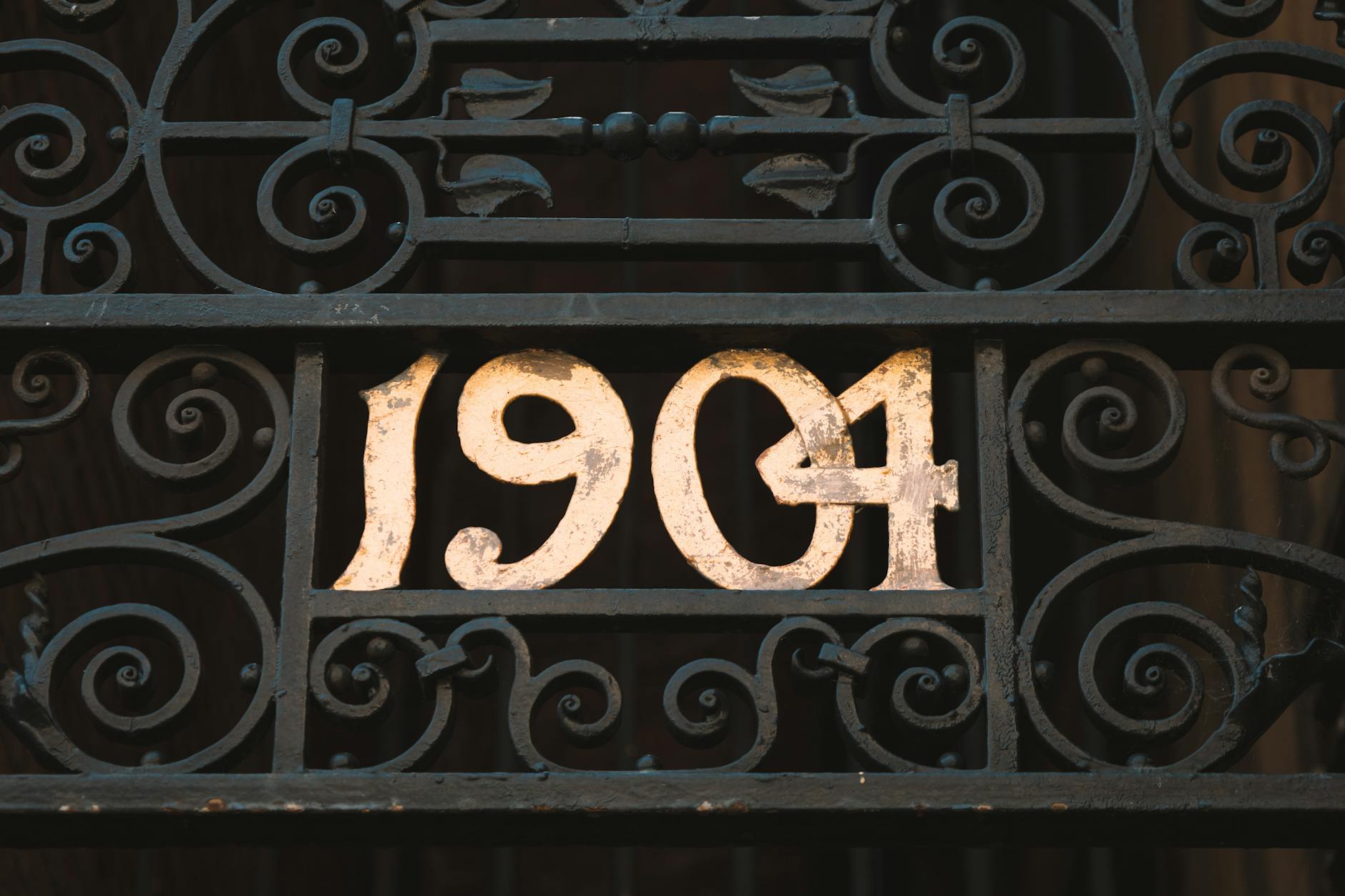
Restored or reproduction Victorian cast iron house numbers bring historical authority to a facade that few other materials can replicate. The weight and depth of the casting creates a tactile richness visible even from the pavement, where it reads as genuinely old-world rather than decorative pastiche. Period properties benefit most directly from this choice as it restores visual continuity between the original architecture and the address signage. The durability of cast iron means the investment requires little maintenance beyond occasional repainting in traditional heritage tones. Architectural salvage experts note that original Victorian numerals on a property can meaningfully contribute to heritage character assessments.
Font Selection

The typeface used for house numbers carries as much communicative weight as the material chosen to display them. Serif fonts suggest formality, tradition and established prestige while sans-serif choices read as contemporary and uncluttered. Script or cursive numerals introduce personality but can compromise legibility at distance, which subtly creates a less considered impression for passing visitors. Typography researchers have found that numeral style influences perceived resident personality more consistently than colour does in exterior signage studies. Homeowners who align their font choice with the architectural period and style of their property create a coherence that registers as effortless good taste.
Colour Contrast
The relationship between number colour and background surface determines how quickly and confidently an address is read from the street. High contrast pairings such as white numerals on dark doors or black numbers on pale render achieve immediate legibility that communicates clarity and organisation. Low contrast combinations that blend into the background can suggest inattention to detail, which visitors and buyers often project onto the wider condition of the property. Colour psychology research shows that certain pairings such as navy and gold or forest green and brass carry inherent associations with quality and discretion that elevate perceived status. Choosing contrast deliberately rather than by default is one of the simplest ways to sharpen the first impression a home delivers.
Number Size
The scale of house numbers relative to the facade around them communicates proportion and spatial awareness in ways that observers feel before they consciously register them. Numbers that are too small for the wall surface create an impression of timidity or incomplete thinking in the design of the entrance. Oversized numerals on modest facades can read as aggressive or poorly considered, undermining the welcome a front entrance should provide. Architectural guidelines generally suggest numbers should be sized to remain clearly legible from the edge of the property boundary in standard daylight conditions. Getting the scale right demonstrates the same eye for proportion that buyers and visitors expect to find throughout the interior.
Mounting Height
The vertical position of house numbers on a door, wall or gate affects both practical legibility and the psychological tone of the entrance. Numbers mounted at eye level create an immediate and natural connection between the address and the arriving visitor. Placement that is too low can suggest a lack of confidence in the presentation while positioning that is too high demands effort from the viewer and can feel unwelcoming. Wayfinding specialists advise that numbers placed between 1.5 and 1.8 metres from ground level achieve the best balance between visibility from vehicles and comfort for pedestrians approaching on foot. Consistent mounting height across a terrace or development also contributes to the sense of a well-managed and orderly streetscape.
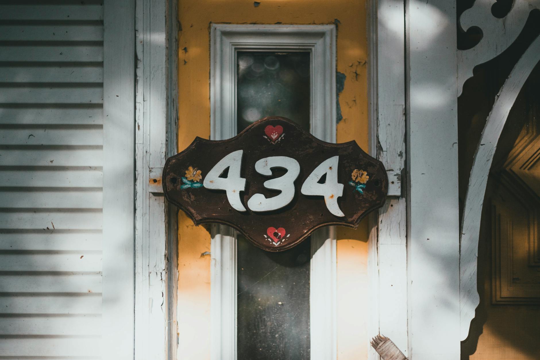
Surface Condition
The physical condition of house numbers carries disproportionate weight in the overall impression a property makes because they are among the smallest and most detailed elements on the facade. Peeling paint, rust staining, missing digits or cracked plaques are read by visitors as direct evidence of deferred maintenance and reduced pride in ownership. Buyers conducting property viewings have consistently reported that deteriorating address markers create doubt about the standard of upkeep inside the home before they have crossed the threshold. The relatively low cost of replacing or restoring house numbers makes their condition one of the highest return-on-investment details available to homeowners preparing a property for sale or rental. Keeping this small detail in excellent condition signals that no part of the property has been overlooked.
Spacing and Alignment
The spacing between individual digits and their alignment relative to each other and to the surrounding architecture reveals the level of care taken in the installation process. Uneven gaps between numbers or digits that are not precisely level register unconsciously as disorder, which can affect the overall impression of the entrance before a visitor identifies the specific cause. Professional installers use spirit levels and measured templates to ensure that multi-digit addresses achieve a visual balance that reads as deliberate rather than approximate. The spacing between numerals should follow typographic logic, with optically adjusted gaps rather than mechanically equal ones that can appear uneven due to the differing widths of individual digits. This level of precision is rarely noticed when executed correctly but is immediately felt when it is absent.
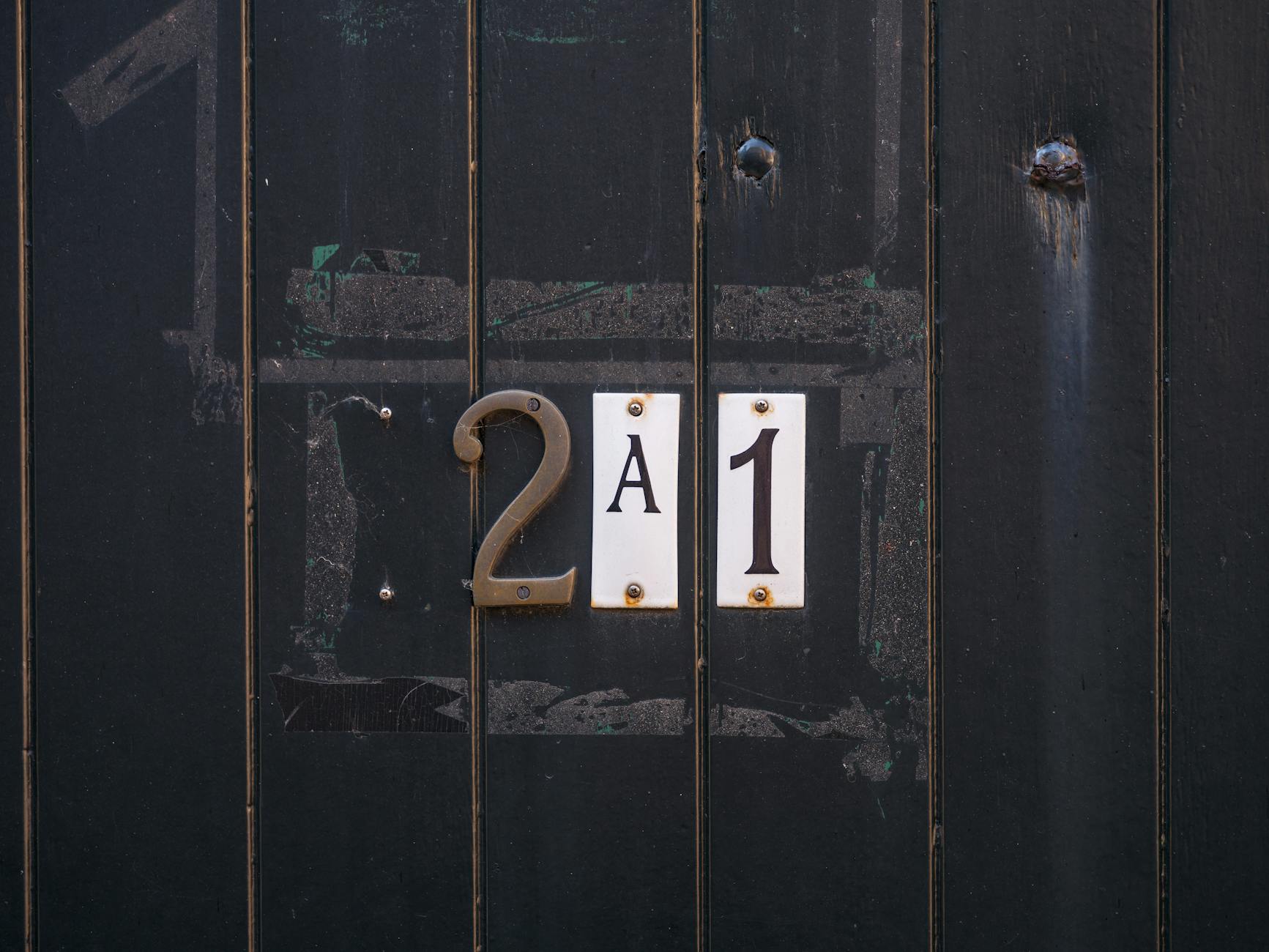
Door Hardware Coordination
Coordinating house number material and finish with other door hardware such as knockers, letterboxes and handle sets creates a unified design language that elevates the entire entrance. Mixing metals and finishes introduces visual noise that fragments attention and prevents the eye from reading the facade as a composed whole. Interior designers working on exterior presentation consistently advise treating the front door zone as a single curated composition rather than a collection of independent functional items. Chrome numbers paired with polished brass knockers or matte black numerals beside brushed nickel furniture create a subtle friction that observant visitors register as an absence of intention. A coordinated entrance hardware scheme takes modest effort to achieve but delivers a lasting impression of considered and complete design thinking.
Neighbourhood Context
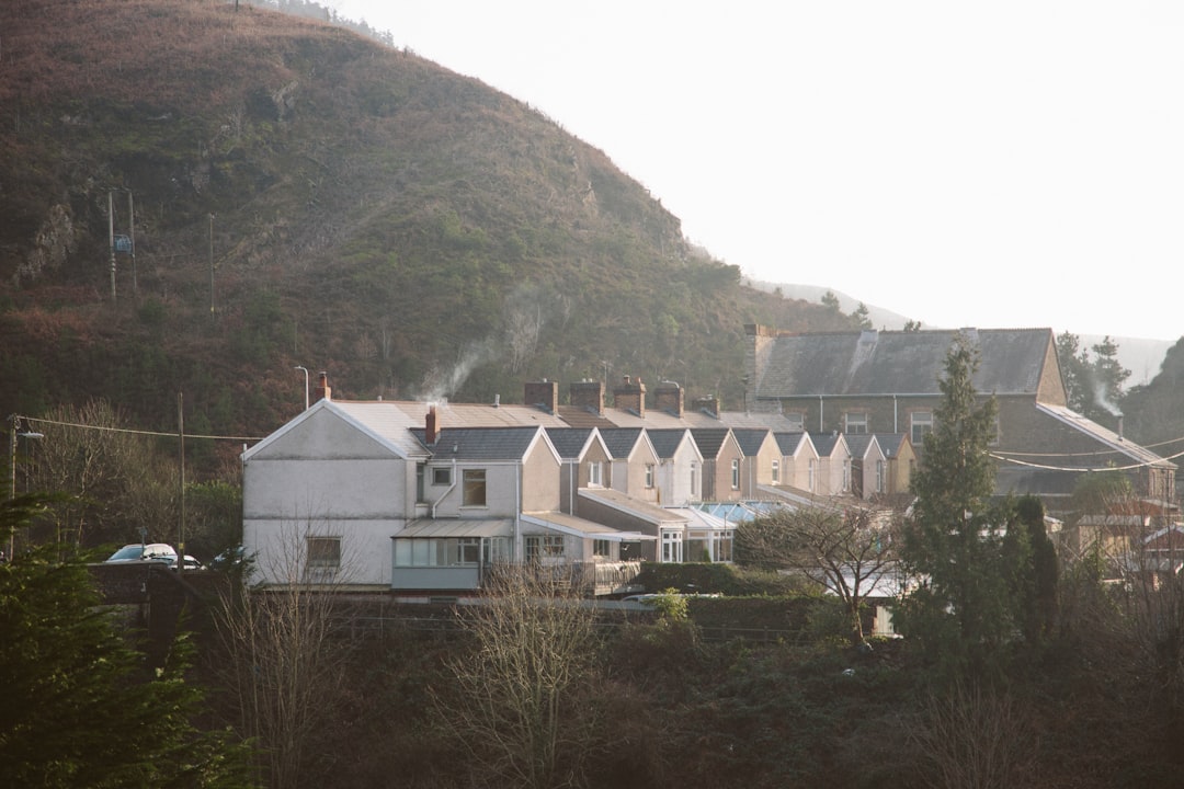
The relationship between a home’s house numbers and the visual language of the surrounding streetscape shapes how the property is perceived within its community. Numbers that are dramatically out of step with neighbouring properties in scale or style can read as either admirably individual or conspicuously discordant depending on execution and context. Estate agents advise that properties which distinguish themselves through quality rather than contrast tend to achieve the strongest positive responses from buyers unfamiliar with the area. Conservation areas and planned developments often have specific guidelines around address signage that reflect the importance local planning authorities place on visual coherence at street level. Choosing numbers that elevate the entrance while remaining sensitive to context demonstrates the same social and spatial intelligence that characterises well-regarded homes across every type of residential environment.
Seasonal Visibility

House numbers that perform well across all seasons and lighting conditions demonstrate a level of foresight that visitors and buyers register as thoroughness. Materials that fade in prolonged sun exposure or corrode during wet winters communicate a mismatch between the initial choice and the realities of the local climate. Powder-coated metals, UV-stabilised polymers and properly sealed stone maintain their appearance year-round without requiring frequent intervention from the homeowner. Winter months reduce available daylight and increase the likelihood that visitors will arrive at the property in low-light conditions where reflective or illuminated solutions offer a meaningful practical advantage. Selecting numbers with genuine seasonal durability ensures that the first impression the property delivers remains consistent regardless of the time of year a visitor arrives.
Property Style Match
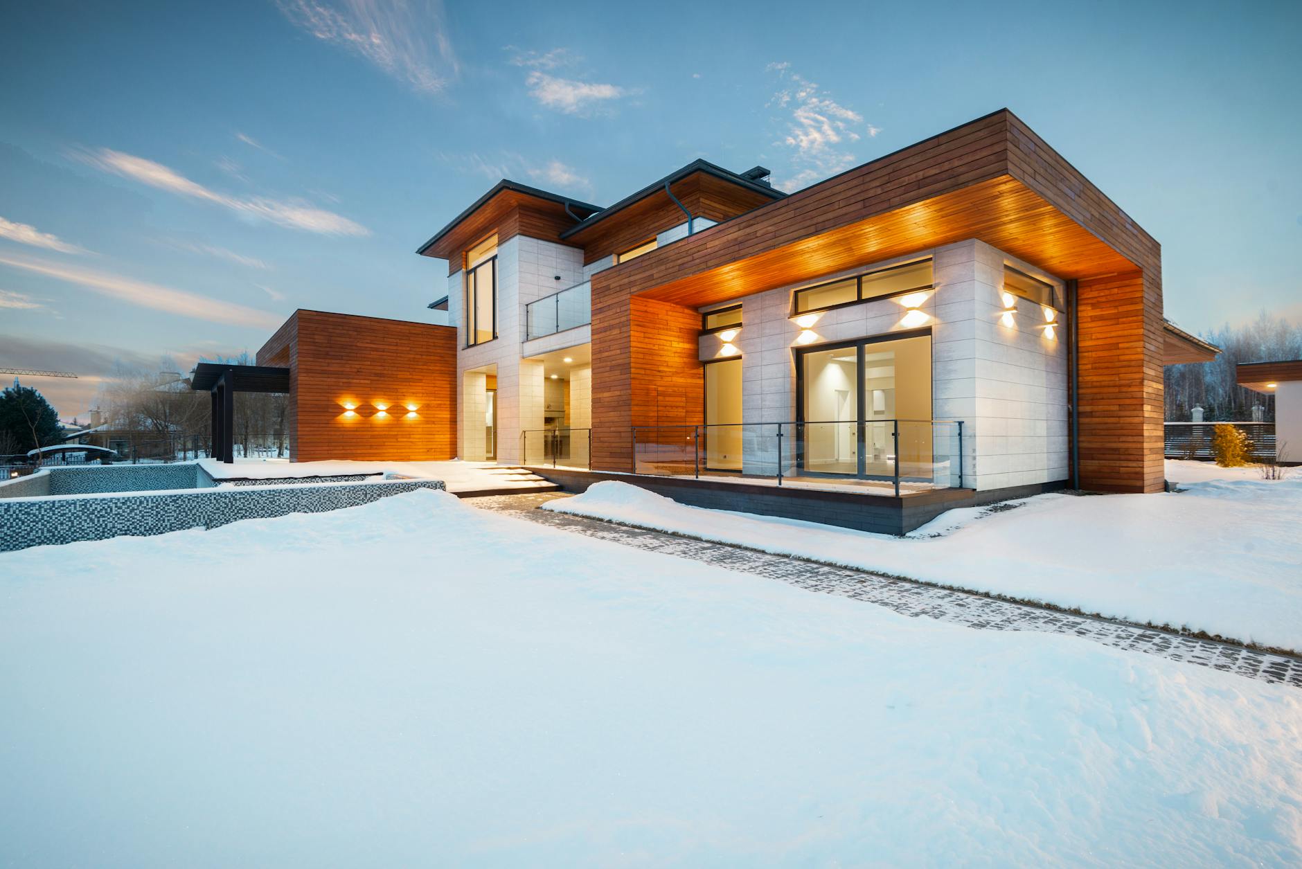
The architectural period and stylistic identity of a home provides a clear framework within which house number choices either reinforce or undermine the overall character of the building. Georgian and Edwardian properties respond well to traditional materials such as cast iron, painted wood and polished brass that echo the craftsmanship of their era. Modernist and contemporary builds benefit from the precision and simplicity of brushed steel, anodised aluminium or recessed letterforms that align with their clean geometric language. Matching number style to property character is one of the principles most consistently cited by architects and property stylists as a marker of design literacy in residential exteriors. When the choice feels inevitable rather than imposed it contributes to a sense of wholeness that visitors experience as the property simply looking right.
Driveway Positioning
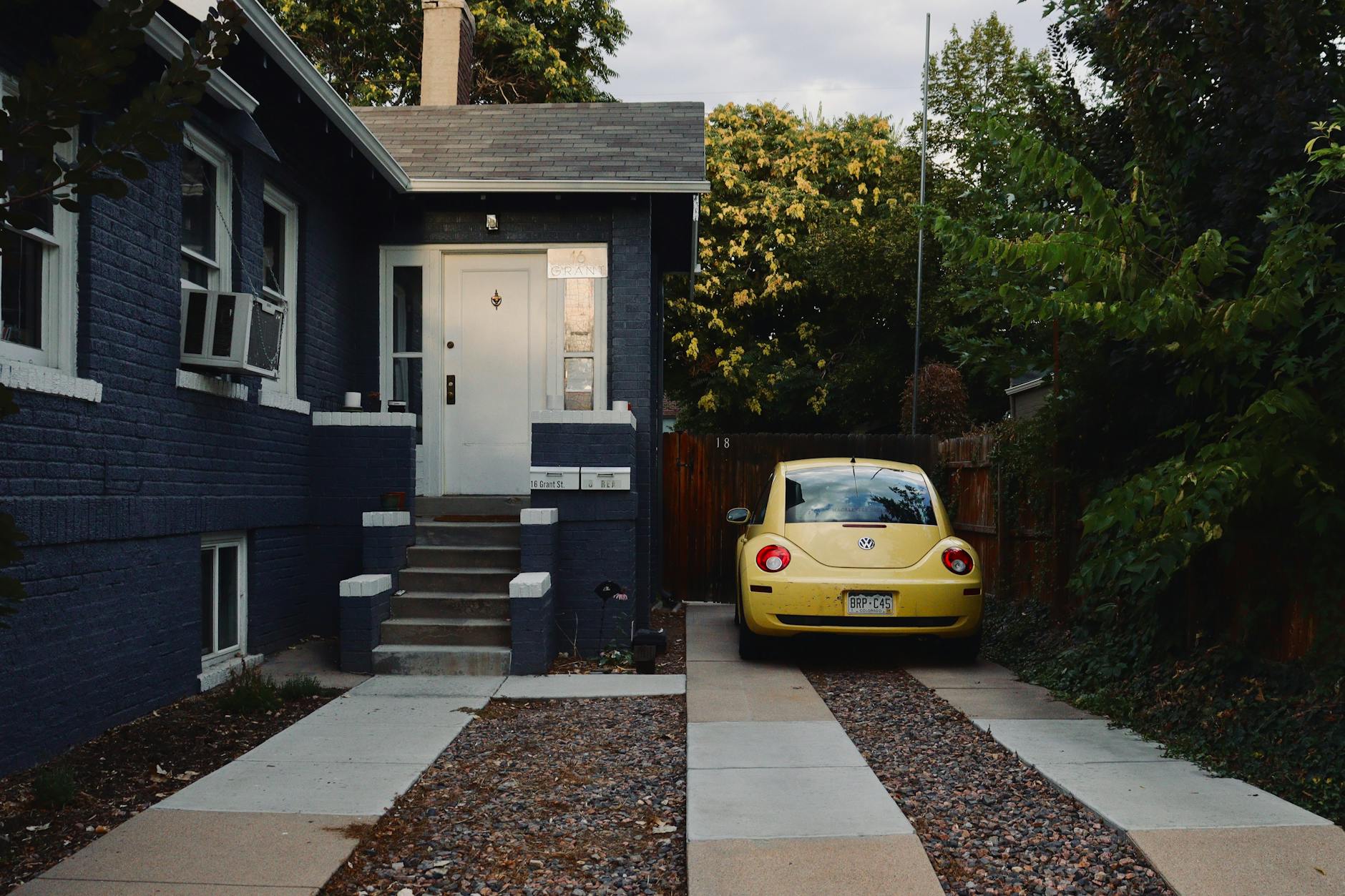
Properties with driveways or gated entrances must consider whether house numbers are most effectively displayed at the boundary or on the building itself. Numbers positioned at the entrance gate or pillar ensure that visitors and delivery drivers can identify the property before committing to turning in from the road. When numbers appear only on the building facade they can be obscured by vehicles in the driveway or become difficult to read through planting as it matures over the seasons. Dual placement at both the boundary and the door is increasingly recommended by security consultants and wayfinding specialists as it eliminates any ambiguity for emergency response teams. The decision about where to position numbers within a property with a driveway is therefore not merely aesthetic but has meaningful practical implications that the most attentive homeowners address proactively.
Night Visibility
A house number that disappears in darkness represents an incomplete design solution regardless of how well it performs during daylight hours. Solar-powered backlit panels have made illuminated address signage accessible at a modest price point that removes the previous barrier of electrical installation costs. Reflective vinyl overlays applied to existing numbers offer a lower-commitment solution that significantly improves visibility for vehicle headlights scanning for addresses after dark. Studies of urban wayfinding consistently show that properties with poor night-time address visibility experience higher rates of missed deliveries, delayed visitors and delayed emergency service responses. Treating night visibility as a non-negotiable baseline rather than an optional enhancement positions the homeowner as someone who has thought through the full range of circumstances in which their property must communicate clearly.
Postal Legibility
House numbers must satisfy the practical requirements of postal workers, couriers and emergency services before any aesthetic consideration is applied. Characters that are stylistically inventive to the point of ambiguity create operational friction that can result in misdelivered parcels, failed first attempts at access and avoidable frustration for both the homeowner and service providers. Royal Mail and equivalent postal services in most countries publish specific guidelines on minimum numeral height, colour contrast and placement that represent the baseline standard every property should meet. Script fonts that cause the number six to be mistaken for a zero or the number one to resemble a lowercase letter are among the most commonly reported causes of address-related delivery errors. Legibility is the single functional requirement that cannot be compromised in the pursuit of aesthetic distinction.
Material Longevity
The lifespan of the material chosen for house numbers determines how long the positive first impression created at installation will be maintained without further investment. Anodised aluminium and marine-grade stainless steel are among the materials most resistant to the combined effects of ultraviolet exposure, moisture and atmospheric pollution in typical residential environments. Painted wood and powder-coated finishes require periodic renewal that owners of high-maintenance properties sometimes defer until visible deterioration has already begun to affect the overall impression. Material selection is therefore a decision that projects forward in time and reflects either a short-term or long-term orientation in the homeowner’s approach to property stewardship. The most respected residential streets tend to be those where every property displays address signage that has been maintained to the standard set at the point of original installation.
Street Number Visibility
The speed at which a passing driver or pedestrian can locate and confirm a house number from the street is a measure of how effectively the entire addressing system is functioning. Numbers obscured by overgrown hedges, parked vehicles or repositioned bins create frustration that visitors associate with the property rather than with the obstacle. Trimming planting around address signage and ensuring clear sightlines from the pavement are practical maintenance tasks that directly protect the investment made in quality numbering. Estate agents conducting street appraisals consistently identify obscured or hard-to-find house numbers as a factor that reduces the confidence of buyers approaching a property for the first time. Keeping the number visible from multiple angles and distances ensures that the first impression the property delivers begins at the kerb rather than only once a visitor has already reached the door.
Finishing Details
The small finishing details around house number installation reveal the standard of care that has been applied to the entrance as a whole. Raw screw heads left exposed after mounting create a utilitarian appearance that undermines even the most carefully chosen numeral style and material. Matching fixings in the same finish as the number itself or using concealed mounting systems removes this distraction and allows the numeral to be read as a complete and considered object. Sealant applied cleanly around the perimeter of a plaque prevents moisture ingress while also signalling that the installation was treated as a finished piece of work rather than a functional task to be completed quickly. The discipline of attending to these final details is the same quality of thinking that distinguishes a truly impressive entrance from one that is merely adequate.
Plinth and Frame Options
Mounting house numbers within a frame, plinth or backing panel adds a layer of considered presentation that elevates the numeral from a functional item to a design feature. Recessed or shadow-box frames create depth and visual interest that makes the addressing element of the entrance feel intentionally composed. Backing panels in contrasting materials such as brushed copper behind dark ceramic or white acrylic behind polished brass create a two-tone effect that improves legibility while adding aesthetic sophistication. Architectural supply companies report consistent growth in demand for framed number presentations as homeowners increasingly treat the front entrance as an extension of interior design principles applied outward. A well-chosen frame transforms a simple address into a focal point that anchors the composition of the facade.
Installation Quality
The precision and permanence of the installation process determines whether a carefully chosen house number achieves its intended effect or undermines it through poor execution. Numbers that are visibly tilted, inadequately secured or mounted on damaged surfaces communicate a gap between intention and follow-through that visitors extend to their assessment of the entire property. Professional installation using appropriate fixings for the substrate material ensures that the number remains secure and level through seasonal expansion and contraction of the building fabric. The quality of the pilot holes drilled into masonry, the alignment checked at multiple distances from the street and the condition of the wall surface behind the plaque all contribute to an end result that reads as either confident or provisional. Investing in careful installation is the final step that transforms a good purchasing decision into a genuinely impressive exterior detail.
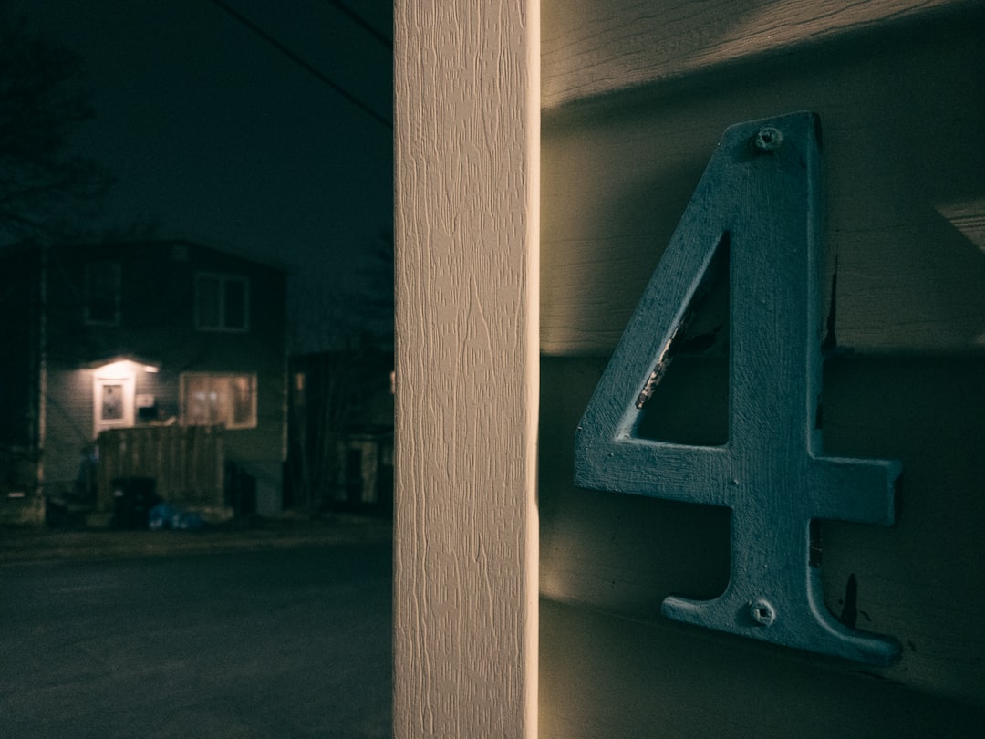
Cultural Numerology
Numerological associations with specific house numbers are a factor in property desirability that varies significantly between cultural communities and should not be dismissed as irrelevant by vendors or developers. In many East Asian cultures the number four carries strong negative associations due to its phonetic similarity to the word for death, while eight is considered highly auspicious and associated with prosperity and good fortune. Properties bearing the number eight command measurable price premiums in communities where this belief is widely observed, a phenomenon documented in residential property market analyses across the United Kingdom, Australia and North America. Vendors preparing a property for a diverse buyer pool increasingly consider how the address interacts with numerological frameworks that may be meaningful to prospective purchasers. Understanding this cultural dimension of house numbering reveals that the address displayed at the front of a home can carry meaning that extends well beyond its function as a locational identifier.
If you have a view on what your house numbers say about your property, share it in the comments.