Choosing the right wall color is one of the most critical decisions a homeowner makes before listing a property for sale. Real estate professionals consistently report that highly personalized or aggressive shades can deter potential buyers and lower the final sale price. Buyers often struggle to visualize themselves in a home when overwhelmed by specific tastes that do not align with current design trends. Repainting these problematic hues with neutral tones is frequently the most cost effective improvement a seller can make. Avoiding the following colors will help ensure the property appeals to the widest possible audience.
Fire Engine Red
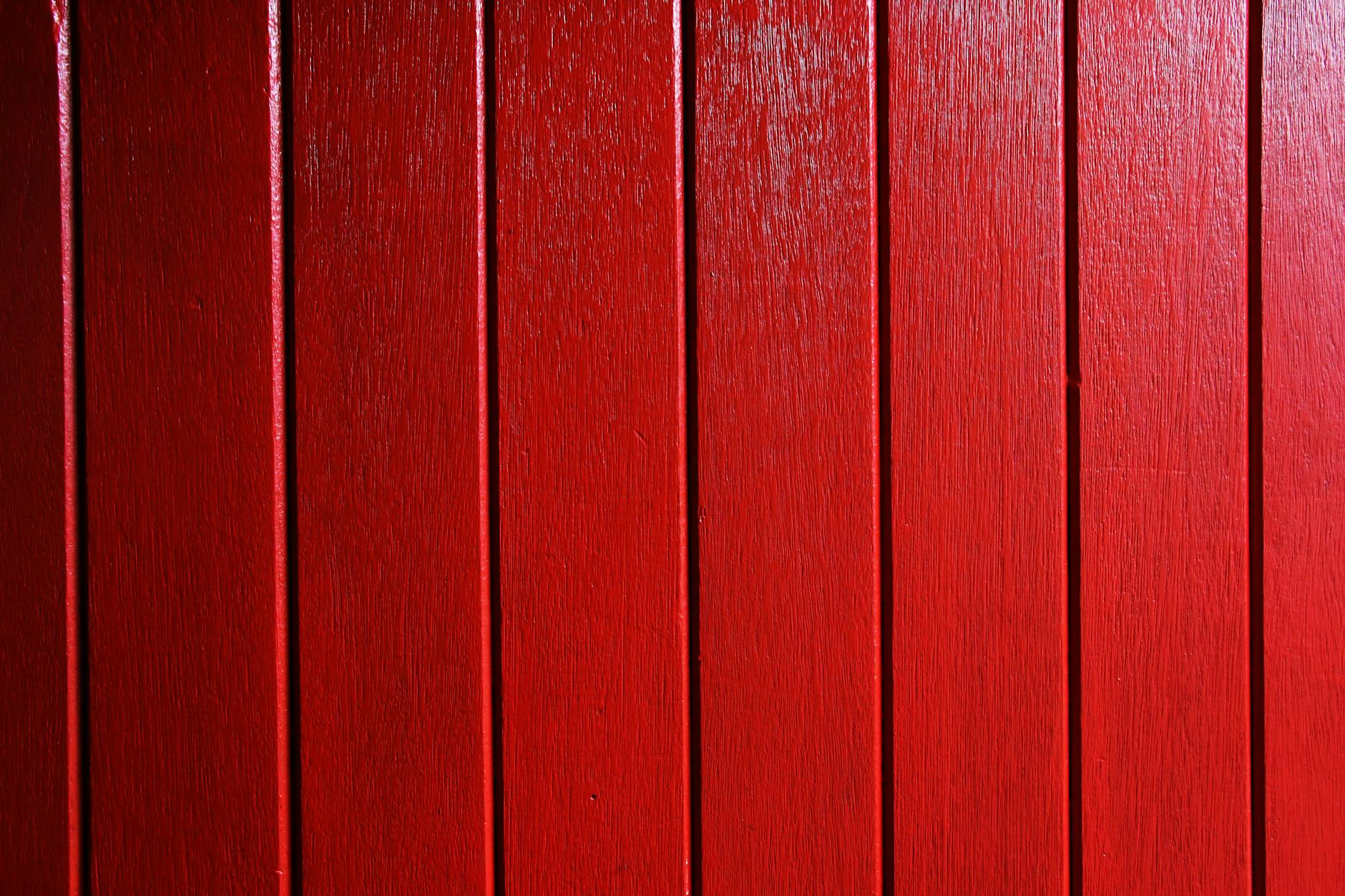
This aggressive hue is widely considered the single worst choice for interior walls when selling a home. The intense saturation creates a visual heaviness that can make large rooms feel claustrophobic and stressful. Prospective buyers often view bright red walls as a major project because covering the pigment requires several coats of expensive primer. Experts note that this color stimulates excitement rather than the relaxation most people seek in a living space.
Lime Green

Neon shades of green distract viewers from the architectural features of a home by drawing the eye immediately to the walls. This color casts an unflattering reflection on skin tones and can make the entire room feel sickly or artificial. It is extremely difficult to match furniture or decor with such a vibrant and specific shade. Agents find that buyers are often unable to look past this color to appreciate the actual square footage of the room.
Bright Orange
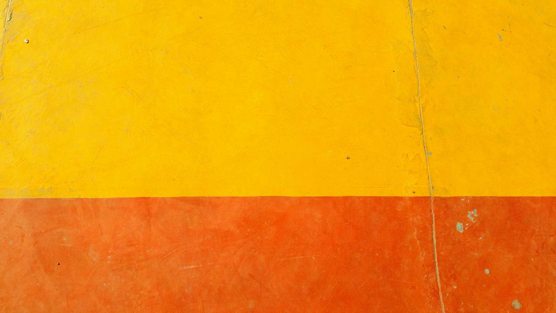
Orange is an energetic color that often overwhelms the senses and signals a dated aesthetic to modern buyers. It is one of the least liked colors in the world when it comes to interior design surveys and general preference. The reflection from orange walls can alter the perceived color of flooring and cabinetry in a negative way. Removing this color typically involves significant labor and materials which translates to lower offers from buyers calculating renovation costs.
Dark Brown
Painting an entire room in dark brown can make the space feel muddy and significantly smaller than it actually is. This heavy color absorbs natural light and forces the homeowner to rely heavily on artificial lighting fixtures even during the day. It often gives the impression of a cave rather than a welcoming home environment. Real estate agents suggest swapping this shade for a lighter taupe or warm beige to maintain warmth without the gloom.
Sunshine Yellow
While yellow is associated with happiness it often induces anxiety and visual fatigue when applied to all four walls of a room. Pale buttery shades might be acceptable but bright primary yellow is notoriously difficult to sell. The color rarely looks the same on the wall as it does on the chip and often intensifies in natural light. Buyers typically view this choice as a frantic or childish aesthetic that needs immediate remediation.
Eggplant Purple

Deep purple is a highly polarizing color that appeals to a very specific and narrow demographic of buyers. It tends to darken bedrooms and can create a somber or gothic atmosphere that feels uninviting to the general public. This shade is particularly hard to paint over and may require sanding or heavy priming to hide the dark undertones. A neutral gray or lavender offers a sophisticated alternative that does not alienate potential bidders.
Hot Pink

This vibrant color is almost exclusively associated with children’s rooms and instantly pigeonholes a space. Buyers looking for a home office or guest room will struggle to visualize the potential of a room painted in such a gendered and specific hue. It implies that the house has not been updated or neutralized for the market. Sellers are strongly advised to paint over pinks to create a versatile canvas for the next owner.
Turquoise
Retro teal or bright turquoise can make a home feel like a time capsule from the 1950s in an unintentional way. This color is very specific to certain decor styles such as coastal or mid-century modern and clashes with most other furniture. It draws too much attention to itself and away from selling points like views or hardwood floors. Agents recommend reserving such bold aquatic colors for throw pillows or removable accessories instead of permanent wall paint.
Slate Gray

Gray was the dominant neutral for many years but dark slate shades are now viewed as cold and industrial. Homes painted entirely in this cooler tone can feel sterile or unwelcoming compared to the warmer greige tones popular today. Poor lighting can make slate gray walls appear flat and depressing during evening showings. Warming up the palette helps buyers feel an emotional connection to the property that cold steel tones simply cannot provide.
Builder Beige

There is a distinct difference between a modern warm neutral and the yellow-toned beige used in mass construction twenty years ago. This specific shade often has pink or fleshy undertones that make walls look dirty or aged even when they are clean. It signals to buyers that the home has not been updated in decades and will likely need other renovations. Replacing this dated hue with a crisp white or modern off-white instantly lifts the perceived value of the property.
All Black

While black accent walls can be stylish painting an entire room black is generally a mistake for resale purposes. It absorbs every bit of light and hides architectural details like molding and trim work. Many buyers associate all-black rooms with college dorms or moody basements rather than high-end living. The effort required to return a black room to a neutral color is a significant deterrent for almost every purchaser.
Salmon Peach

This pastel orange-pink hybrid is strongly associated with 1980s design trends and immediately dates a property. It often clashes with modern hardwood floor stains and contemporary furniture styles. The color can make a room feel dusty and tired regardless of the actual condition of the home. Modern buyers prefer cleaner pastels or whites that reflect light rather than the muddy warmth of salmon.
Kelly Green

Intense grass green is highly stimulating and creates a visual vibration that many people find uncomfortable. It is another color that casts difficult reflections and limits the type of furniture that can be placed in the room. This shade is often used in sports-themed rooms which limits the imagination of buyers who may not share those interests. A softer sage green is a much safer choice that brings nature indoors without the visual assault.
Metallic Gold

Using metallic paint on walls creates texture issues and reflects light in uneven and often unflattering ways. These finishes are notoriously difficult to repair if they get scratched or scuffed during the moving process. The aesthetic is often viewed as tacky or ostentatious rather than luxurious by the average homebuyer. Sanding down textured metallic walls adds labor costs that buyers will deduct from their offer price.
Pastel Blue
Baby blue is widely perceived as a nursery color and can make main living areas feel infantile. It often lacks the sophistication required for living rooms or dining areas and fails to anchor the space effectively. The color can look icy in rooms with north-facing windows which makes the home feel physically colder. Soft gray-blues or navy accents generally provide a more mature and valuable aesthetic for resale.
Please let us know in the comments which wall colors you would immediately paint over if you bought a new house.