There is a particular category of interior design choice that announces financial aspiration far more loudly than it communicates actual taste or genuine affluence. The people who curate genuinely wealthy homes rarely make these choices, not because they cannot afford the originals but because they have never felt the need to perform prosperity for the benefit of visitors. The trends that follow have saturated a specific stratum of the consumer market where the desire to appear successful has become disconnected from the design literacy that would actually achieve it. What follows are the most recognizable and most frequently made decor decisions that interior designers, architects, and quietly wealthy homeowners identify as the clearest signals that a home’s aesthetic is performance rather than expression.
Faux Columns
Installing decorative columns that bear no structural relationship to the home’s actual architecture announces a desire for grandeur that the building itself does not support and that the addition cannot convincingly supply. Genuine columns in historically significant homes exist because they are doing something, holding weight, defining a portico, articulating a genuine classical facade, and their beauty derives precisely from their functional honesty. The foam or resin column applied to a suburban entryway or wrapped around a load-bearing post in a living room has no such justification and reads to any architecturally literate visitor as a costume rather than a feature. Interior designers who work across income brackets note that the decorative column is one of the most reliable indicators of a homeowner who has absorbed the visual language of wealth without understanding its grammatical rules. The irony is that the columns intended to elevate the perceived status of the space consistently achieve the opposite effect among the audience whose opinion the homeowner most wishes to impress.
Chandelier Overload

Installing a chandelier of disproportionate scale in a room whose ceiling height, square footage, and architectural character cannot absorb it creates a visual imbalance that communicates a fundamental misunderstanding of how scale and proportion function in interior design. A genuinely impressive chandelier derives its impact from its relationship to the space it inhabits, and that relationship requires a room of sufficient volume, ceiling height, and architectural formality to provide the appropriate context. The oversized crystal fixture hanging eight feet from the floor in a dining room with standard residential ceiling height does not read as opulent but as miscalculated, drawing attention to the gap between the ambition of the choice and the reality of the space. Lighting designers who consult on residential projects note that chandelier scale errors are among the most common and most visually disruptive mistakes they encounter in homes that are attempting to signal luxury. The fixture that was intended to be the room’s crowning achievement becomes instead its most obvious liability.
Gold Everything

Applying gold or brass-toned finishes to every hardware, fixture, frame, and accessory surface in a room without the restraint that makes metallic accents effective produces an environment that reads as gilded rather than luxurious. Genuine luxury interiors that incorporate gold tones do so with a selectivity that allows each element to register individually against a carefully considered background, creating a dialogue between the metallic element and its surroundings that generates visual interest through contrast and specificity. The room in which every switch plate, towel ring, picture frame, vase, tray, and candleholder has been sourced in the same uniform gold tone has eliminated this dialogue entirely, producing instead a monochromatic metallic environment that overwhelms the eye rather than guiding it. Interior stylists who study the difference between high-end and aspirational interiors identify restraint in metallic application as one of the clearest differentiators between rooms that communicate genuine taste and rooms that communicate a desire for it. The principle that more gold equals more luxury is the precise inverse of how gold functions in genuinely sophisticated interior design.
Inspirational Wall Text
Covering wall surfaces with mass-produced typographic prints, vinyl lettering systems, or canvas panels bearing motivational phrases, family-values declarations, or lifestyle affirmations in script fonts is a decorating approach that substitutes verbal content for visual design in a way that communicates a fundamental uncertainty about whether the space can speak for itself. Genuinely considered interiors communicate their character through the quality, selection, and arrangement of their elements rather than through explicit textual instruction about how visitors should feel or what values the household holds. The kitchen wall that announces the room’s function as a place of gathering and nourishment through food, light, and material quality is communicating the same information as the one that bears a script-font sign reading gather in a way that requires no literacy from its audience. Graphic designers and art directors who comment on interior trends note that the popularity of typographic wall decor reflects a broader cultural shift toward explicit communication of values that previously would have been expressed through more subtle aesthetic choices. The more a home relies on text to establish its character, the less confidence the design itself inspires.
Fake Flowers
Filling a home with artificial flowers and plants of insufficient quality to sustain the illusion they are intended to create places the home in a permanently suspended state of decorative deception that living plants or genuine absence would serve better than the obvious substitute. High-quality artificial botanicals exist and are used thoughtfully in specific contexts by designers who acknowledge their limitations, but the mass-market silk flower arrangement in a foyer vase or the plastic succulent collection on a kitchen windowsill reads immediately as an attempt to access the vitality and beauty of living plants without the commitment their maintenance requires. Interior designers note that visitors who interact with artificial plants experience a specific form of mild disappointment that colors their subsequent perception of the home’s other design choices, as the discovery of one deception primes them to look for others. The genuinely wealthy home is more likely to contain either impeccably tended living plants maintained by household staff or a confident and deliberate absence of botanicals than it is to contain artificial substitutes at any quality level. Fresh flowers purchased regularly in season communicate far more about a household’s relationship to beauty than a permanent arrangement of artificial alternatives at any price point.
Accent Wall Overdose
Applying an accent wall treatment in every room of a home rather than deploying the technique selectively dilutes its intended effect and produces an environment that feels visually restless rather than deliberately composed. The accent wall exists as a design tool to create emphasis, to draw the eye to a specific architectural feature or focal point within a room that is otherwise unified by a cohesive color or material approach. When every room contains a competing feature wall in a different color, pattern, or material, the technique’s function as an emphasis device is eliminated because emphasis requires contrast with a dominant element that the proliferation of accent walls has removed. Color consultants who work on residential projects identify the every-room accent wall phenomenon as one of the most common results of homeowners following trend content in isolation without understanding the underlying compositional principles that make the technique work in specific contexts. The restraint that would make one well-placed accent wall genuinely effective is the same restraint that the decision to apply it everywhere has abandoned.
Tuscan Kitchen
Replicating the surface vocabulary of a Tuscan farmhouse aesthetic including faux-painted walls in terracotta and ochre, wrought iron pot racks, ornamental rooster motifs, ceramic grape clusters, and distressed wood elements in a suburban American kitchen creates a theatrical environment whose relationship to the culture it is referencing is entirely superficial and whose peak moment in design culture occurred at the turn of the millennium. The Tuscan kitchen trend became so widely adopted at a specific moment in American interior design history that it ceased to communicate the European sophistication it was originally intended to evoke and became instead a reliable indicator of decor decisions made during a particular period and never revisited. Interior design historians note that theme-based kitchens of any cultural derivation share the fundamental limitation of prioritizing stylistic costume over genuine material quality, meaning that the money spent on thematic accessories might have been more effectively invested in superior appliances, cabinetry, or stone surfaces. Homeowners who are currently living with a fully realized Tuscan kitchen are navigating a design moment that even the trend’s original enthusiasts have largely moved away from. The difficulty of updating a deeply committed thematic interior without a complete renovation is itself a cautionary argument against committing to any culturally specific aesthetic at full intensity.
Matching Suite Furniture
Furnishing an entire room from a single matching suite, in which every piece of furniture shares an identical finish, hardware, silhouette, and proportional language, produces an environment that resembles a furniture showroom floor rather than a curated living space with a developed point of view. Genuinely sophisticated interiors are assembled from pieces of varying provenance, period, material, and style that are unified by a color palette, a proportional sensibility, or a curatorial logic rather than by having been purchased from the same catalog page on the same day. The matching bedroom suite in which the headboard, nightstands, dresser, armoire, and mirror share every design detail communicates a relationship to furniture as a commodity purchase rather than as a collection of objects with individual character and history. Interior stylists who work with clients transitioning from matching suite interiors to more considered assemblages note that the clients frequently report the resulting environment as feeling more expensive and more personal despite having spent less on individual pieces than the original suite cost. The willingness to mix pieces of varying origin and period is one of the most reliable visual markers of genuine design confidence.
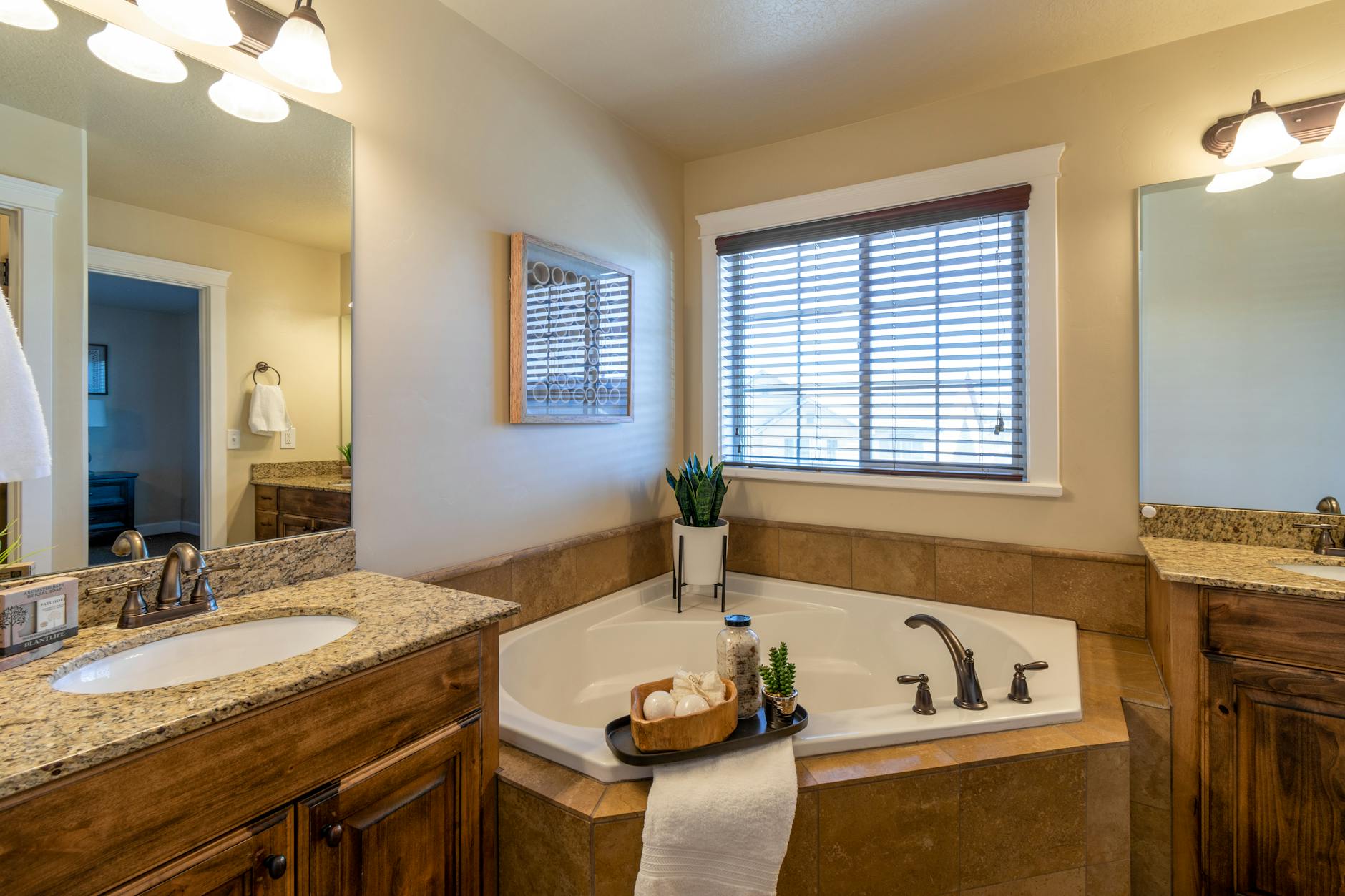
Ornate Bathroom Fixtures
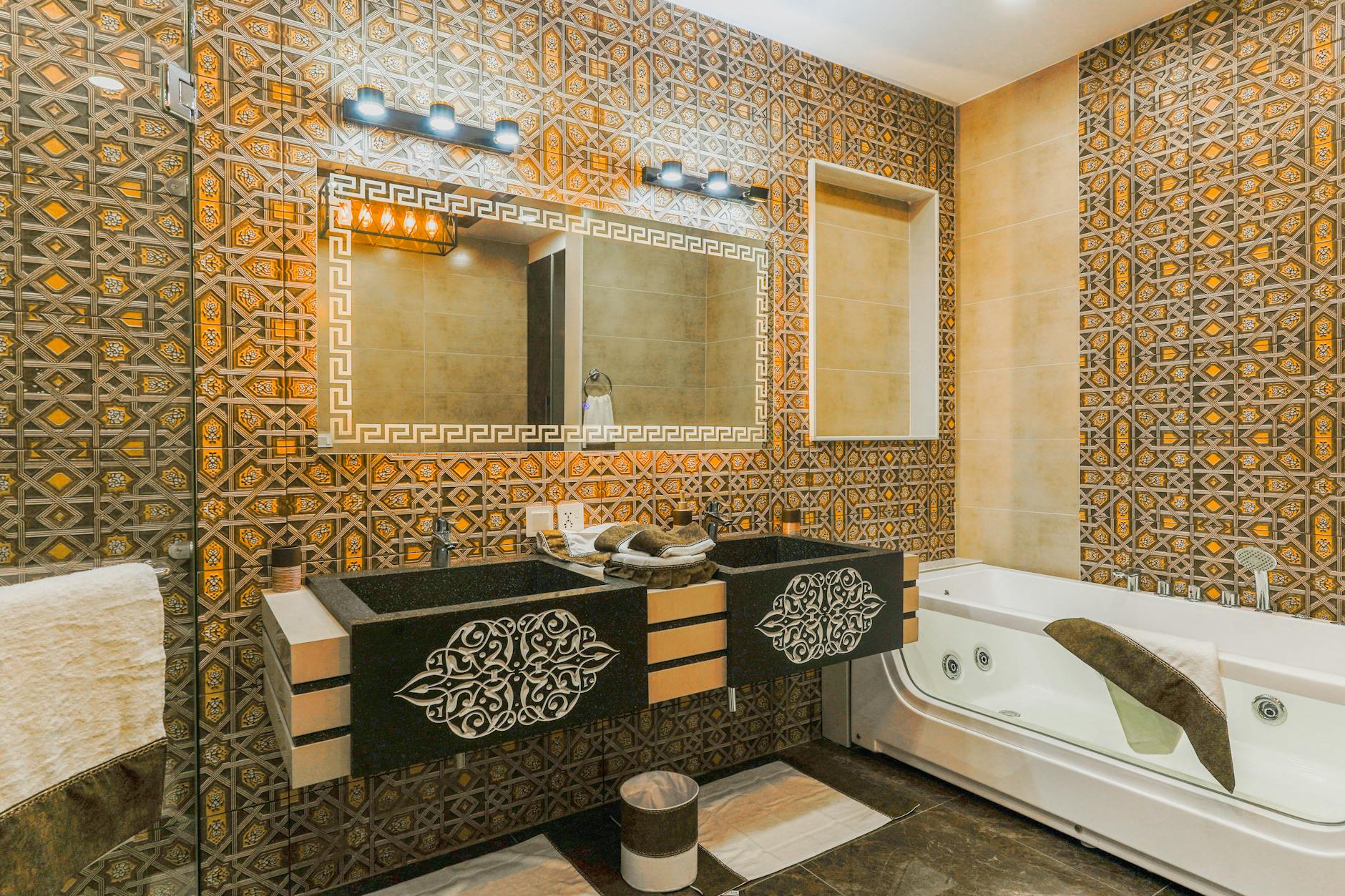
Installing heavily ornamented bathroom fixtures including swan-neck faucets with crystal handles, shell-form basins, and gold-plated hardware in a bathroom whose architecture and construction quality cannot support the visual weight of those choices creates a decorative disconnect that reads as aspiration rather than achievement. Genuinely luxurious bathrooms derive their impact from the quality of their materials, the precision of their installation, the generosity of their spatial planning, and the coherence of their design language rather than from the ornamental intensity of individual fixtures. The gilded faucet installed over a standard ceramic sink in a bathroom with builder-grade tile and hollow-core doors creates a hierarchy of quality within the space that makes the expensive fixture read as a costume accessory rather than as an integral element of a considered whole. Plumbing fixture designers who study purchasing patterns note that maximum ornamentation correlates inversely with budget remaining for the surrounding construction quality, producing a pattern in which the most elaborate fixtures are often installed in the least luxurious overall environments. The restraint of a beautifully made simple fixture in a bathroom whose every surface reflects genuine material quality communicates far more effectively than elaborate ornament competing with a mediocre background.
Farmhouse Overcommitment

Fully committing to the shiplap, galvanized metal, reclaimed wood, mason jar, and chalkboard sign vocabulary of the farmhouse aesthetic at a volume and uniformity that removes any ambiguity about the design’s derivation from a specific television program rather than from an authentic relationship to agricultural architecture or vernacular American building traditions. The farmhouse aesthetic, when executed with genuine material quality, regional specificity, and restraint, draws on a rich tradition of American domestic design whose honest materiality and functional beauty have genuine visual authority. The version that reproduces the exact combination of elements popularized through media content, including the barn door on interior openings, the shiplap accent wall, the open shelving with artfully arranged mason jars, and the word farmhouse rendered in a cut-metal sign, is a reproduction of a reproduction that has moved several steps away from the vernacular source it originally referenced. Interior design critics note that the farmhouse trend’s widespread adoption across genuinely suburban and urban homes where it has no geographic or cultural relationship to the surrounding context is precisely what accelerated its transition from trend to cliche. The homes most likely to execute this aesthetic most effectively are those that have some actual relationship to the landscape and building tradition it references.
Excessive Throw Pillows
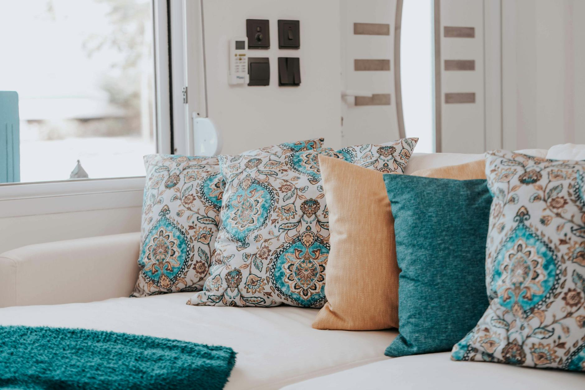
Covering sofa and bed surfaces with a quantity of decorative throw pillows so large that the furniture’s primary function is obscured and a significant portion of each day must be dedicated to their arrangement and storage creates an environment that prioritizes the appearance of luxury over any practical experience of it. Genuine luxury in textile and soft furnishing is communicated through the quality of individual pieces, the sophistication of their fabric selection, and the confidence of their composition rather than through sheer quantity of cushion. The bed that requires fifteen minutes of daily arrangement and a storage system for its decorative pillows has subordinated every other domestic priority to the maintenance of an aesthetic that communicates abundance while delivering inconvenience. Interior stylists who consult on bedroom environments note that the high-volume throw pillow aesthetic is one of the most frequently cited sources of domestic friction between partners, as the practical absurdity of the arrangement is experienced daily by every person who uses the bed. The confident reduction of decorative cushions to a small number of genuinely beautiful examples communicates more about actual design sensibility than the maximum-volume approach it replaces.
Faux Brick Panels

Installing lightweight plastic or foam panels designed to simulate exposed brick in an interior that has no structural relationship to the masonry they are mimicking introduces a material deception that fails at close range and reads as unconvincing theatrical scenery rather than as genuine architectural character. Exposed brick in an interior has visual authority because it represents the actual material reality of the building’s construction, and that authenticity is precisely what gives it the warmth, texture, and visual weight that makes it desirable. A simulation material that reproduces the visual surface of brick without any of its material properties, thermal mass, acoustic quality, or constructional history cannot access the qualities that make the original desirable because those qualities are inseparable from the material’s physical reality. Interior architects who encounter faux brick panel installations note that the product’s limitations become most apparent at the edges and corners where the panel’s thinness and uniform regularity betray its manufactured nature to any observer who passes within touching distance. The investment in a faux material whose deceptive capacity is limited might be more effectively redirected toward a genuine surface treatment that does not depend on distance for its credibility.
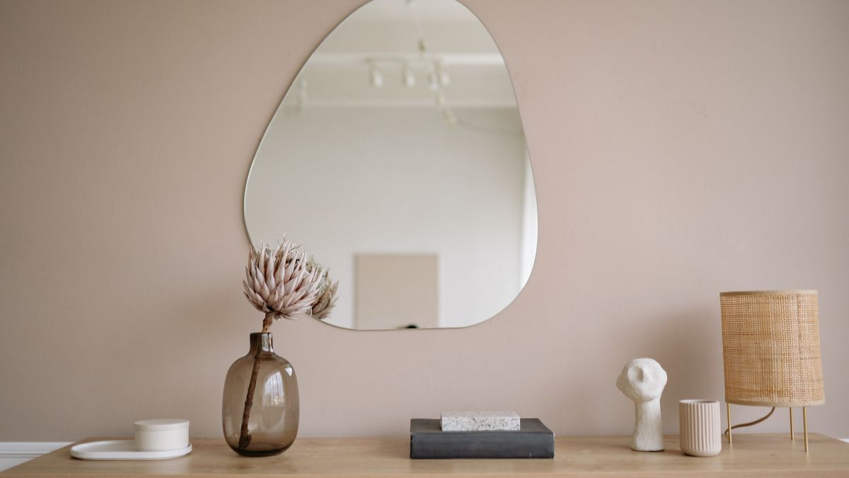
Mirror Overuse
Covering multiple wall surfaces, cabinet fronts, or entire feature walls with mirrored glass in the conviction that reflection multiplies the perception of space and luxury produces instead an environment of visual fragmentation and perpetual self-awareness that most visitors find disorienting rather than expansive. Mirrors used with genuine design intelligence serve specific purposes in specific locations, bouncing light from a window, extending the apparent depth of a narrow corridor, or creating a focal point in a vanity context where reflection is functionally appropriate. The living room in which two walls are entirely mirrored does not read as twice the size of a comparable room with painted walls but as a room that is acutely conscious of its own dimensions and is using a visual trick to manage them, which communicates the spatial anxiety it is attempting to conceal. Interior designers who work with small space optimization note that the mirror wall solution is typically adopted when clients resist the spatial efficiency strategies that would actually address the room’s dimensional limitations. The rooms that feel most generously proportioned are almost never those that have deployed maximum reflective surface area.
Luxury Brand Display
Arranging luxury brand shopping bags, boxes, and branded accessories as deliberate decorative elements within a living space communicates a relationship to those brands in which the packaging is valued above the product because it carries the visible status signal the owner wishes to display. The Chanel bag displayed on an open shelf, the Hermes box arranged on a coffee table, and the luxury retailer bag suspended from a bedroom hook are all communicating the same message, which is that the association with these brands is itself the acquisition the owner most values. Genuinely wealthy individuals who own these items tend to store them in appropriate conditions that protect their value rather than displaying their packaging as trophies, because their relationship to the objects is about the objects rather than about the cultural associations their branding carries. Interior designers who work with genuinely high net worth clients note that the luxury brand display phenomenon is almost entirely absent from their projects while being extremely common in aspirational interiors at significantly lower budget levels. The confidence to own beautiful things without announcing their provenance is itself one of the most reliable signals of a comfortable relationship with affluence.
Ornamental Books

Arranging books by spine color rather than by any organizational principle connected to their content, or purchasing books in bulk as decorative objects without any relationship to their literary content, produces a bookshelf that communicates a desire for the cultural signaling that books provide without the actual relationship to reading that would justify their presence. Books arranged in a color gradient from one end of the shelf to the other are communicating explicitly that their value in this context is visual rather than intellectual, which is precisely the opposite of the cultural sophistication that a well-stocked bookshelf is conventionally understood to signal. Interior stylists who have popularized the color-organized bookshelf approach defend it as a legitimate design choice, but critics note that it evacuates the most interesting visual and intellectual content from the shelf, which is the evidence of an actual reading life accumulated over time. The genuinely well-read person’s bookshelf, with its mix of sizes, its worn spines, its eclectic range of subjects, and its occasional paper bookmark, communicates something about its owner that no styled arrangement of color-coordinated decorative volumes can replicate. Books purchased by the foot from a prop house for a home staging project and books accumulated over a lifetime of reading are distinguishable to any visitor who looks closely enough.
Oversized Abstract Art

Hanging a very large canvas of low-quality abstract painting purchased from a mass retail source because its color palette matches the room’s existing scheme rather than because of any genuine engagement with its artistic merit treats art as a furniture accessory rather than as a cultural object with its own content and value. The oversized abstract canvas in beige and gray that coordinates with the sectional sofa and the area rug below it is not functioning as art in any meaningful sense but as a large decorative surface whose primary qualification for its position is chromatic compliance. Genuine art collections, even modest ones, are distinguished by the evidence of actual engagement with individual works, which produces an eclectic range of sizes, styles, and subjects that reflects the collector’s developing taste rather than a retail buyer’s coordination logic. Art advisors who work across budget levels note that a small number of genuinely chosen works of modest scale communicates more about a homeowner’s cultural engagement than an entire wall of retail abstract canvases selected for their color story. The painting that was bought because it moved its owner in some way, regardless of its scale or market value, contributes something to a home’s interior that the color-matched large-format canvas cannot provide.
Faux Exposed Beams

Installing decorative beams of foam, lightweight wood, or hollow box construction across ceilings that do not structurally require them attempts to access the rustic architectural gravitas of genuine timber framing through a theatrical approximation whose limitations become apparent at close inspection. Exposed structural beams in genuinely old homes carry their visual authority from the evidence they bear of real construction, real material, real aging, and real load-bearing function, and these qualities are inseparable from their physical reality in ways that surface simulation cannot replicate. The foam beam that has been painted and textured to suggest old timber reads convincingly from floor level in a photograph taken with specific lighting conditions and becomes a visible deception when examined at normal human proximity in natural light. Architectural historians note that the desire to replicate the aesthetic of vernacular building traditions through applied surface treatments reflects a broader cultural nostalgia for material authenticity whose most honest expression would be the genuine material rather than its simulation. The home that has real architectural character, however modest, is always more interesting than one that has applied the surface vocabulary of a different building tradition to a structure that has no relationship to it.
Bathroom Word Decor
Mounting framed prints, wooden signs, or vinyl lettering within the bathroom that explicitly name the room’s function or describe the activities performed within it represents a particularly concentrated example of the typographic decor tendency applied to a context where it reaches its logical extreme. The bathroom that contains signs reading soak, refresh, relax, or the more elaborate spa-themed typography that describes the room as a sanctuary of self-care is explaining itself to its occupants in a way that no amount of genuine design quality would require. Interior designers who comment on typographic bathroom decor note that it represents a curious doubling of explicit communication in a space whose function requires no clarification and whose atmosphere, if successfully created through material and sensory quality, needs no textual reinforcement. The bathroom whose quality of tile, fixture, light, and material creates a genuinely restorative experience communicates that experience directly through the senses of every person who uses it without requiring those senses to be supplemented by instructional signage. The sign that tells visitors to relax is providing evidence that the space itself has not achieved that effect through its design.
Plastic Chair Replicas
Purchasing and displaying mass-produced plastic replicas of iconic modernist chair designs including the Eames shell chair, the Tulip chair, and the Ghost chair in contexts where the replica’s material and production quality are apparent to any observer familiar with the originals attempts to access the cultural prestige of those designs without the investment that genuine versions require. The original designs in this canon are distinguished not only by their formal innovation but by the material quality and manufacturing precision that their original producers developed specifically to realize the designer’s intentions, and a plastic approximation at a fraction of the price accesses the form while sacrificing precisely the qualities that make the form meaningful. Design-literate visitors who recognize the original design and its replica simultaneously experience the gap between them as a more prominent design statement than either object would make independently. Interior designers who work with clients who admire these canonical designs often recommend purchasing a single authentic vintage example of a less prominent iconic design at equivalent cost to a room full of replicas, as the genuine object communicates a relationship to design history that no collection of approximations can replicate. The confidence to own fewer things of genuine quality is the same confidence that distinguishes genuinely considered interiors from those that are performing the appearance of design engagement.
Waterfall Countertop Excess
Installing a waterfall edge countertop treatment in a kitchen or bathroom whose overall material quality, cabinetry specification, and spatial generosity cannot support the visual weight of this feature-forward detail creates a hierarchical imbalance that draws attention to the gap between the signature element and its surroundings. The waterfall edge, in which the countertop material continues down the sides of an island or cabinet run to the floor, is a genuine architectural detail with visual authority when executed in a material of genuine quality within a kitchen that has been designed with sufficient coherence for the detail to read as an integral element. Applied to a kitchen with standard-specification cabinetry, laminate flooring, and builder-grade appliances, the marble or quartz waterfall island reads as a single expensive detail stranded in an environment of ordinary quality, which amplifies rather than conceals the budget constraints it was intended to transcend. Kitchen designers note that the decision to concentrate available budget in a single signature feature rather than distributing it across the overall quality level of the space typically produces less satisfying results than a more even allocation would achieve. The waterfall detail in a kitchen of genuinely consistent quality is an understated luxury while in a kitchen of mixed specification levels it becomes the element that most clearly reveals the budget’s limitations.
Excessive Monogramming
Applying monograms to towels, bedding, glassware, throw pillows, doormats, wall plaques, cutting boards, and serving pieces at a volume that covers every soft and hard surface in the home with the household’s initials communicates a relationship to personal branding that mistakes identification for identity. Monogramming has a genuine tradition in quality domestic linens where it served both as a mark of ownership and as evidence of the care and investment that fine household textiles represented, and in this context a restrained monogram on a set of good linen towels carries quiet dignity. The contemporary version that extends the monogram motif to every purchasable surface in the home, sourced from the personalization sections of mass retail websites, has detached the practice from its original context of genuine material quality and applied it instead as a branding system for the entire domestic environment. Interior stylists note that excessive monogramming is particularly prevalent in homes that are otherwise furnished without a strong design point of view, as the personalization element provides a sense of curated intentionality that the surrounding design has not independently established. The home that is interesting enough in its design choices does not require its owner’s initials on every surface to establish that someone lives there.
Versailles Bathroom

Executing a master bathroom in a full French baroque decorative program including gilded fixtures, ornate mirror frames, toile wallcovering, crystal hardware, and reproduction Louis XV furniture pieces attempts to install a decorative vocabulary developed for palace-scale rooms with twenty-foot ceilings and proportional marble floors into a residential bathroom context that cannot provide the architectural setting the style requires to function as intended. Baroque interiors derive their visual coherence from the relationship between their decorative program and the architectural scale and quality of the space they inhabit, and that relationship is almost never available in a residential bathroom regardless of the home’s overall size or value. The full baroque bathroom in a residential setting reads not as a fragment of palatial grandeur but as a theatrical set piece whose incongruity with its actual context is its most prominent characteristic. Interior historians who study the adoption of period decorative styles in residential contexts note that the styles most frequently misapplied are those that were developed for building typologies, scales, and social functions that have no contemporary residential equivalent. A genuinely beautiful bathroom is far more effectively achieved through material quality, spatial generosity, and lighting excellence than through the application of a decorative vocabulary that requires an architectural context it will never receive.
Faux Fireplace
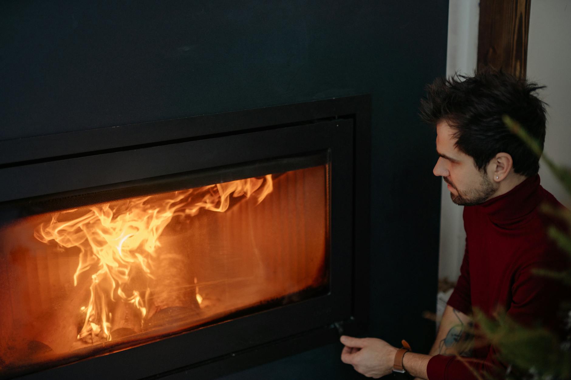
Installing a non-functional decorative fireplace surround around an electric insert or an entirely empty firebox in a room that has no chimney creates a domestic focal point whose status as a design fiction is immediately apparent to anyone who notices the absence of any means by which the fire would enter or leave the space. The fireplace holds such a central position in the domestic imagination as a symbol of warmth, gathering, and home that the desire to possess one regardless of the building’s actual construction is entirely understandable and also entirely transparent to any observant visitor. Electric fireplace technology has improved to the point where genuinely beautiful examples exist that make no claim to be anything other than what they are, and designers who work with these products note that they perform far better when selected and installed with honesty about their nature than when disguised within a surround that implies a structural reality the building does not possess. The decorative mantel with candles and seasonal greenery arranged in the empty firebox is attempting to access the visual language of the working fireplace while inadvertently drawing attention to the absence of the element that would give that language its meaning. A room designed with its actual architectural conditions honestly addressed almost always produces a more satisfying result than one designed around the simulation of conditions the building does not have.
What decor choices in your own home or others have made you cringe, and what do you consider genuinely timeless? Share your thoughts in the comments.