Choosing the wrong paint color for a compact space can instantly make the area feel cramped and uninviting. Certain shades absorb natural light or create heavy shadows that obscure the corners of a room. These colors often advance visually and effectively shrink the perceived square footage of the interior. Homeowners should understand how hue and saturation impact spatial perception to avoid creating a claustrophobic environment. The following list identifies specific colors that typically fail to enhance small living areas.
Dark Navy

Dark navy absorbs significant amounts of natural light and creates heavy shadows that obscure the corners of the room. This deep shade pulls the walls inward visually and makes the ceiling feel much lower than it truly is. Small spaces painted in this color often require excessive artificial lighting to combat the inherent gloominess it generates. The resulting atmosphere can feel oppressive and suffocating rather than cozy in limited square footage.
Brilliant Red
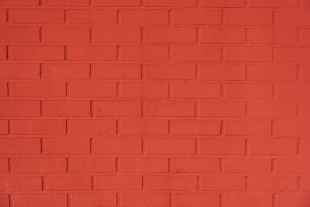
High energy red stimulates the senses too aggressively for a confined area where visual rest is typically desired. The intensity of this hue advances the walls toward the viewer and effectively shrinks the perceived volume of the space. It creates feelings of anxiety or agitation when applied to all four walls of a tiny room. Designers note that this color dominates the environment and leaves little breathing room for furniture or decor.
Muddy Brown

Brown tones with murky undertones often look dirty or dingy in small rooms with limited natural light sources. This color creates a flat and heavy appearance that lacks the dynamic quality needed to open up a space. It absorbs illumination readily and fails to reflect any brightness back into the center of the room. The overall effect creates a dated and confined aesthetic that feels uninviting to occupants.
Forest Green
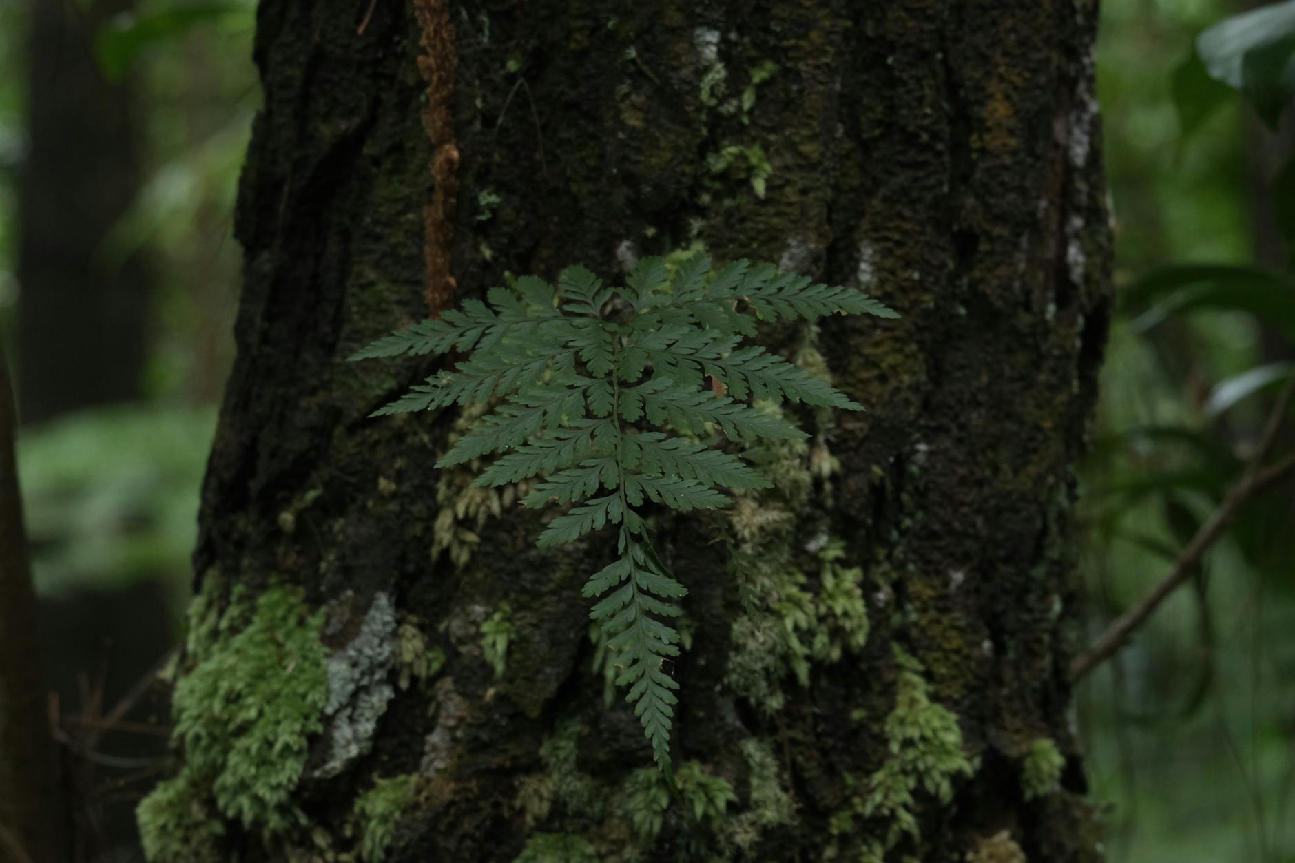
Deep forest green creates a dense visual barrier that makes the perimeter of a room feel much closer than it is. The dark nature of this hue swallows light and hides architectural details that might otherwise add depth. It transforms a small room into a dark box unless there is an abundance of large windows present. This color often feels too serious and imposing for modest areas like powder rooms or small offices.
Neon Orange

Neon orange reflects light in a harsh manner that overwhelms the eye and makes a small space feel chaotic. This vibrant color creates a vibration effect that blurs the edges of the room and causes visual fatigue. The high saturation level leaves no space for the eye to rest and makes the room feel cluttered even when empty. It is generally considered too stimulating and aggressive for use in tight quarters.
Matte Black
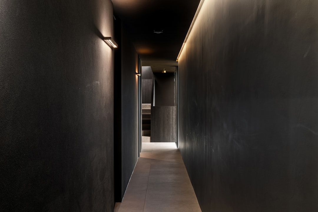
Painting a small room entirely in matte black eliminates all sense of depth and dimension by erasing shadows and light play. The walls seemingly disappear into a void that makes the space feel infinitely small rather than expansive. It requires specific lighting schemes to function well and usually fails in standard residential small rooms. This choice creates an intense and confining environment that feels smaller than the actual square footage suggests.
Mustard Yellow
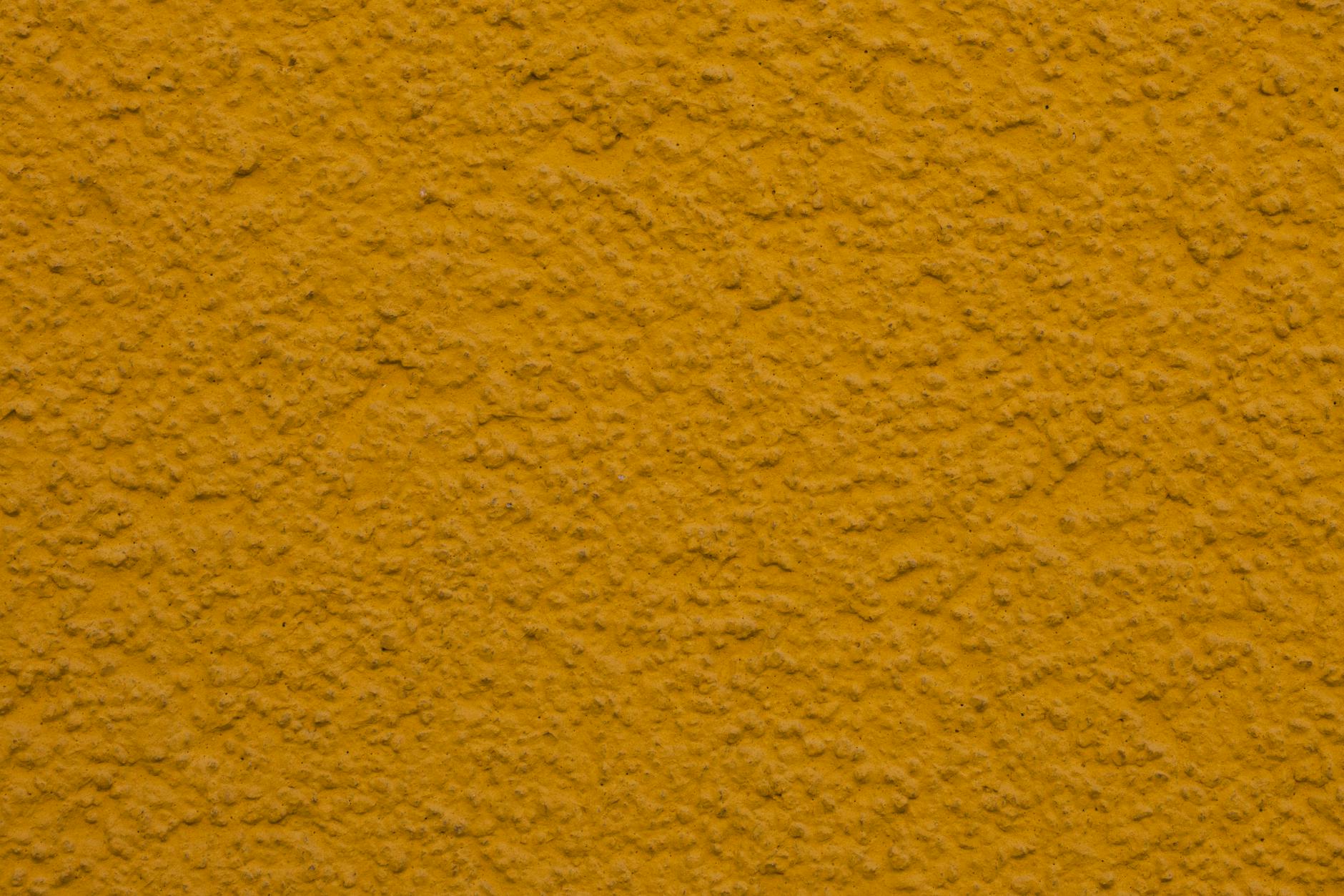
Mustard yellow can cast a sickly pallor over a small room if the lighting conditions are not perfectly managed. This shade tends to close in on the viewer and creates a murky atmosphere in spaces without bright daylight. It clashes easily with many flooring types and makes the room feel visually cluttered and heavy. The warmth of the color becomes oppressive rather than inviting when compressed into a small area.
Eggplant Purple

Rich eggplant purple creates a heavy visual weight that drags the energy of a small room downward. This dark hue absorbs light greedily and often appears black in corners where illumination does not reach. It makes the walls feel thick and impenetrable which significantly reduces the feeling of airiness. The dramatic nature of the color overpowers small spaces and leaves them feeling cramped and somber.
Hot Pink
Hot pink acts as a visual assault in small spaces because it advances toward the eye more aggressively than cooler tones. This intensity makes the walls feel like they are closing in on the occupant from every side. The color reflects onto skin tones and furniture in a way that alters the appearance of everything in the room. It creates a frantic energy that prevents a small room from ever feeling calm or spacious.
Slate Grey
Dark slate grey often renders a small room cold and industrial without providing the coziness of warmer tones. It creates a shadowing effect in corners that blurs the definition of the room and makes it feel smaller. The color lacks the reflective properties of lighter greys and absorbs the available light instead of bouncing it around. This results in a cave atmosphere that feels isolated and dim regardless of the time of day.
Tell us which paint disasters you have experienced in small rooms in the comments.