Food packaging is designed to sell products as much as it is to contain them, and the gap between what labels promise and what products deliver can be surprisingly wide. Brands invest heavily in visual psychology, strategic wording, and regulatory loopholes to make their products appear healthier, fresher, or more premium than they actually are. Understanding these common tactics helps consumers make more informed choices at the grocery store. A closer look at the shelves reveals just how calculated the art of food packaging really is.
Natural Labeling

The word “natural” appears on thousands of food products despite having no regulated definition in most countries. Manufacturers apply it freely to items that contain artificial preservatives, processed sweeteners, or chemically altered ingredients. Shoppers tend to associate the term with wholesome, minimally processed food, which is exactly the perception brands aim to create. Reading the full ingredient list rather than relying on front-of-pack claims gives a far more accurate picture of what a product actually contains. The label is a marketing choice, not a nutritional guarantee.
Health Halos
A single positive attribute on the front of a package is often used to overshadow a product’s less flattering qualities. Chips labeled as gluten-free, granola bars promoted as high in protein, or cookies marketed as vegan can all still be high in sugar, sodium, or saturated fat. This technique exploits the consumer tendency to judge an entire product by one highlighted benefit. Nutritionists refer to this as the health halo effect, where one positive claim creates a falsely virtuous overall impression. Checking the nutrition panel independently of any front-of-pack claims is the most reliable approach.
Serving Size Manipulation
Nutrition information on packaging is calculated per serving, and serving sizes are frequently set far below what a person would realistically consume in one sitting. A bag of chips might list its calorie count for just ten chips, or a bottled drink might claim to contain two and a half servings despite being a single-use container. This practice makes calorie, sugar, and sodium figures look significantly lower than they would appear if calculated for the full package. Regulatory bodies in many countries allow brands considerable flexibility in defining what constitutes a serving. Multiplying the listed figures by the number of servings per container reveals the true nutritional picture.
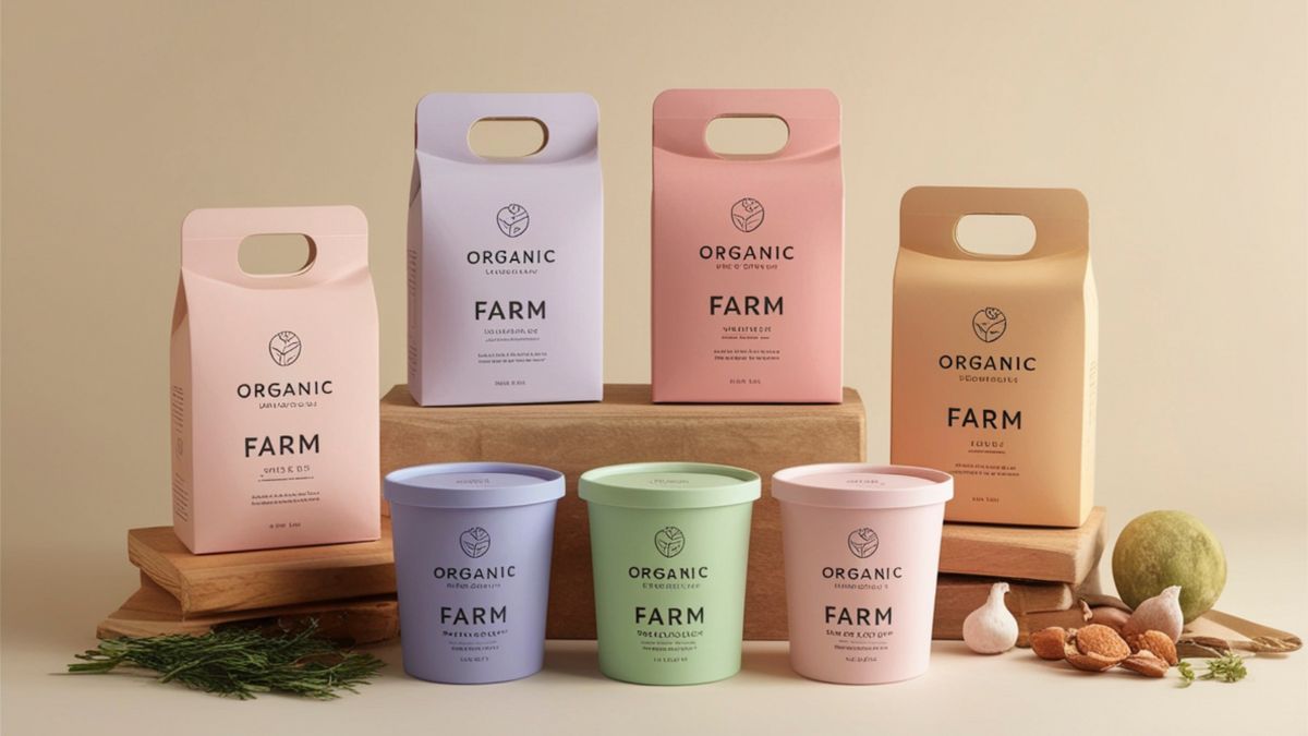
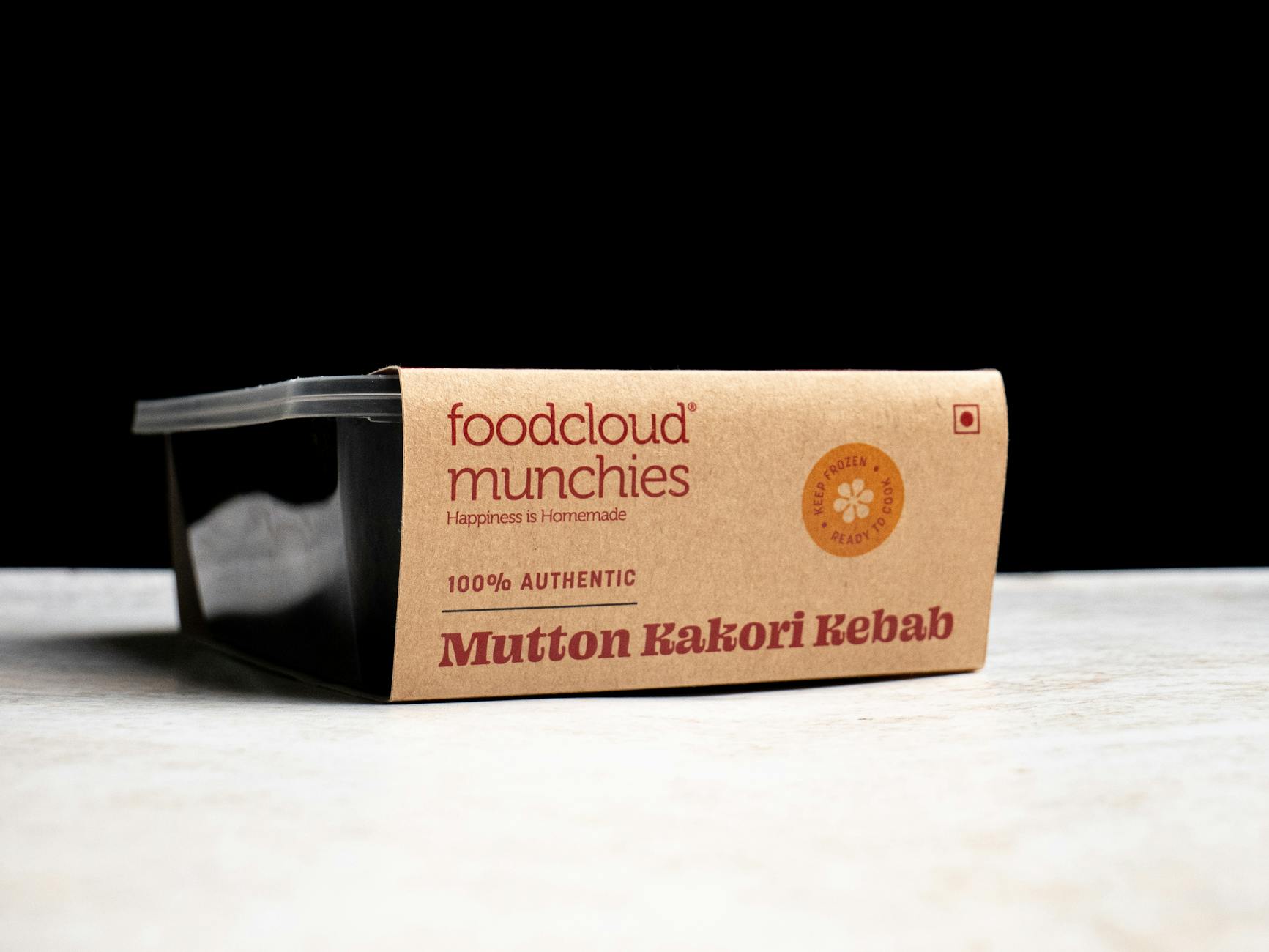
Color Psychology
Packaging colors are chosen with deliberate psychological intent to shape how a product is perceived before a single word is read. Green is widely used to signal health, freshness, and environmental responsibility even when a product is heavily processed. Brown and kraft paper tones suggest artisanal quality or whole grain content regardless of actual ingredients. White packaging communicates purity and simplicity in a way that blue or red might not. These color associations are so deeply conditioned that they can influence purchasing decisions faster than any written claim on the label.
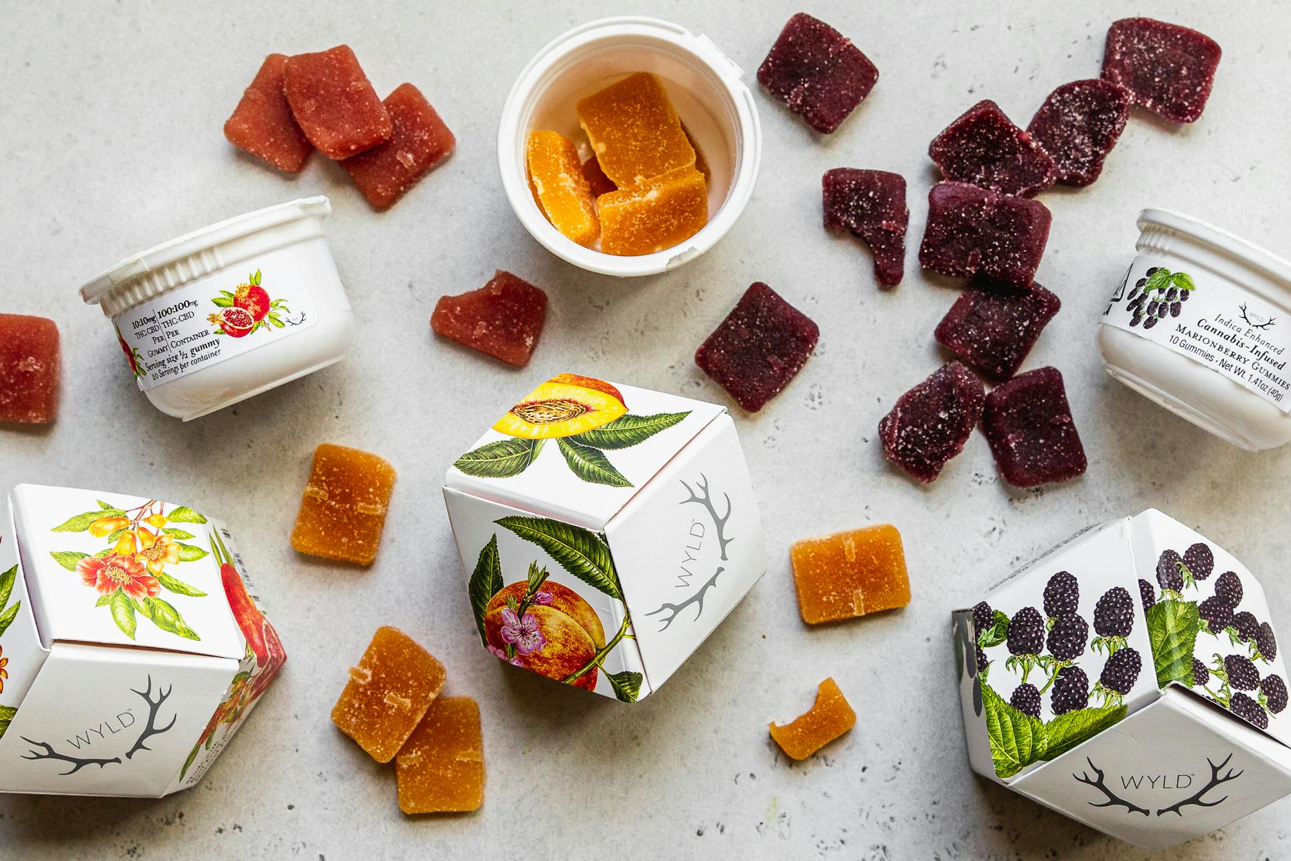
Misleading Imagery

Photographs and illustrations on packaging routinely depict ingredients in quantities or qualities that do not reflect what is inside the product. A yogurt carton adorned with clusters of fresh blueberries may contain only a small percentage of fruit or artificial flavoring. Soup cans featuring thick, vegetable-rich broth often hold a much thinner liquid with fewer whole ingredients. In many jurisdictions, these images are permitted as long as they are accompanied by the phrase “serving suggestion” in small print. That disclaimer is typically positioned so inconspicuously that it goes unnoticed by most shoppers.
Shrinkflation

Shrinkflation occurs when a brand quietly reduces the quantity of a product while keeping the packaging size and price the same or similar. The box, bag, or container remains visually unchanged, so most consumers do not notice the reduction until they compare unit prices over time. This tactic allows companies to offset rising production costs without triggering the consumer resistance that a visible price increase would provoke. A family-size cereal box that once held 750 grams may now contain 640 grams with no change to the outer design. Comparing price per 100 grams rather than price per package is the most effective way to detect this practice.
Fortification Marketing

Adding a small amount of a desirable vitamin or mineral to an otherwise unremarkable product allows brands to prominently feature that nutrient on the front of the packaging. A sugary breakfast cereal might be marketed around its added vitamin D content, or a soft drink might highlight its inclusion of zinc. The added nutrient is often present in quantities too small to provide meaningful health benefits, but its presence justifies bold claims that elevate the product’s perceived value. This practice is particularly common in products marketed toward children, where parents are especially receptive to health-related claims. The overall nutritional profile of the product tells a far more complete story than any single added ingredient.
Buzzword Overuse
Terms like “artisan,” “crafted,” “heritage,” “premium,” and “wholesome” carry strong positive connotations but have no standardized legal definitions in the food industry. Any manufacturer can apply them to any product without meeting specific criteria, making them essentially meaningless from a regulatory standpoint. These words are selected through consumer research that identifies language associated with quality, tradition, and trustworthiness. A mass-produced cracker can be labeled as artisan-crafted just as easily as one made in a small bakery. Treating these terms as aesthetic choices rather than factual descriptors protects shoppers from being misled by appealing language.
Front vs. Back

The front of a food package functions as an advertisement, while the back panel contains the factual nutritional and ingredient information brands are legally required to disclose. Savvy packaging design ensures that the front face is eye-catching and benefit-forward, drawing attention away from the more detailed and sometimes unflattering information on the reverse. Studies in consumer behavior consistently show that the majority of shoppers make purchasing decisions based on the front of the package alone. Front-of-pack claims are subject to some regulation but still allow for significant creative latitude. Flipping the package over and spending a moment with the ingredient list and nutrition facts is the most straightforward way to cut through the marketing.
Eco-Friendly Deception

Greenwashing refers to the practice of making a product appear more environmentally responsible than it actually is through packaging design and marketing language. Phrases like “eco-friendly packaging,” “sustainably sourced,” or “environmentally conscious” are frequently used without third-party certification or verifiable evidence to back them up. Earthy color schemes, leaf motifs, and recyclable-looking materials create an impression of environmental virtue that may not extend to the product’s actual supply chain or manufacturing process. Genuine sustainability claims are typically supported by recognized certifications from independent bodies. Consumers interested in making environmentally responsible choices benefit from looking beyond packaging aesthetics and seeking out verifiable credentials.
Have you ever been surprised by the difference between a product’s packaging and what was actually inside? Share your experiences in the comments.